Identity Crisis
July 30, 2014
Has the web created irresponsible logo design?
To say the Internet has profoundly impacted the modern graphic design industry is an understatement.
No other force has so radically changed what we do and how we do it — except perhaps the Mac computer. Not long ago when a new company approached a designer for help, they wanted a logo, business cards and a brochure. Now, it is a logo and a website. Over the years, I have become very interested in how the latter affects the creation of the former.
Back in the late ‘80s, Canada’s best identity designers taught me how to design a logo. The challenge was to distill the essence of a company into simple, graphic form. Simplicity was key. “The principal role of a logo is to identify and simplicity is its means,” says Paul Rand in Design, Form, and Chaos. Simplicity wasn’t just a modernist aesthetic ideal, but also a practical one. Simple forms reproduce well at a small size.
Function determines the form
At my first design firm, the Internet was only beginning to be a reality. We used a modem to send our typesetting files to service bureaus and it sang this distinctive warble when connected. Clients didn’t need their logos to work online; they needed them to reproduce well on stationery or on the cover of an annual report. Price drove how much colour could be used because clients wanted to save on printing costs. One or only two colours were practical. The biggest challenge was to ensure the logo was still clear after it was faxed — the crude black-and-white thermal printing was the ultimate legibility test.
Designers routinely consider the limitations of where logos are ultimately viewed. If a client needs outdoor signage, the number of colours available in vinyl limits colour strategy. Understanding the limitations in advance avoids having to fix problems later. I developed a methodology to always design for the worst-case scenario, and then every other situation would work. Was designing for the Internet just another consideration or something more?
In the late 1990s, Chapters, the book retailer, was preparing to launch an online store. It would be my first online logo. Designers were starting to create websites and we typically used programmers. Mine pointed out a pretty obvious fact: websites are always in colour. All the colours of the rainbow were available and it wouldn’t cost any more. I took note of what he said but thought that there would be situations when a black-and-white version is required, such as a form that is photocopied. My first online logo would be a single colour.
Consistency was also a fundamental consideration. To build strong brand awareness, the same logo was used across a range of applications. There were different versions (black, reverse and colour), but the master artwork was the same. I supported this rigorous approach by the strategic principle that a strong brand is a consistent brand. Alina Wheeler writes in Designing Brand Identity that coherence is one of the nine brand identity ideals. Having different versions of an identity would weaken the system and be impractical to implement for any large company with worldwide offices.
After several years of working on my own, there were many rules that I followed when executing a concept. The idea needed to work first in black and white. It needed be a simple graphic form with a minimum amount of detail or ornamentation that was legible at a small size.
Figure out the worst case scenario for legibility and design for that situation. Create base artwork from which there are three versions: black, reverse and single or two colour. And there were things you just didn’t do: no gradations, no photographs and no elaborate multi-colour symbols. In the following years, those rules would be questioned, and it all started in school.
OCAD University hired me in 2004 and it wasn’t long before one of my courses was focused on branding. The course covered the process of creating a logo but I was also preparing the students to be future brand identity designers. What should these future logos look like and how would the students create them? Those questions made me rethink colour.
Branding online 101
My students, only just out of high school, didn’t know of a world without Internet, and that world was always in full colour. In the assignment brief, they were required to work in black and white first before going to colour. When a student questioned the requirement, I argued that working in black and white was the only way to truly evaluate the form and counter-form, adding that their concept might be faxed at some point. Very few had ever faxed anything, and weren’t fax machines actually scanners which were in colour anyway?
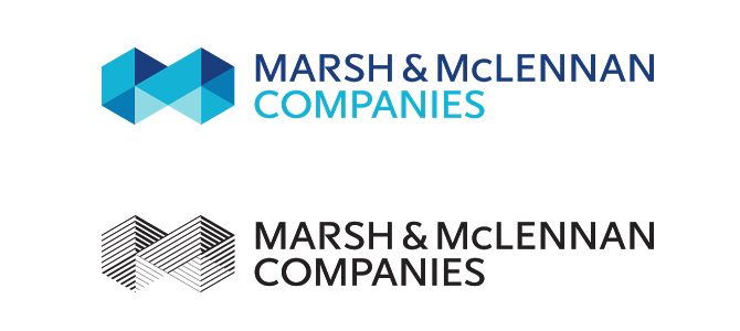
It was around then that I started to notice designers creating logos in reverse. There were elaborate multi-colour logos while the black-and-white versions were just simplified — or an entirely different graphic approach, suggesting that designers had done the colour first and the black-and-white later. An example of this is Marsh & McLennan Companies logo by Lippincott. The stylized “M” of the full-colour symbol is made of blocks in several hues of blue, whereas the black-and-white version is created by different weights of line. But why have different versions of the same identity? Wouldn’t that inconsistency be a weakness? In this case, would anyone really
notice?
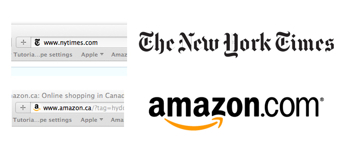
Then came favicons (the tiny graphic before the URL in the address bar of the browser), and they made me consider the rule about designing for the worst-case scenario. The 16 x 16-pixel square is about as tiny and coarse as you can get. Words become illegible and because it is a square format, only forms of equal height and width fit. Should logos of the future be designed to this standard? In their book Creating the Perfect Brand: Teach Yourself, authors Paul and Julie Hitchens state, “The favicon has become a must-have to brand your website,” so they advise creating a logo that is legible when reduced to that size. Most brands do something special for this application. The New York Times just uses the Gothic capital “T” from its masthead, and Amazon uses the “A” from its wordmark, with the smile underneath.
Square shapes became even more dominant with the explosion of social media. Frantic to capitalize on this virtual community, brands wanted their logos to work in the square provided by Facebook or Twitter. Once again, this proportion was restricted to anything horizontal and also got smaller in the social media stream. Do all logos in the future need to be designed in a square? It is worth pointing out that the contents of these squares were for a photo of a face, not a 2D graphic. Faces scale extremely well and are easily identifiable at a small size. Just look at how easy it is to pick out your mom in the grid of friends on your Facebook page.
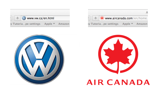
This led me to another question. Are simple, graphic forms still the ideal? Faces are photographs with highlights, mid tones and shadows. Since they reduce in scale much better than flat graphics, perhaps logos require more dimension and complexity. When you compare the Air Canada symbol with the more 3D Volkswagen logo at the extremely small favicon size, VW wins. This suggests that photographs, gradations and other dimensional effects are not just design trends, but useful and functional methods for creating symbols. I wonder if Paul Rand would agree with me.
Finally, the web is not a static medium. The possibility of motion or animation is now a very relevant consideration when developing a logo. We see it from complex television station branding to the simple animation of banner ads. Motion is so important that my university has made it a learning outcome in the graphic design curriculum. In my branding course, the students need to create an animation of the identity that tests its potential not just as a static graphic, but as a form that has movement and life.
I once thought the Internet was just another application to consider, but with social media, smartphones and tablets in play alongside desktops, brands need to succeed online to survive. This doesn’t mean that if an identity works online, it is the right solution, or that because we can now do something graphically new, we should. This thinking has lead to a lot of irresponsible logo design.
The online world has opened up possibilities that never existed for identity designers. The opportunity of colour use, detail and animation are extraordinary but need to be handled with taste, discipline and sensitivity to form. These are core principles that will never change.
David Thorne is the creative director at David Thorne Communications and an assistant professor at OCAD University.