McMillan's New Look
May 16, 2016

We’re not the only ones who had a milestone birthday this year and decided to change our look!
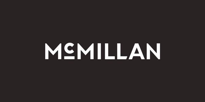
Ottawa agency McMillan recently marked 20 years in the business and debuted a brand overhaul to celebrate.
The new look is also in line with the agency’s shift to focusing on global B2B brands. “It became an opportunity to rebrand, especially for those new to McMillan,” says Jennifer Van De Vooren, art director. “There’s often a misconception that the B2B world is drab and outdated. But it can be fresh and exciting, and we want the new brand to reflect that.”
She continues, “McMillan is energized and alive, and there are so many neat things going on in the office that people don’t know about.” Van De Dooren points to lunch and learns, in-house projects like the “Interns” video game and events such as “Anti Valentine’s Day.”
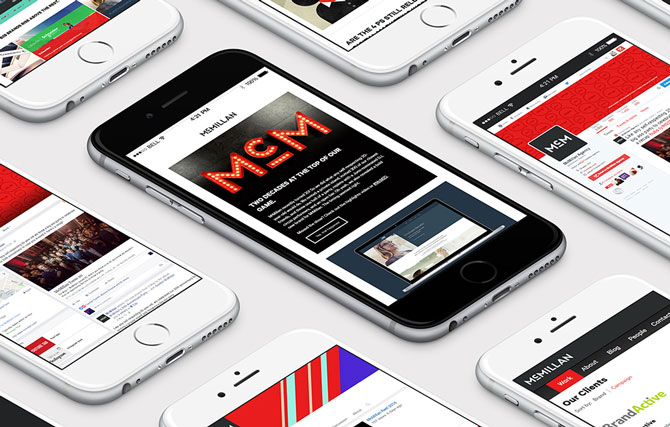
Over the past few years, the agency has evolved to include two “arms,” though they’d be better described as multiple personalities than true silos. There’s the McMillan we’ve always known, and then there’s McM, the creative side that pushes boundaries. One of the ways the new brand conveys the agency’s creativity is with patterned backgrounds that will change seasonally, which the art directors are using behind the logo mark and as pause screens in client presentations to make the “corporate” a little more convivial.
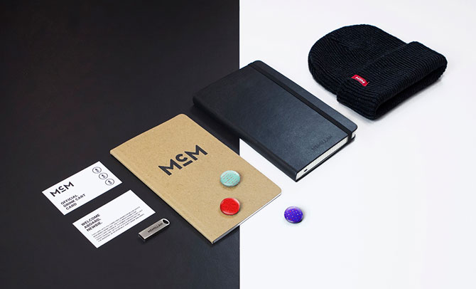
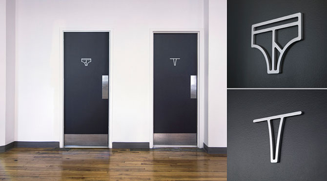
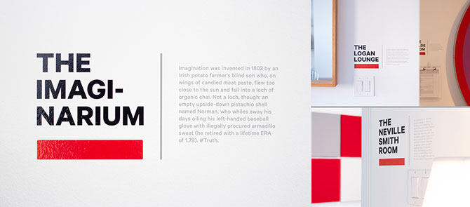
Also part of the rebrand: animated gifs, updated wayfinding throughout the office, employee swag, a vintage McM sign handmade by a local metal artisan, and a simple black-on-white exterior sign, backlit by a bulb that can change colours on a whim. “Everything we’ve been touching when it comes to this brand is to push our creativity and think of it in a different context,” says Van De Vooren of the project, which has been in development for the better part of a year. “We hope everyone has the opportunity to use the brand as a creative outlet.”
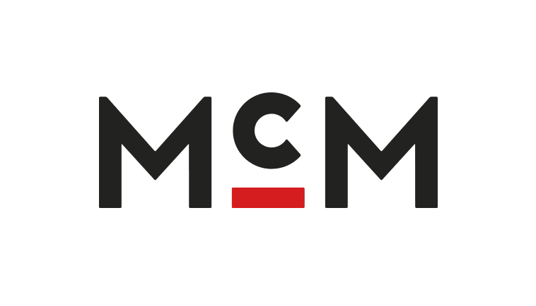
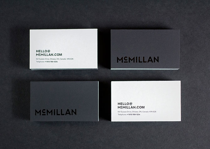
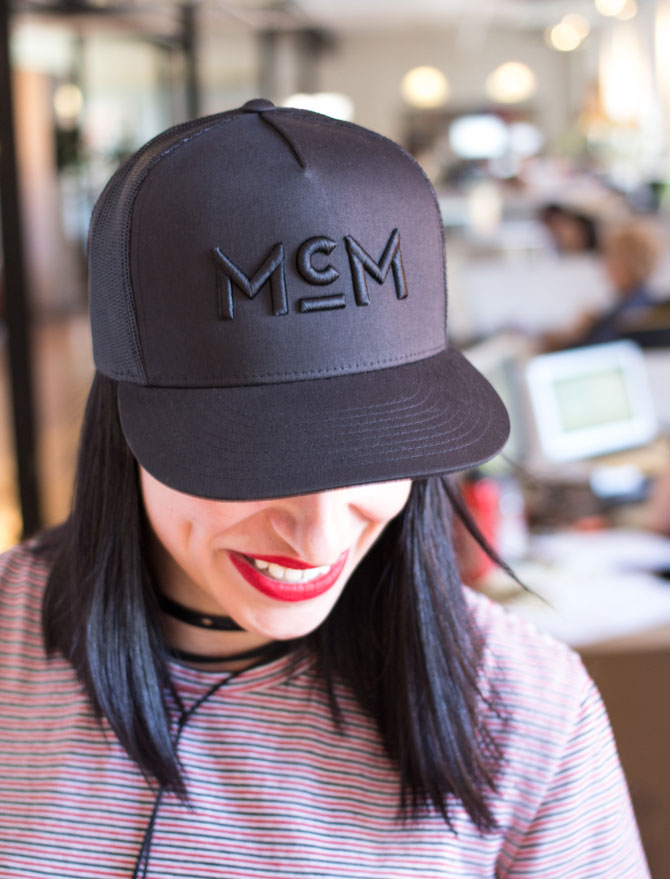
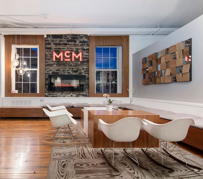
And as for that new logo, which features a “c” that rotates and flips upside down? It’s the cornerstone to the agency’s new approach and has the flexibility to speak to both “sides” of the company.
“‘McMillan’ is the trusted advisor, which is where we get that simplified look. It’s black and white, modern and minimalist,” says Van De Vooren. “And on the other hand, we have ‘McM,’ the creative side. So the new mark plays with that old design rule, ‘thou shalt not mess with the logo.’ The underline on the ‘c’ is called the launch pad here at the office. It’s the key to McM: it adapts, evolves and changes.”
Put another way: “McM is the one you want to go to a party with and McMillan is the one that takes your keys and puts you in a cab at the end of the night,” she says.
Cheers to 20 years!