Connecting the Dots with The White Room
March 20, 2018

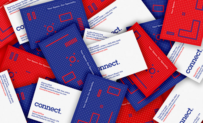
Toronto’s The White Room recently unveiled a brand revamp for Connect, an interior design and facility management firm that primarily deals with corporate clients.
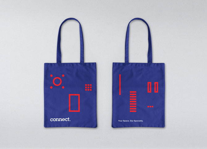
Neil Rodman, creative director at The White Room, says that after 20 years in business, Connect has expanded beyond interior design into furniture sales and whole-office moving, so the original brand no longer accurately reflected the company’s position in market. For this update, Connect wanted a younger, more approachable look. Rodman created a more conceptual floor plan using a dotted grid, and punctuated it with outlines of basic furniture components.
“The dots play off the word Connect,” he says. “I wanted to incorporate the dots somehow into the design, but not be so literal about it.” Instead, Rodman says he wanted to convey the company’s personality, which he describes as personable.
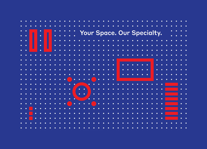
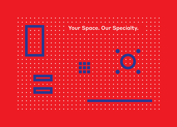

“The grid came about because they often walk into meetings with typical square paper, and they will take measurements and draw out their ideas,” Rodman says. “The concept is to take these stripped-down components and use them in a whole bunch of ways to create different backgrounds and patterns, and then move them around to show how flexible Connect is as a brand.”
Shortening the company’s official name—Connect Resource Managers and Planners— not only helped in the execution of the logo, which is set in the geometric ITC Lubalin Graph, but also was more reflective of the company’s full journey with its clients. The two "n" letters in "Connect" are joined to reinforce that idea. The White Room also created the tagline "Your Space. Our Specialty."
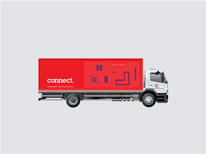
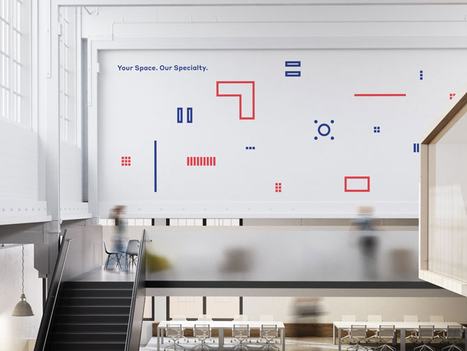
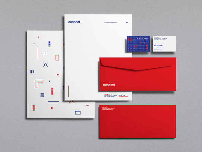
In addition to the logo, The White Room produced other brand identity elements, such as a wrap on the company trucks and a feature wall for Connect’s new office space in downtown Toronto. A stationery set includes a debossed letterhead as well as business cards with six different graphic combinations in red, and another six in blue—the brand’s signature colours pop from the specialized UV press used at Andora Graphics. “You get these vibrant colours from it,” notes Rodman. “Everything was registered perfectly.”
Still forthcoming is a new website, which Rodman animated to ensure all the furniture shapes move on the grid.
In total, The White Room spent more than two years on the project with the client ensuring all the details were ironed out ahead of Connect's 20th anniversary in 2018. Connect’s concern over environmental friendliness led to sourcing sustainable materials wherever possible. “This was a rare scenario where the client was really open to the design. They put a lot of trust in us and believed in what we could do,” Rodman says. “We gave them three different concepts and they wanted to go with the most progressive one!”