SPATULA Foods Rebrand
Rebrand Logo - Single
2022
Humanity, Toronto, ON
e: carolyn.shaw@humanityagency.com
w: humanityagency.com
Design Director: Louis Duarte Chief Creative Officer: Carolyn Shaw Executive Creative Director: Bryan Hobson VP, Head of Strategy: Ryan Hughes Senior Strategist: Nicole Stanhope VP, Client Relationships: Naomi Olsen
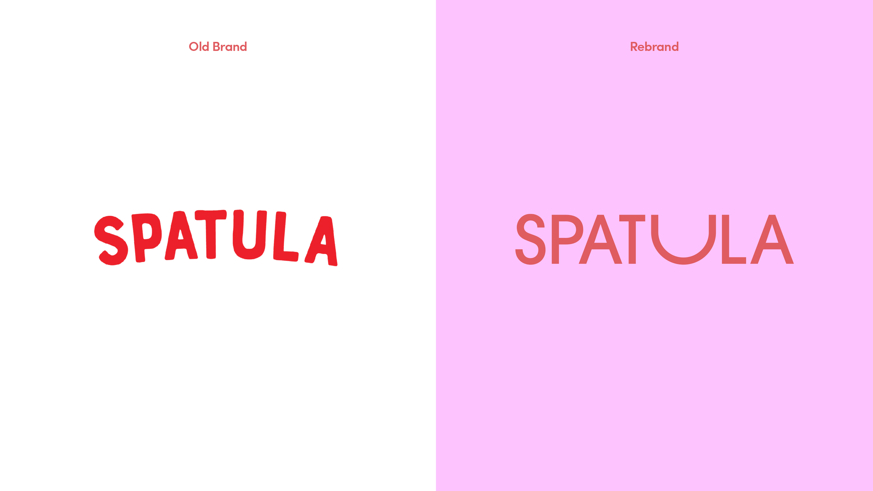
While you won’t find SPATULA'S Chef created dishes in stores, you could easily find yourself cooking one of their inspired dishes at home, if you have ten minutes and a pan to spare. The U in the logo is at the core of the brand’s visual identity as it is representative of a bowl, pot, pan or plate. Plus, not only does the U provide a bold design element, but it also informs the brand’s entire visual language by expressing the brand’s principle reason to believe – you’re cooking.