Comparisons
Online Video - Single
2008
Ogilvy & Mather
t: 416-945-2237
e: marina.pietracci@ogilvy.com
w: ogilvy.com
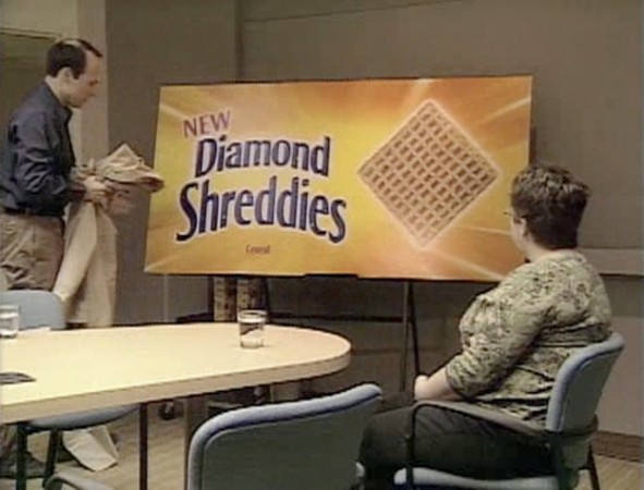
Ad Agency: Ogilvy & Mather Art Direction: Ivan Pols Client: Kraft Canada Inc./Post Cereals Copywriting: Hunter Somerville, Tim Piper Executive Creative Direction: Nancy Vonk, Janet Kestin Production Company: AVH live communications
Winning Website: diamondshreddies.com/videos.php
Shreddies had been a favorite cereal in Canada for decades, but it was virtually forgotten. This cereal didn't need innovation. Canadians love Shreddies “just the way they are” . The brand needed a face-lift and a radical marketing approach to break through the cluttered cereal category. We created a fake line extension: “Diamond Shreddies" . And executed the integrated campaign "launch" with a straight face. "Comparisons" is one of the virals created for the website in which our moderator talks to real participants in focus groups about the difference between ‘square' and ‘diamond' Shreddies.