Wes World
The graphic universe of Wes Anderson’s The French Dispatch
October 7, 2021
If it is the task of the designer and the visual artist to re-imagine the world, take it apart and put it back together again in ways that others would never have imagined possible, few artists have done so as beguilingly as Wes Anderson.
Let’s agree that in order for such feats of creative magic to succeed, they must contain enough visual cues from the "real" world—but no more than necessary—to set up a sufficiently delicious tension with the reimagined one. This is why, for so many people, movements like cubism, futurism and abstract expressionism never worked: the language they spoke had never been encountered before. All of the cues were too new.
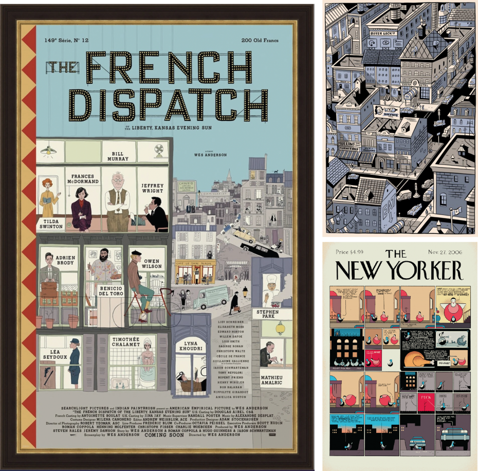
Left: The original film poster, designed by Erica Dorn and illustrated by Javi Aznarez, takes its cues from The New Yorker magazine covers – especially those of Seth (above right) and Chris Ware (below right)
In a Wes Anderson film, there are layers and layers of visual cues, satisfying both the artistically uninitiated and the visually sophisticated. The soon-to-be-released The French Dispatch may be his most meticulously constructed, multilayered effort yet.
While the film has yet to hit the cinemas, a plethora of visual assets, from trailers to featurettes to posters to music videos has flooded the Internet in anticipation of the great event. Originally scheduled for a pre-pandemic release, COVID has delayed it until now, which may explain the creation of so much promotional material. But even after gorging on this embarrassment of riches, we still salivate at the prospect of being immersed in the cinematic feast that awaits.
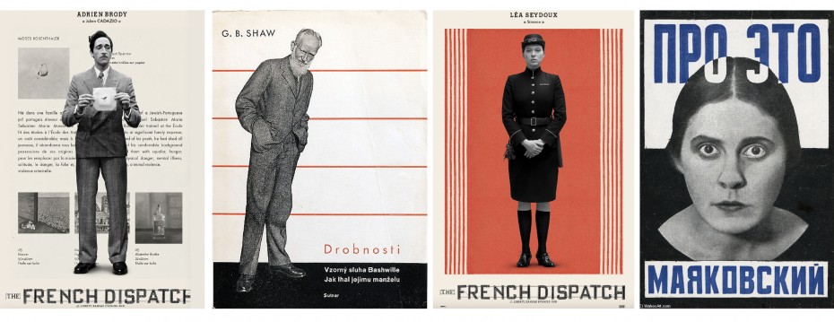
Adrian Brody strikes a pose reminiscent of Ladislav Sutnar’s 1928GB Shaw book cover; Lea Seydoux borrows her grimace from Rodchenko’s cover for a book of poems by Mayakovsky
For anyone familiar with art and design history, there are many references to drool over. We already mentioned the New Yorker, famed for its wonderful covers. The film is an homage to the venerable weekly’s golden era, expressed as a series of vignettes about a group of American expat journalists who cover France from the fictitious town of Ennui-sur-Blasé—only one example of the screenwriters’ wry humour. Other examples include a chef named Nescaffier and an art critic named JKL Berenson.
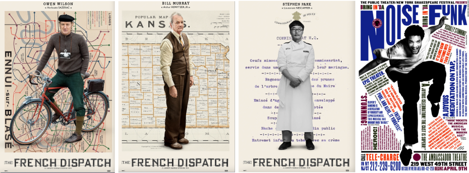
Characters played by Owen Wilson, Bill Murray and Stephen Park are set against backdrops which evoke Paula Scher’s more dynamic but similar juxtaposition of figure
and typography
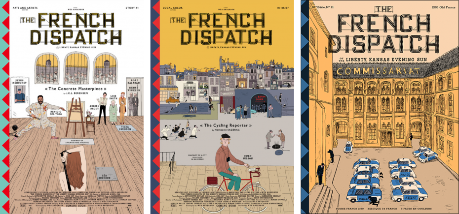
A series of posters depicting each of the 12 main characters draws on a buffet of visual cues from design history, from the constructivism of the 1920s to the deconstructivism of the 1990s. At the distant end of that continuum one is reminded of Czech designer Ladislav Sutnar and Russia’s Aleksandr Rodchenko; at the more recent end one sees echoes of Paula Scher, herself a virtuosic plunderer and transformer of historical cues. Two other posters in the series recall the revolutionary motifs of the Paris student protests of 1968. The artwork for an animated video of the film’s musical theme borrows gleefully from Edward Gorey—another great contributor to the New Yorker’s covers.
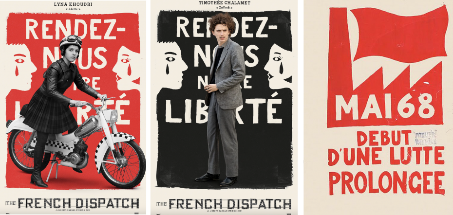
The rough grass roots aesthetic of the MAI 68 protests (far right) is reprised as the background for Lyna Khoudri and Timothée Chalamet.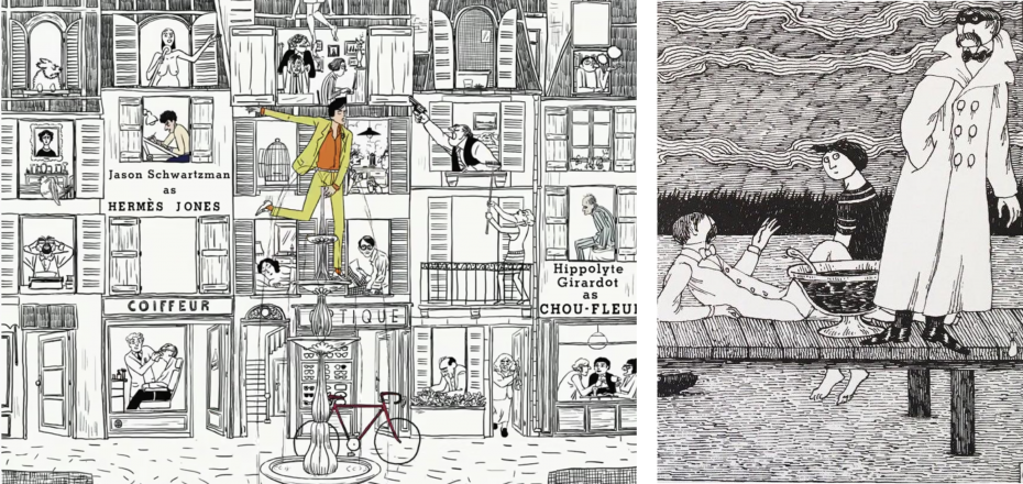
Left, Javi Aznarez. Frame from the animated video of the key musical theme. Right, Edward Gorey gazes in the direction of his progeny.
In Anderson’s films, colour is almost a member of the cast. In this one, the star is yellow—a hue which recalls Dijon mustard and lends itself well to the kind of muted palette you would expect in a place named after boredom and indifference.
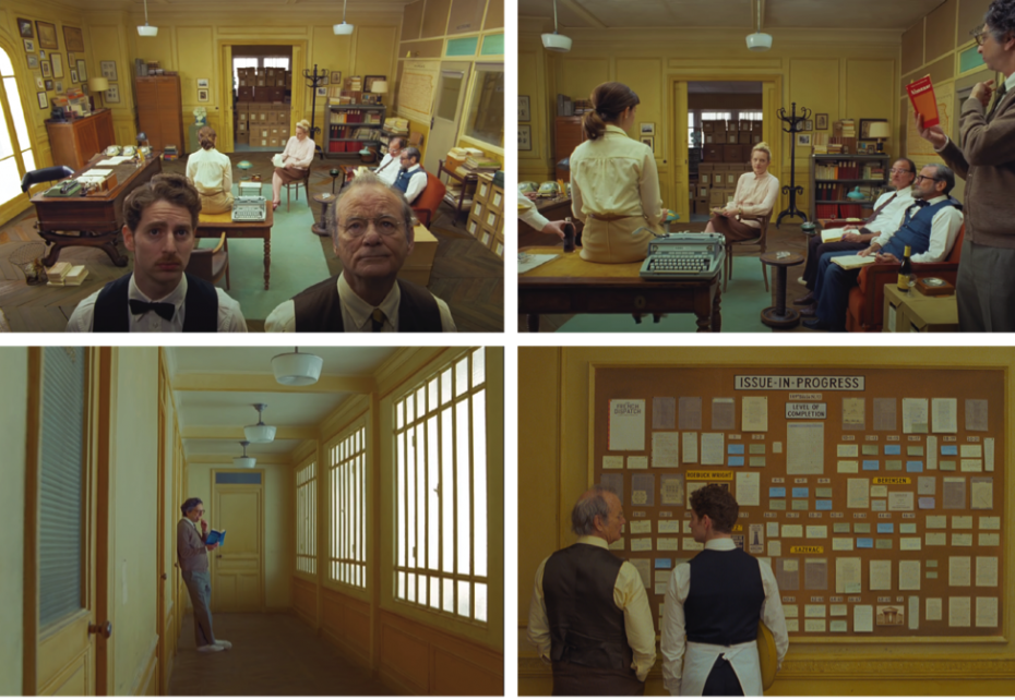
In the final analysis, colour is but one of the tools Anderson uses to make his highly constrained parallel universe conform to its own eccentric but delightful design logic. Like all carefully designed artifacts, Anderson’s films and the devices used to promote them express a yearning for control, order and meaning in response to our otherwise messy, ruleless universe. His obsessively reconstructed worlds offer a welcome if fleeting respite from the absurdity of the one we live in.
The French Dispatch opens in theatres on October 22.
Will Novosedlik is a designer, writer, long-time contributor and former editor of Applied Arts Magazine. He is known for a critical perspective on the cultural and socio-economic impact of design, brand, business and innovation.