Q&A: Stefan G. Bucher
February 28, 2018

The designer sculpts 3D letterforms in his new book
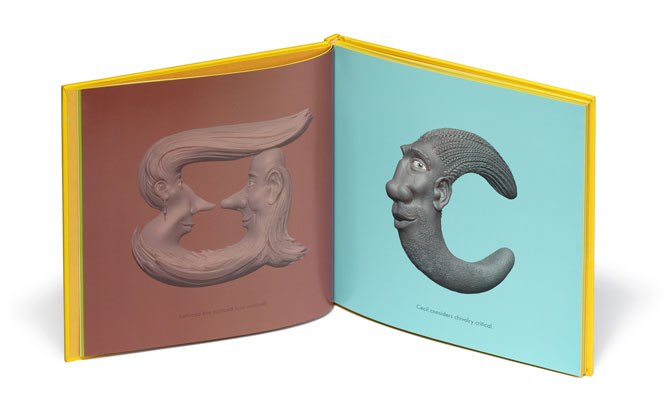
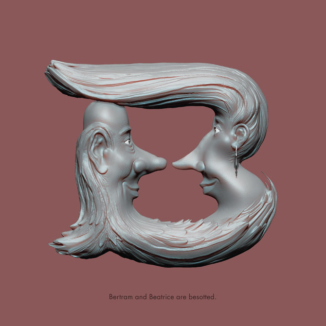
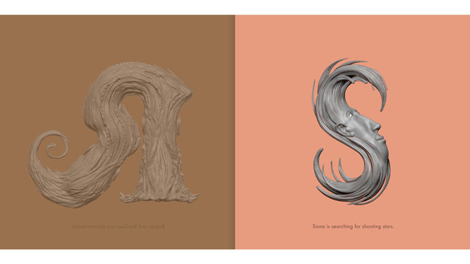
Designer parents looking to teach their kids about letterforms and type would do well to pick up the recently released LetterHeads book by LA-based designer and illustrator Stefan G. Bucher. Bucher, who runs his own studio, 344 Design, created an alphabet book using 3D modelling software to turn the letters into human characters. Each form appears on a background with a colour that corresponds to its letter, and is accompanied by a fun alliterative line.
Here, Bucher tells us what went into the production of the book.

Stefan G. Bucher photo by Bruce Heavin
What got you interested in 3D software and in making heads in particular?
In the spring of 2016, I got to speak at the -ING Creative Festival in Dubai. One of the other speakers was Neville Page, creature designer for Avatar, Tron: Legacy, and the new Star Trek movies. He gave a sculpting tutorial in ZBrush that just blew my mind. The minute I got home I purchased a license, and started playing.
I’ve been drawing grotesque faces for as long as I can remember. Of course, my Daily Monsters are all about ridiculous facial expressions, but the most direct antecedent of the LetterHeads is my 344 Flowers poster. A lot has come out of that poster. It was also the first time I’ve blown ink in any serious way.
Do you model the faces off anything?
Finding the faces is a process of discovery. Once I work out the general structure of a face, I start playing—pushing things around, sculpting them further—until the character comes to life. It’s always a distinct moment when I realize that the lights come on inside their eyes. That’s my favourite moment!
How long does it take you to create each letter?
All in all, it’s about 24 hours of sculpting on average, and another 10-20 hours of Photoshop work to bring everything up to code for print use. We printed the book using stochastic screening, so the result is beautifully detailed, but also quite unforgiving because of it.
What was the most challenging part of this project?
It was important to me not to reuse solutions for creating the characters. I didn’t want to use a second moustache as a structural element after I’d used it on the A, for example. I wanted there to be as much variety as possible. It’s easy on the first five or six letters, but once I got deep into the alphabet I had to stretch myself. Which was the point, of course.
What’s one thing that surprised you as you were learning to master the ZBrush program?
Oh, everything was surprising. ZBrush is wonderfully intuitive about half the time, and a wonky nightmare of sedimented heritage UX the other half. But I love it! I’ve not had this much fun using software since I discovered Photoshop in art school! It was great being a novice again, having no bag of tricks to rely on. Every day I had to combine the things I knew how to do into solutions to do what I wanted to do. I had to learn a fundamentally new thing, and that’s rare! It’s fun to get to learn and be aware of learning at the same time!
Can you discuss your design decisions regarding the colour choices and which features were most important for you to highlight?
Every part of the book is meant to add an extra bit of fun. Every letter is shown on a background of an alliterative colour. The A is on apple green, the B is on burgundy, and so forth. My friend Wesley Stace (aka John Wesley Harding) actually wrote a song about the colours. You can check it out here. Each letter also comes with an alliterative sentence that can serve as a jumping off point for stories if you’re reading the book with a child. More information about each character is revealed in the index. Deedra, for example, thinks of Doyald; and that’s my late friend the great letterform designer Doyald Young, of course.
On the production side, I’m bringing to bear everything I’ve learned from the dozens of books I’ve designed for clients and from the first six of mine. There are UV spot gloss varnishes on the cover, spin and back. The paper is 200gsm. The endpapers feature step-by-step 360° turns of each character, so you can see them in their full 3D glory. The fore-edges are painted yellow, so the whole book looks like a yellow block. But I guess the most prominent feature is that you get to see each character from the front and back as you turn the pages. It’s as if the page itself goes away, and you have a character floating before you.
Why did you decide to compile the letters into a book—was that always the goal, or was it something that evolved from a personal project?
At this point, just about everything I do ends up as a book eventually. It’s an addiction. Yes, it was always my plan to publish the LetterHeads as a book first. But of course they live as actual 3D files, so I’ve already 3D-printed the A, and there is no reason these characters couldn’t become 10-foot bronze statues in a public park, or toys, or hot air balloons.
Who is the book geared toward, and what kind of feedback have you received so far?
As much as I’d like to tell you that I perform some advanced market analysis before I get to work, I go from the gut. I build my books so that they make me happy. Once I manage that, they invariably resonate with others, too. It’s been lovely to see that designers and illustrators love my take on the alphabet, and it knocks me out to see little kids get deeply absorbed discovering the characters! And of course people find ever new ways of calling me crazy, which is as it should be.
See a video of the making of LetterHeads below: