Q&A: FCB/SIX Visualizes Equality with Destination Pride
January 24, 2018

The brand experience agency creates a real-time pride flag visualization of global LGBTQ+ rights
PFLAG Canada, with the help of digital brand experience agency FCB/SIX, is giving the pride flag an extra level of meaning with its new "Destination Pride" campaign, which assigns each bar of the flag to a metric measuring freedoms for LGBTQ+ people.
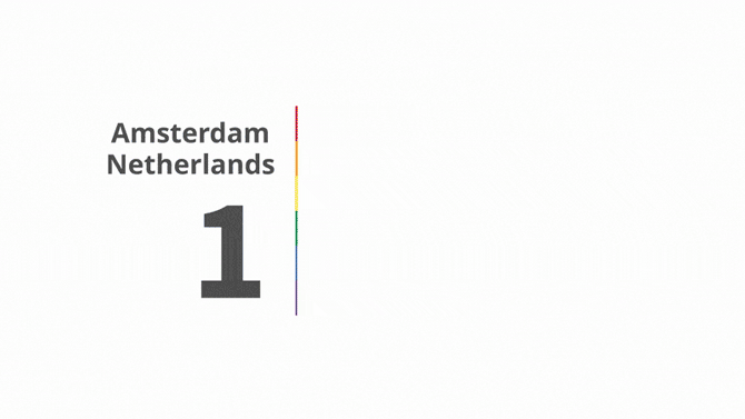
A web-based data visualization forms the centre of the campaign, and allows users to enter the name of any city in any country in the world to find out its overall score based on those measurements. The campaign is geared to LGBTQ+ travellers looking for extra information on a destination's friendliness as they make their travel plans—and is also an eye-opening look for everyone at where the world stands on this set of human rights (for example, even in countries where same-sex marriage is legal, like Canada, the scores are not as high as you might think).
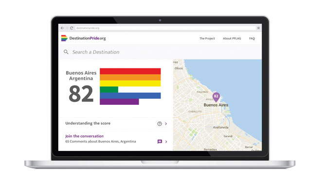
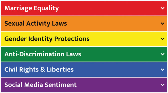
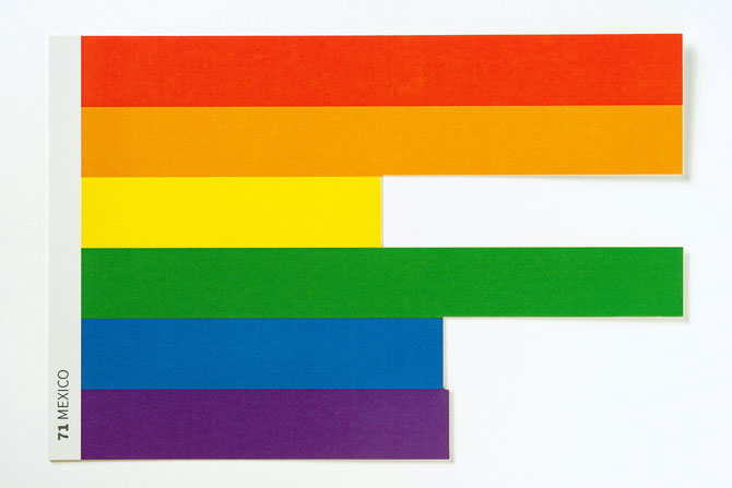
Using real-time data pulled from Wikipedia, LGBT knowledge base Equaldex, and social analytics program Netbase, you can see a destination’s score reflected in the size of its corresponding coloured bar (the six areas measured are Marriage Equality, Sexual Activity Laws, Gender Identity Protections, Anti-Discrimination Laws, Civil Rights & Liberties, and Social Media Sentiment), which thus changes the shape of the pride flag. To read more about what’s measured in each metric, click here.
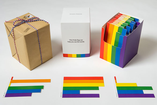
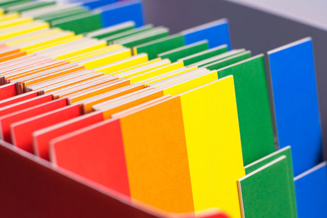
The ongoing campaign launched globally last week with digital out-of-home and Facebook video ads (below) running in the highest- and lowest-scoring cities, highlighting destinations that would be more welcoming for LGBTQ+ travellers to visit based on actual interviews with real people. Seven more videos will roll out over the next two months. Comment boards on the site allow people to share their individual experiences in a destination. FCB/SIX also created physical postcards (pictured above, and below) for each country in the world, which will be mailed to influencers over the coming weeks.
Ian Mackenzie, executive creative director of FCB/SIX, says the idea behind the campaign is to help the LGBTQ+ community and its allies make positive and informed travel choices. Through research, the team realized that many LGBTQ+ travellers have had similar unfavorable experiences while travelling, but there wasn’t much public chatter about it. Mackenzie talked to Applied Arts about how “Destination Pride” is cutting through.
How did you arrive at the insight that there has not been much conversation about travelling as an LGBTQ+ person?
We brought the idea to PFLAG Canada early in its inception. Its National Director of Marketing, Louis Duncan-He, became a partner and advocate right away. He and the PFLAG team have been vital collaborators, and made the work better at every gate, with firm but collaborative feedback.
We arrived at the insight and idea behind this work because the diversity at our agency connects us to diverse real world problems and opportunities. In other words, some of our people have lived the challenges of LGBTQ+ travel, which enables us to bring forward a creative solution rooted in empathy and authenticity.
As for LGBTQ+ travel being a topic few are talking about, it’s one of those things that’s hidden in plain sight. There have been so many important conversations about LGBTQ+ rights over the years, it would be easy to miss some of the satellite problems. That came through every time we spoke with new people about the project. We’d see these light bulbs go off as, maybe for the first time, they thought about the fact that even the simple act of standing at a hotel check-in desk can be a charged moment for LGBTQ+ people.
There’s also the bubble problem: if it’s okay here, it must be okay everywhere. And unfortunately, that’s not the case.
How did you arrive at the idea of using the pride flag as an interactive bar chart? Did you have other concepts that didn’t work out?
As obvious as it seems now, the pride flag visualization only came about halfway through the development of the project. We were at a point where we knew we had an interesting data story, but hadn’t yet found a beautiful and powerful way to tell it. That spark came when one of our writers sat down with our U/X person with the express task of visualizing the data. It was such a clean and assertive breakthrough, we never looked back. It’s the creative process at its best.
How did you decide which data to show?
We wanted a mix of hard, fixed data and softer, dynamic data. For example, marriage is either equal or it’s not. It’s not opinion, it’s fact. So, we started figuring out what hard data we needed and where to find it. Equaldex is a fantastic and active LGBTQ+ knowledge base that has done so much hard work in gathering data. Our algorithm pulls in that data, then cross-checks it with data available on Wikipedia. All that data is reflected across to top five bars of our flag. The bottom, purple bar of the flag measures social media sentiment. That’s where Netbase comes in. It’s a social analytics tool (like Sysomos). We use it to measure positive and negative sentiment in real time as expressed on Twitter and other social platforms by geographic region.
What were the design challenges in accurately conveying the data?
Progressive disclosure! The pride flag as a bar graph is a super quick read. But it’s also very high-level from a substantive point of view. Once they’ve seen it, many users will want to know what each of the bars mean. So we had to balance the economy of this iconic visualization against the deep and important data it represents. You can see that design argument unfold as you engage with the flag on the site—and in the “Out in the World” animated interview videos, each of which concludes with a quick mnemonic that provides a top-line explanation of the bars.
What mood were you looking to create with the animated videos?
We worked with an amazing animation team at Alter Ego in Toronto (and Grayson Matthews for sound). The goal of these videos is to humanize the data. They had a big job to do, as they have to support the details and mood of the story being told. They need to tee up the pride flag visualization without overcomplicating or overshadowing it. And they need to tell viewers about Destination Pride: what it is, why it is, and how to use it. Ultimately, these animations are gateways between a super clean digital design world, and the beautiful, sometimes messy spectrum of human experience.
Tell us about the postcards you created. How do they further tell the Destination Pride story and how are they being used?
It’s a series of 196 die-cut postcards—one for each country on earth. We think the Pride flag visualizations are striking and we wanted to bring them to life in a real-world way. Something you could hold in your hands. And postcards fit with the platform’s interest in travel. We also loved the idea that because the cards are die-cut (actually laser-cut), and because no country has a full flag, the cutaway could be so severe you wouldn’t actually be able to use some of them as postcards. We may be reaching, but for us, it’s a tactile metaphor for the barriers this community may face in travel. We’re sending kits of 196 postcards to influencers. The hope is they’ll find them interesting and engaging enough to share.
Credits
Campaign: Destination Pride
Client: PFLAG Canada
National Director of Marketing: Louis Duncan-He
Agency: FCB/SIX
Executive Creative Director: Ian Mackenzie
Associate Creative Director: Dave Laing
Associate Creative Director: Krystle Mullin
Copywriter: James Ly
Art Director: Devon Williamson
Experience Designer: Patrick Stolk-Ramaker
Associate Design Director: Stuart Thursby
Art Director: Allan Mah
Account Director: Shalta Dicaire Fardin
Group Account Director: Andrea Barrett
Project Manager: Ashley Whitaker
Project Manager: Khizra Arshad
VP, Head of Data and Technology: Jacob Ciesielski
Director of Technology: Madara Ranawake
Developer: Dov Atlin
QA: Peter Panchine
EVP, Strategy: Anna Percy-Dove
Strategy Director: John Fung
Strategist: Zac Matheson
Strategy Coordinator: Mike Conte
President: Andrea Cook
VP, Managing Director: Elizabeth Sellors
VP, Operations: Grace McCann
Print Production: Joyce Jackson
Print Production: Chris Costa
Producer: Lindsay Hann
Editor: David Rodriguez
User Experience: Kristy Pleckaitis
Front End Developer: Heung Lee
Front End Developer: Jonathan Sanford
Visual Effects: Alter Ego
Designer/Animation Director: Edward Deng
Creative Director: Eric Whipp
Executive Producer: Cheyenne Bloomfield
Music and Sound Design: Grayson Matthews
Music & Voice Director: Mark Domitric
Audio Producer: Kelly McCluskey
Engineer: Vlad Nikolic
Sound Design: Laura Titchner
Sound Design: Ben Swarbrick
Casting: Shasta Lutz, Jigsaw Casting
Media Agency: Initiative Media
President: Helen Galanis
Director of Content Marketing: Katherine Fera


