Makers of Things Aren't Always Makers of Sense
April 20, 2016

Just because they can doesn’t mean they should
I’ve just learned that LinkedIn has 749 members who describe themselves with the title Maker of Things. A review of these members suggests that the only things some of these folks make are phone calls and photocopies, but that’s beside the point. The Internet has gone beyond merely democratizing creativity to making it mandatory for all, irrespective of training or talent.
Thus, we have CEOs like Yahoo’s Marissa Mayer participating in the redesign of her company’s logo (the old one’s on top, the new one below).

As Mayer said in a 2013 blog post:
I love brands, logos, colour, design, and, most of all, Adobe Illustrator...I’m not a pro, but I know enough to be dangerous :) So, one weekend this summer, I rolled up my sleeves and dove into the trenches with our logo design team…We spent the majority of Saturday and Sunday designing the logo from start to finish, and we had a ton of fun weighing every minute detail.
I’m going to go out on a limb here and suggest that Mayer’s design team would have a very different account of that weekend, and their version would not include a smiley or the word fun, not even once. Nor, I suspect, would the memoirs of the designers who wristed up new logos for Uber CEO Travis Kalanick. Here’s the old one:

And here are the replacements (the one on the left is for users, the other for drivers):

Kalanick’s intention was to express graphically his exhaustingly complicated theory that Uber is all about bits and atoms. For all the deep thinking that went into this two-year design process, I’m fairly certain it didn’t include the possibility that the logo would pretty much disappear on the user’s crowded screen.

Of course, bad logos and over-involved clients are nothing new. But these stories become all the more painful when we reflect on the career of Toronto’s Hans Kleefeld, who died on March 10 at the age of 86.
If you’ve never heard of Kleefeld, you will certainly be familiar with his logos, many of which remain substantially as he created them in the 1960s and 70s.


Kleefeld had a rare gift for the craft of distilling a client’s story to its simplest graphic expression. As he wrote in 2011, that ability came from training at a time when computers (and even Letraset) were decades away):
The challenges, for example, of laying down a perfectly flat colour, poster-size, in gouache with a brush, or to hand-render 10-point Bodoni, were enough to have weaker spirits consider switching to something less taxing, such as milk delivery…Much time and energy was spent, crouched over a drawing board, rendering. The aim, we were told, was to develop reliable coordination between brain, eyes, and hand. The only way to reduce the drudgery of rendering was to envision clearly what you were trying to achieve before you put pencil, pen or brush to paper.
Later, as he dryly notes in the piece, “things changed dramatically. Computers eliminated any need for a steady rendering hand.” Kleefeld would surely agree that the loss of this steady rendering hand has also led to a loss of discipline. Designers once had to be fully responsible for achieving excellence with nothing but a pen and an idea. Today, the quest for simplicity is thwarted by limitless possibilities and the reality that even a client can use Creative Cloud.
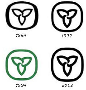
Kleefeld was a fierce critic of the products of these limitless possibilities. Though he had nothing to do with the old logo for Ontario, he admired its strength and simplicity, qualities that allowed it to remain essentially unchanged for more than 40 years.

When the new logo came out in 2006, Kleefeld dismissed it with an image that can never be unseen: three men in a hot tub.
Toronto freelance copywriter Suzanne Pope is the founder of Ad Teachings.


