2014 GDC National Scholarship Winners
August 25, 2014
Who won this year's awards? We discuss project design with the winners and honourable mentions
Young talent is something we actively promote at Applied Arts, which is why every year we partner with the Graphic Designers of Canada (GDC) to fund a scholarship for graphic design students.
The GDC recently announced the winners of the Applied Arts Scholarship, the Canada Type Scholarship and the GDC Foundation Ray Hrynkow Scholarship. Judges Adrian Jean, Brenda Sanderson, Marga Lopez and Naoko Masuda (all possess the CGD designation) determined the winning entries from more than 140 submissions.
Congratulations to all of the winners, honourable mentions and nominees. Read on for more information on the top projects.
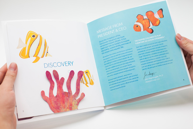
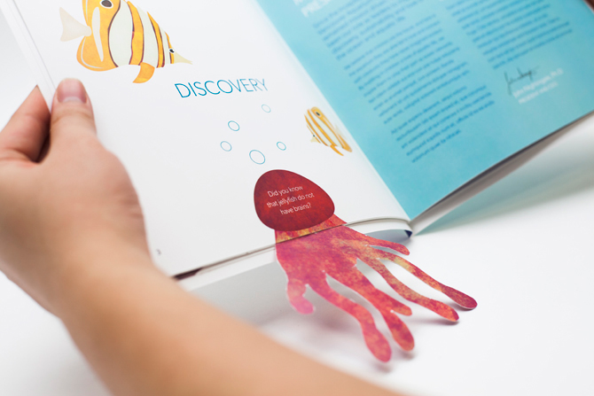
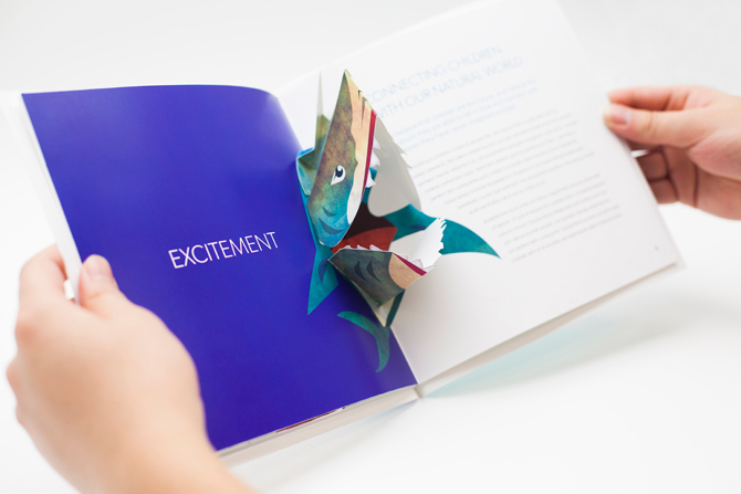
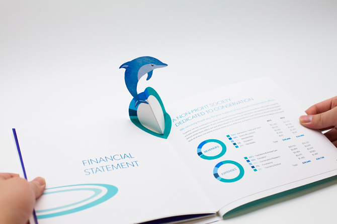
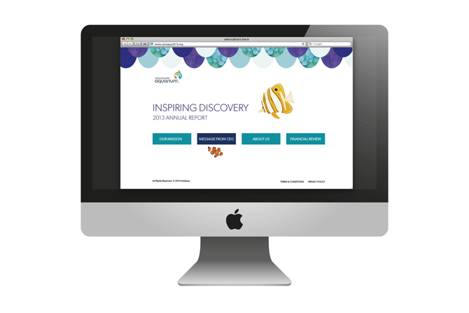
Michelle Lim, Applied Arts Scholarship ($1,000)
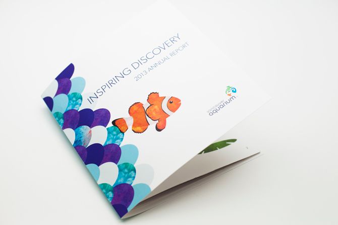
When our Applied Arts scholarship winner was asked to design an annual report for class, picking the Vancouver Aquarium was a no-brainer. “I always enjoyed going to the aquarium as a kid,” Michelle Lim says.
Lim, who just finished an internship at Spring Advertising and is entering her third year at Capilano University, used the information in the Vancouver Aquarium’s existing annual reports to influence her version, and studied other aquarium annual reports to see what she could do differently.
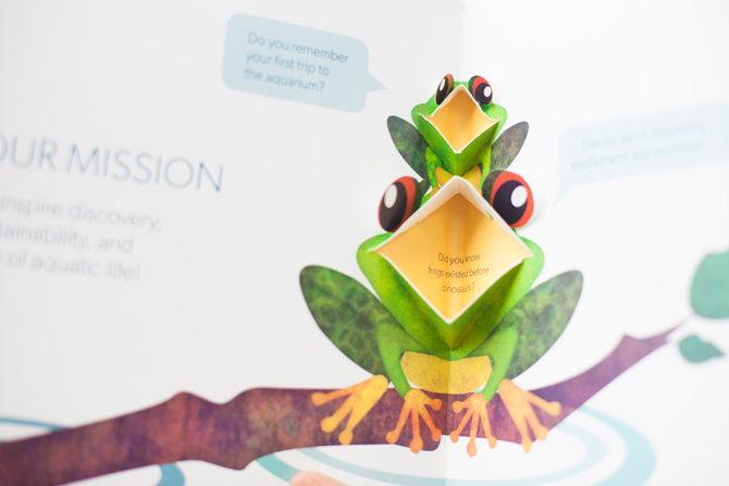
Her final piece included the blue and green colours favoured by the Aquarium, but departed from its traditional design with a series of pop-ups featuring aquarium critters such as fish, frogs and dolphins. “Our teacher was pushing us to be unconventional,” Lim says. “I’ve always loved making pop-ups, and I wanted to make [the report] interactive.”
She used the pop-ups as an opportunity to create effects throughout the book. A fact saying frogs existed before dinosaurs hides in a frog’s open mouth, and a piece of coral folds down to turn into the tendrils of a jellyfish.
“Designing the report was really hard because, digitally, it’s flat, and you can’t see what it’s going to look like when it pops up,” Lim explains. “I had to do a lot of paper mockups.”
Lim’s report has already made the rounds around the Aquarium’s board of directors. “They thought it was a really neat and fresh idea,” she says.
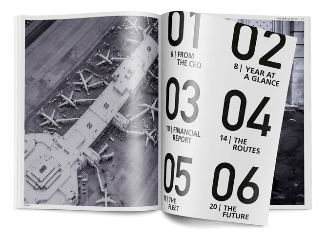
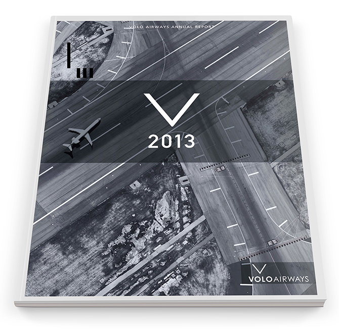
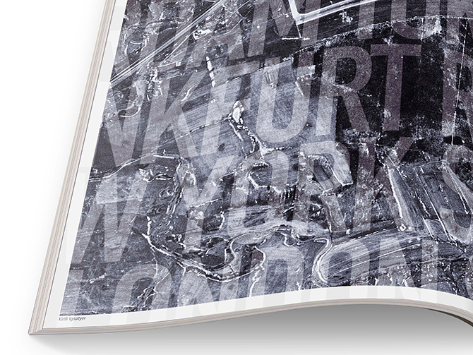
Wes Browne, Canada Type Scholarship ($2,000)
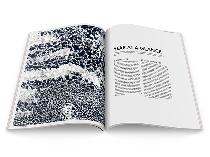
The clean graphic design of Capilano University student Wes Browne’s annual report and typographic poster for Volo Airways is what tipped the jury in his direction.
Browne used large images, plenty of white space and considered type treatments to achieve the final look of his project. “I chose an airline because I thought it offered some interesting visual opportunities. I imagined using pictures taken from the sky, and imagery of other things associated with airlines, such as planes and airports,” he says. “For the type treatment, I thought of what you might see at an airport. I am interested in wayfinding, and so I researched typefaces and treatments and used that as an influence.”
The project took Browne several weeks to complete, and he says he wanted to challenge himself. “I tried to create a sophisticated look — which I thought was appropriate for the company and the audience — through layout, image choices and minimal colour.”
Browne is entering his last year of design at Capilano University, and has plans to push himself further. “I want my career to involve a variety of work, so I’m going to concentrate on polishing my portfolio to really showcase that I can create solutions in a range of projects,” he explains.


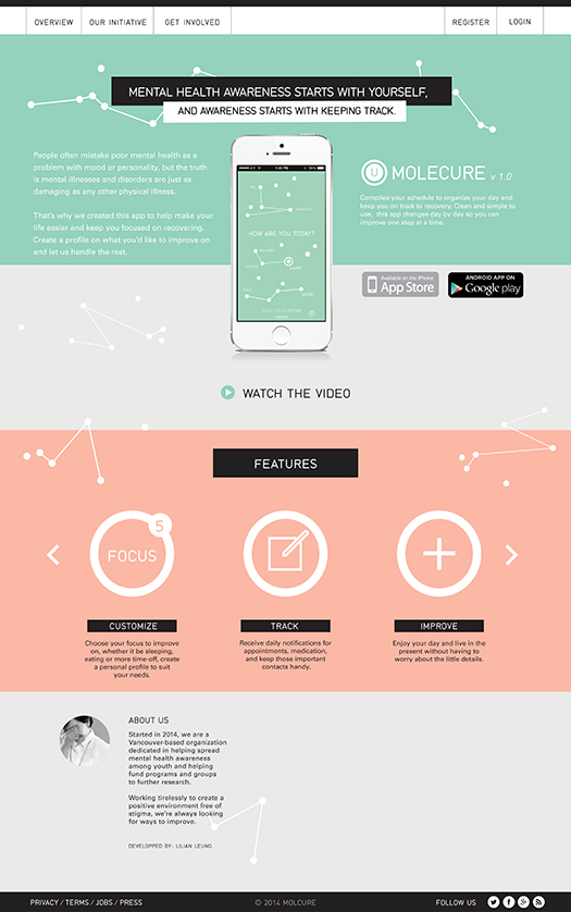
 Lilian Leung, GDC Foundation Ray Hrynkow Scholarship ($500)
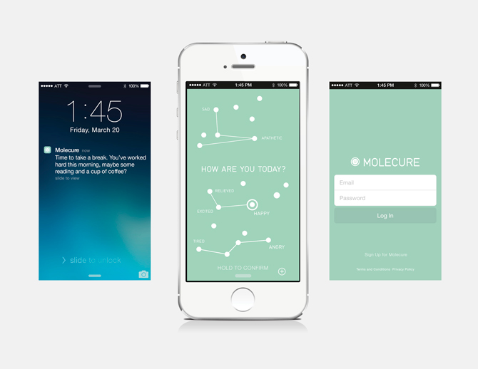
“People have a stigma with mental illness,” Capilano University student Lilian Leung says. “A lot of people don’t talk about it. I thought maybe people need something in the beginning to help them go through their ordeal.”
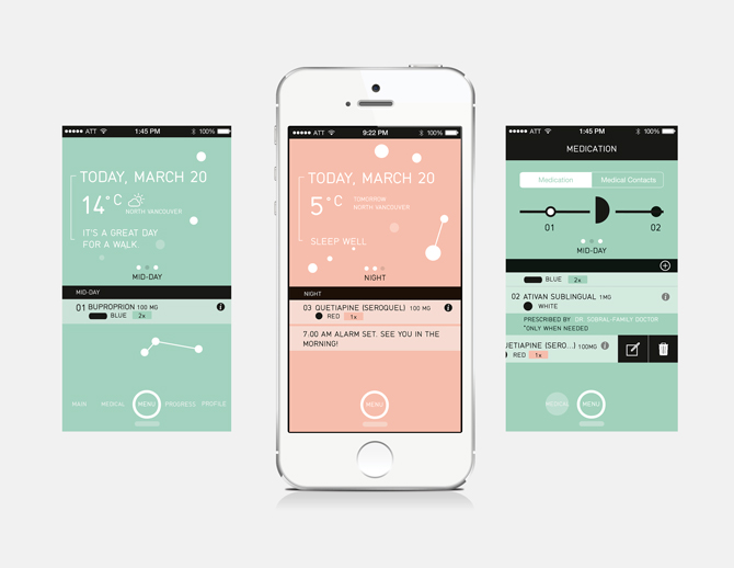
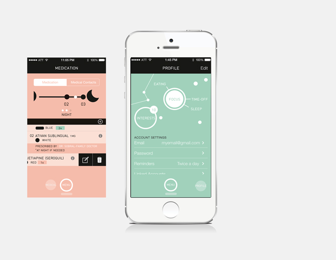
That’s what led Leung to create “Molecure,” the design for a mobile app that helps patients with depression not only track their medications and prescribing doctors, but schedule their days in manageable increments.
“It’s not simply a day planner that people ignore,” Leung says. “It has the schedule organized in a one-day format so that people don’t have to worry about the future. It encourages people to live in the present, and resolve some of their anxiety.”
Leung designed an option for users to build a profile that highlights things they’d like to work on, so the app can prompt them to eat better, exercise more or take time for mediation.
Her considered design includes a primary scheme of green (the representative colour of mental illness), and salmon. Colours change throughout the day depending on the user’s schedule. “The dots and lines represent molecules, and show the links between things such as physical health and being more aware,” Leung says. “I wanted to simplify a lot of the language around it, and not make it sound robotic. It starts off with, ‘how are you?’ or ‘how are you feeling?’”
Leung says she’d like to refine the design and try to market the app to a builder as she enters her final year.
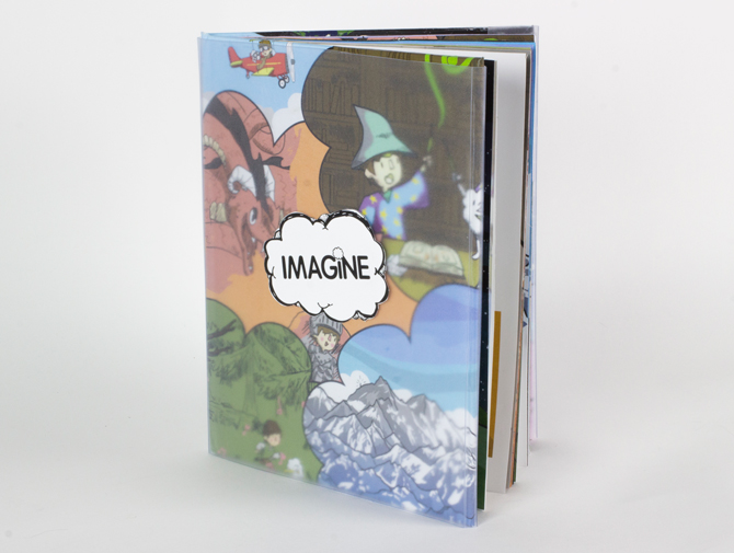
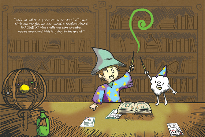
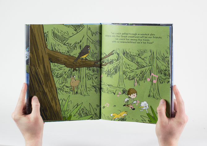
Colton Floris, Applied Arts Scholarship Honourable Mention
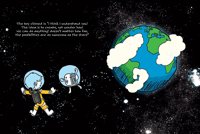
First-year graphic design student Colton Floris went two-fold for his school project: he wrote, illustrated and bound a picture book, and then did it all over again in digital form.
His “iMaGiNE — A Children’s Story,” about a boy who hasn’t yet learned to use his imagination, includes a feature for the reader to name the main character. “I feel like it’s a great way for the book to have a deeper impact on kids, and also make it more fun to read,” Floris says. “Funnily enough, the concept for the story actually came to me while I was lying in bed one night unable to sleep. I thought a story about a little boy learning to dream with his imagination would make a fun book.”
The book’s spreads feature encounters with wizards and dragons, set in such disparate environments as forests and space. “I tried to keep the amount of colours I used to a minimum so the line work would really show through,” Floris says. “It was awesome dreaming up these bright, colourful worlds for this boy to go exploring in, and equally fun to draw them out.”
“I found it challenging to illustrate a book with both digital and print versions in mind,” he continues. “I wanted the digital version to feature lots of interactivity, but at the same time didn’t want the print to feel stale in comparison.” Because the bookbinding process was costly, Floris is currently working on publishing the app of the book. He’s learning Xcode in the process as he enters his second year in the graphic and digital design program at the University of the Fraser Valley.


Tabitha Robin, Canada Type Scholarship Honourable Mention
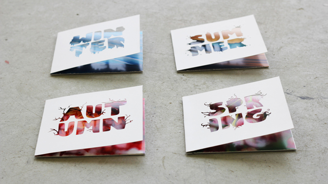
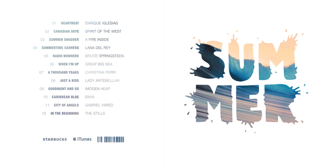
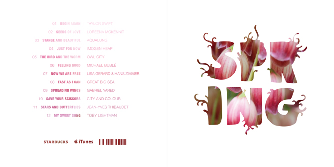
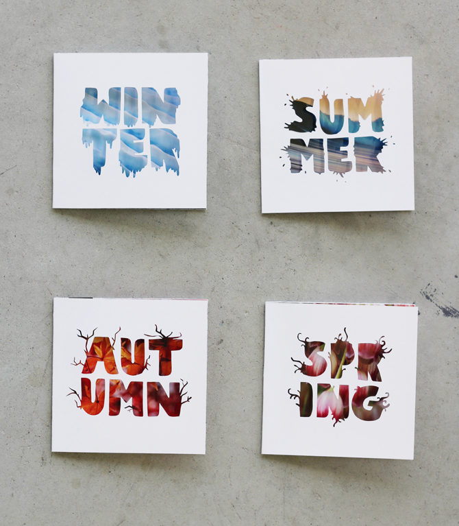
Third-year University of Manitoba student Tabitha Robin created four hand-cut album covers as her assignment for ‘Segun Olude’s graphic design studio class. Students were asked to create an album series representing the four seasons that would suitable both for printed packages and for digital sale on the iTunes Store.
“[I wanted] to focus on the elements of each season in a clear, crisp manner that focused on the intricate details without overwhelming the work,” Robin says. With each season comprised of six letters, Robin achieved a uniform look to her stacked type, then created tendrils represented the seasons emerging from each letter. Icicles hang off the “winter” letters, vines grow from “spring,” water splashes out from “summer” and branches poke from “autumn.”
“Although the cover art needed to translate at the iTunes thumbnail scale, I also wanted to focus on the creation of a physical package that was intriguing and could stand up on its own on the shelf,” Robin explains. “Organic letterforms made the most sense to me. The digital fonts didn’t feel right, and since the typographic elements were the visual focus on the design, something unique and free felt appropriate.”
She continues, “Since a season involves many sensory elements such as smell, touch, sight and sound, the design attempts to feature as many tactile and sensory elements as possible.” She cut each letter by hand, and backed the cutouts with standard desktop wallpaper images to represent the four seasons.
Robin says she kept the cover mostly white to keep the focus on the type treatment as the main visual element, to unify everything as a series.
Jocelyn Wong, GDC Foundation Ray Hrynkow Scholarship Honourable Mention
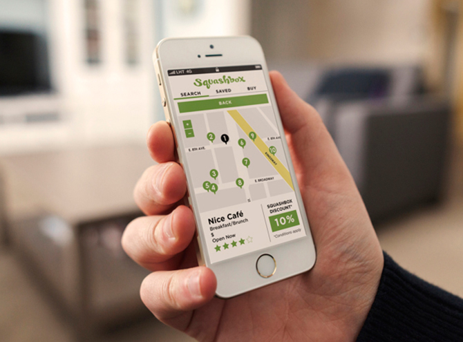
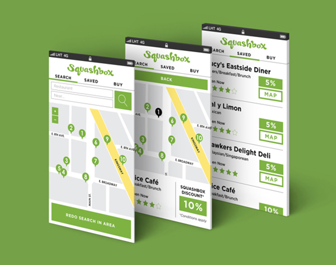
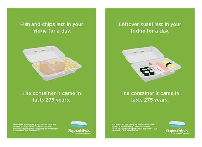
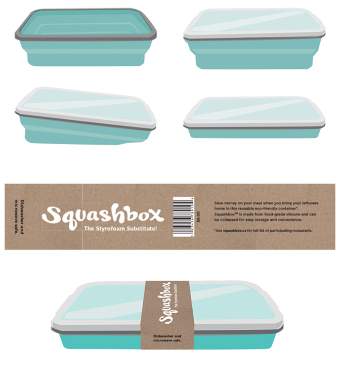
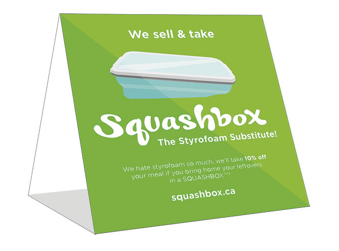
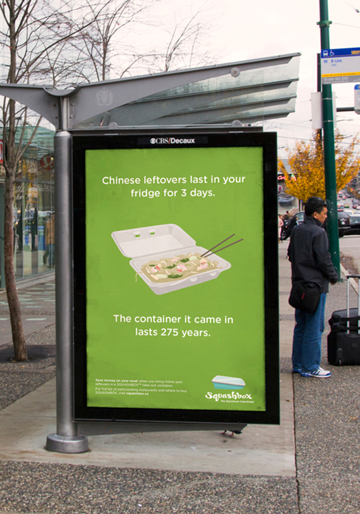
Concerned with excessive waste, Capilano University student Jocelyn Wong decided to turn her unease into a viable app design called Squashbox.
Users of Squashbox would be able to purchase a branded reusable container and use the app to geolocate restaurants that would give patrons a discount for bringing in a container in which to take leftovers home.
“The project was inspired by my mom, who is opposed to Styrofoam use. We go out to eat a lot, and she brings along Tupperware,” Wong says. “I wanted to have a physical product that the company could sell, and the app would help the consumer find participating restaurants.”
Wong considered her target market when designing the app and said simplicity and cohesiveness were major sticking points. “I stuck with the same colours, with green representing the environment and being an approachable colour overall,” she says. The scholarship judges said Wong’s simple, user-friendly design is something she should try to market in the real world.