30 years, 30 Typography winners
April 5, 2016
Since our post on 30 famous faces was a fan favourite, we decided to round up 30 of our favourite typography winners!
Get ready to scroll through some eye-catching images in honour of our 30th anniversary.
If that’s not enough and you’d like to see even more fascinating typography, check out our awards archive featuring winners since 2001! — Shaneza Subhan
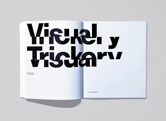
 Year: 2015
Category: Complete Magazine Design - Single
Title: Prefix Photo Magazine PP30
Prefix Photo is a magazine that presents contemporary Canadian photography in an international context. Characterized by innovative design and outstanding production values, it features photography portfolios and critical essays.
Voice:
Website: underlinestudio.com
Underline Studio Creative Direction: Fidel Peña, Claire Dawson Designer: Clea Forkert, Cameron McKague Editor:Scott McLeod Design Studio: Underline Studio Client: Prefix Institute of Contemporary Art Printing Company:Transcontinental
 Year: 2015
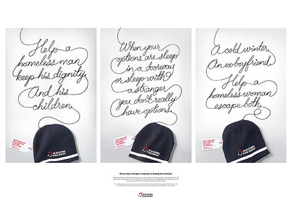
Category: Craft Calligraphy/Handlettering - Series
Title: Every Toque Goes a Long Way in Helping the Homeless
Raising the Roof is an organization that seeks long-term solutions for homelessness. For 17-years, they’ve raised donations by selling toques, an iconic Canadian hat. The biggest barrier keeping people from buying toques is not knowing exactly where their money goes or how it helps. We created interactive online banners that connected the toque directly to the good that it provides. Users could interact with the thread from the toque, revealing the message and driving purchase.
Voice:
Leo Burnett, Toronto Chief Creative Officer: Judy John Art Direction: Chris Brown Copywriting: Jordan GabrielTypographer: Jason Vandenberg Creative Direction: Judy John, Lisa Greenberg, Steve Persico, Anthony Chelvanathan Designer: Chris Brown Illustration: Nabil Elsaadi Stylist: Jeanie Lee Agency Producer: Alexandra Postans, David Eades, Sabrina De Luca Account Director: Natasha Dagenais Account Supervisor: Kayla OsmondPlanner: Lisa Hart Photography: Mark Olson, Nick Wong
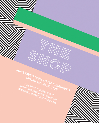
 Year: 2014
Category: Typeface Design - Single
Title: Illusion
The font used on the cover and throughout the magazine was created exclusively for this issue by the Little Burgundy creative team. Playing with the idea of perspective, and using the black and white palette of op-art as a base, the bold font uses depth to give it the illusion of double-vision
Voice: 514 747 2536 x3077
Website: Littleburgundyshoes.com
Email: reannaevoy@aldogroup.com
ALDO Group Creative Direction: Douglas Bensadoun Senior Art Director: Reanna Evoy Art Direction: Françoise Cournoyer Graphic Designer: Amanda Mocci
 Year: 2014
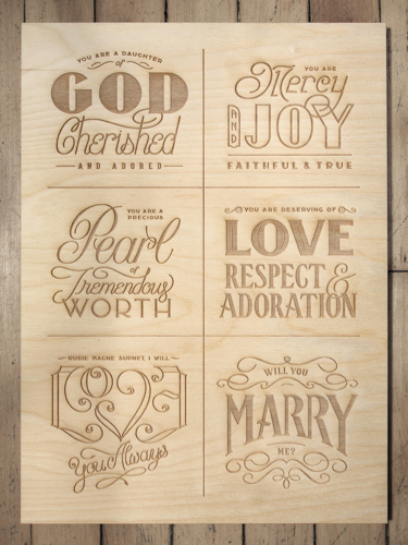
Category: Young Blood Typography - Single
Title: A Handlettered Engagement
Handlettered in its entirety, this piece was designed in six blocks and laser-etched into wood. She said yes! Phew!
Voice: 647-286-7853
Website: kargov.com
Email: kyle@kargov.com
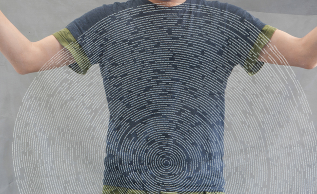
Year: 2014
Category: Young Blood Typography - Series
Title: The Fingerprint of Helvetica
This project is an interpretive transcription of the documentary film, "Helvetica,' directed by Gary Hustwit in 2007. The element of time, together with text, is made material by which the duration of each spoken line dictate the physical lengths of the blank spaces that separate the sentences. The spiral form allows continuity of lines in the textual drawing.
Voice:
Website: www.kyuhashim.com
Email: kyuha.shim@network.rca.ac.uk
Kyuha Shim, Royal College of Art Design: Kyuha Shim Screenprinting: Kyuha Shim
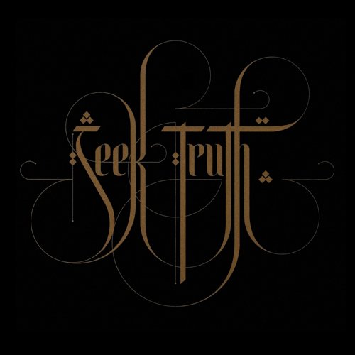 Year: 2014
Category: Typographic Poster - Single
Title: Seek Truth
Seek Truth celebrates calligraphy’s intricate and ethereal nature. Inspired by André Gide’s words, “Believe those who are seeking the truth. Doubt those who find it,” this 18”x18” screenprinted piece explores the intersection of Latin and Arabic script. The round curves create a seductive connectivity between words, inviting the eyes to move across the poster and to visually redraw the forms. As in any pursuit to “seek truth,” the curves’ paths become clear only with time.
Voice:
Website: behance.net/ronruiz
Ron Ruiz Typographer: Ron Ruiz
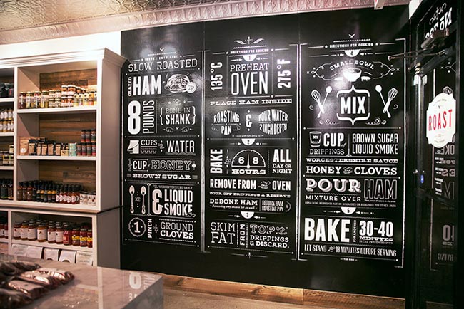
Year: 2015
Category: Typography Miscellaneous - Series
Title: Roast Fine Foods Typographic Wall
Roast Fine Foods is a Toronto butcher shop featuring organic, naturally-raised, and hormone-free meats. To stay true to the tradition of the classic butchery yet retain a modern sensibility, we created a brand that fuses a classic 1950s diner-style aesthetic with clean and modern design elements. This is achieved through the use of old school original photography, bold punches of red, and vintage-style typography, which includes typographic wall installations in store featuring original recipes.
Voice: 416-246-0679
Website: gladstonemedia.ca
Email: info@gladstonemedia.ca
Gladstone Media Inc Creative Direction: Jeremy Gladstone Art Direction: Katya Garipova Graphic Designer: Arian Rahimian Photography: Anthony Cohen Printing Company: U.B. Signs & Graphics
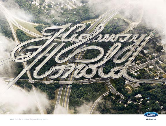 Year: 2015
Category: Typography Miscellaneous - Single
Title: Highway Harold
Everyone has different driving habits, and they require different tires based on how and where they drive. To bring this idea to life, we designed custom highway typography to spell out people’s names.
Company: Blue Hive Art Direction: Dylan Silvestro Copywriting: Tiffiny Li Creative Direction: Matt Frarracci, Jonathan Smith Executive Creative Direction: Serge Pennings Illustration: Pierre Bourjo Producer: Betsy TranHead of Art & Design: Allen Kwong
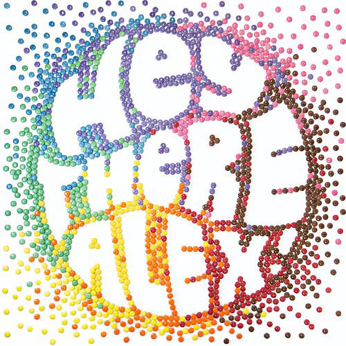 Year: 2015
Category: Typography Miscellaneous - Series
Title: The Smarties Shout Out
We launched Smarties on Instagram by simply saying “hi” with a colourful typography mosaic, hand-made out of individual Smarties. Starting with the 9 most popular names on Instagram, a team of designers created unique typography for each name and greeting. Each one was then brought to life on 3x3 boards with thousands of Smarties. The pieces were then photographed and posted on Instagram, where we tagged 9,000 Canadians with those names, just to say hi!
Voice:
Website: onemethod.com
OneMethod (A Division of Bensimon Byrne) Chief Creative Officer: Amin Todai Creative Direction: Steve MillerAssociate Creative Direction: Laurent Abesdris Art Direction: Joanna Durkalec Graphic Designer: Kevin Youngsaye, John Hotts Copywriting: Alex Davies Project Direction: Mark Hewitt Project Manager: Josh Melfi
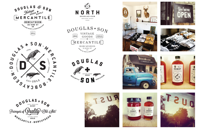 Year: 2014
Category: Typography Miscellaneous - Series
Title: Douglas + Son
Interchangeable typographic signage and collateral design for a vintage goods shop in the town of Bobcaygeon (pop. 2500) located 2 hours north-east of Toronto.
Voice: 705.738.9204
Email: billonthefarm@bell.net
Bill Douglas Design: Bill Douglas Typographer: Bill Douglas Stylist: Sacha Douglas
 Year: 2013
Category: Typography Miscellaneous - Single
Title: 50s news-gift paper
The 50s news-gift paper is a wrapper that inspired by the past where seller used old newspaper to wrap goods. It overlay bright auspicious Chinese words on 1950s' Chinese newspaper of Singapore. It enables viewer to have a look at the news and advertisements of the past - to connect them to the past, and understand our history in a small way. It also allows foreigners to understand the meaning of Chinese auspicious words printed.
Voice: +65 65138050
Website: www.jesvinyeo.com
Email: jesvin@jesvinyeo.com
Client: Chinatown Business Association Creative Direction: Jesvin Yeo Design Director: Alvin Ng
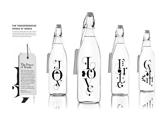 Year: 2015
Category: Packaging - Series
Title: The Transformative Power of Words
We wanted to create a promotional piece for designer Paul Sych that was as unique as his hand-drawn typefaces. Taking inspiration from the experiments of Dr. Masaru Emoto, who demonstrated that words can change the physical structure of water, we used their power to transform reality. We created bottles inscribed with Sych’s work that infused their contents with positive energy, helping cement his reputation as one of Canada’s most innovative and influential designers.
Voice:
Y&R Toronto Chief Creative Officer: Israel Diaz Art Direction: Pearce Cacalda Writer: Kevin Hoessler Designer:Paul Sych, Pearce Cacalda Typographer: Paul Sych Print Producer: Antoinette St. Angelo Photography: Arash Moallemi
 Year: 2014
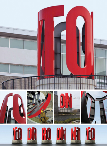
Category: Environmental - Single
Title: Toronto 360
Toronto 360 celebrates the city’s myriad opportunities and elusive charms. Permanently on display at the corner of Markham Road and Steeles Avenue, this winning design structure consists of sixteen foot steel channel letters on a concrete base, spelling out “TORONTO” using only the first five letters. Like the city itself, its meaning is not immediately revealed, but rather slowly discovered upon further inspection. A fitting tribute to one of Canada’s greatest cities (and our home).
Voice: 416-510-1771
Website: www.cundari.com
Cundari Creative Direction: Dean Martin Co-Designer: Dean Martin, Steve Richards Ad Agency: CundariProduction Company: Streamliner Fabrication Inc.
 Year: 2012
Category: Environmental - Single
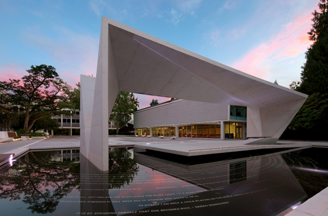
Title: Buchanan Arts Pavilion
Our firm was asked to develop an "expression" of what it means to study Arts at UBC. In order to capture the range and interconnectedness of thinking taking place, we asked the faculty of the Arts to supply quotes reflecting their fields. The final work consists of over 8000 characters set in 11 languages. The project was so well-received that it became the foundation for a new visual identity for the Arts Faculty at UBC.
Voice: 6047384323
Website: www.publicdesign.ca
Email: info@publicdesign.ca
Architects: Public Architecture + Communication/Phillips Farevaag Smallenberg Creative Direction: Susan MavorDesigner: Scot Geib, Mark Stokoe
 Year: 2015
Category: Identity - Series
Title: TOYHAUS logo / TOYHAUS typeface / TOYHAUS poster
The branding for this toy store in Toronto was inspired by the idea of building blocks. It is a fun, playful and highly versatile identity that captures the enthusiasm of our kids.
Voice:
Website: www.boltzhase.de/
Email: mail@boltzhase.de
Boltz & Hase Creative Partner: Sascha Hass, Philipp Boltz
 Year: 2014
Category: Identity - Series
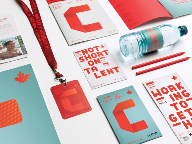
Title: Téléfilm Canada branding for all international events
The design was inspired from the country’s distinctive geography, putting the focus on the immensity of Canadian talent which is equalled only by the breadth of the country. The colour palate was centred on red, a natural and symbolic choice for Canada. The typography was conceived using the existing Telefilm Canada logo for greater visual unity. It’s a complete visual language that puts the focus on the organization’s roots.
Voice: 5142818901
Website: lg2boutique.com
Email: cynthia.moreau@lg2.com
lg2boutique Creative Direction: Claude Auchu Designer: Maude Lescarbeau Copywriting: Stuart MacmillanStrategic Planner: Pénélope Fournier Account Director: Ingrid Roussel, Catherine Lanctôt Account Manager:Marion Haimon Typographer: Maude Lescarbeau Copywriting: ÉRic Beaudin Interactive Art Director: Thibault Gehard Print Producer: lg2fabrique
 Year: 2013
Category: Identity - Series
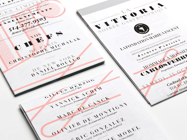
Title: La Vittoria 2012
The luxurious Ritz-Cartlon Hotel was the venue for the 2012 edition of La Vittoria. It also inspired the branding of the event, the various rooms echoing both our modern era and the times of Louis XVI. Spiral scrolls and minimalist geometry, gilding and fluorescent colours created the backdrop for this period of French history and were complemented by architectural elements and photos of chefs reminiscent of statues from that century.
Voice: 514 281-8901
Website: www.lg2boutique.com
Design Studio: lg2boutique Creative Direction: Serge Coté Design: Cindy Goulet, Marie-Pier Gilbert Account Director: Catherine Lanctot Account Manager: Florence Morin-Laurin Copywriting: Pierre Lussier Photography:Luc Robitaille Print Production: lg2fabrique
 Year: 2013
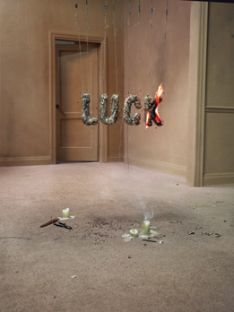
Category: Magazine - Series
Title: The Unlucky Series
The Applied Arts Advertising Annual is a celebration of great work. So when given the coveted opportunity to guest art-direct Canada's leading visual design magazine, our inspiration came from asking a simple question: What does it take to do great work? Through answering this question, our idea that 'luck has nothing to do with what we do' came to life in visually narrative way.
Voice: 416.594.6000
Website: www.maclaren.com
Ad Agency: MacLaren McCann Creative Direction: Sean Davison, Mike Halminen Photography: Mark Zibert Art Direction: Matt Howe Copywriting: Natalie Greenspan Prop Stylist: Mike Sharpe Graphic Designer: Sarah Grundy, Cassie Scowcroft Agency Producer: Julia Auriemma Executive Producer: Jooli Kim Digital Artist: JP GouletProject Manager: Tiffany Punnett Studio: Steve Ferreira, Craft Worldwide Production House Producer: Yael YoungProject Coordination: Shirely Gee First Camera Assistant: Chris Muir Digital Tech/Assistant: Jeromey LaPointeRetouching: Katherine Lau, Gord Carruthers, Evelyne Goulet Production Artist: Byron Yee Production Assistant:Kenny Hughes, Todd Clancy, Drew Grav-Graham, Jason Hennessy, Dylan Hamm, Mike Palangio Location Scout:Dane Morrison
 Year: 2015
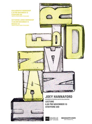
Category: Young Blood Typography - Single
Title: Joey Hannaford Poster
Joey Hannaford is a designer, calligrapher, and experimental letterpress artist. She has a particular affinity for wood type and a true appreciation for pushing the discipline of letterpress. To make her poster, I gathered an assortment of vintage wood type from the letterpress studio. I carefully made silicone molds of the vintage pieces. Next, I used the molds to cast the forms in resin. The resin forms were lit from behind and photographed.
Voice: 706-296-6712
Website: www.cassiehester.com
Email: cassiehester@gmail.com
Cassie Hester Design + Illustration
 Year: 2014
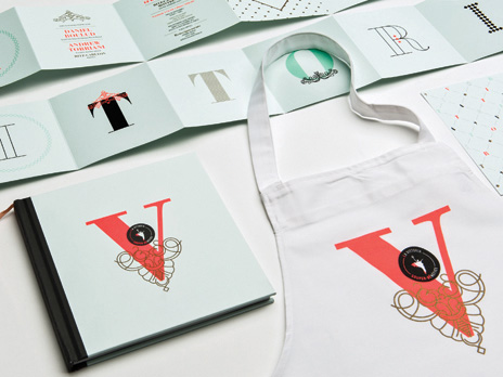
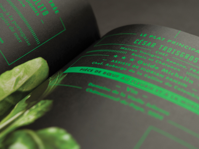
Category: Book - Single
Title: La Vittoria 2013 - Souvenir booklet
For its 2013 edition, La Vittoria teamed up with Cuisines collectives of Hochelaga-Maisonneuve and Montérégie, grassroots organizations that promote food autonomy, notably by reintroducing its members to the basics of cooking.At the centre of the evening’s graphic universe was a return to the source. The thoroughly elegant creative paid tribute to the Earth and its flavours throughout the different pieces, recalling its freshness, innocence and elemental state.
Voice: 5142818901
Website: lg2boutique.com
Email: cynthia.moreau@lg2.com
lg2boutique Creative Direction: Claude Auchu Designer: Maude Lescarbeau, Marilyn Marois, Andrée RouetteAccount Manager: Marion Haimon Account Director: Catherine Lanctôt Account Coordinator: Sara CaradecCopywriting: Gabrielle Godbout, Pierre Lussier Print Producer: lg2fabrique Photography: Luc Robitaille
 Year: 2012
Category: Book - Single
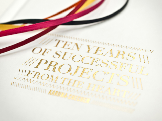
Title: Ten years of Successful projects from the heart
Create an inspiring and touching overview of activities that illustrates the breadth of the Karuna-Shechen Foundation’s achievements over the last 10 years. It also serves as a souvenir book for the workers, volunteers, collaborators and donors who have actively participated in the Foundation’s projects. The entire design communicates hope: the light, the colors, the gold coating, the ribbons, the many candid shots of smiles taken by Matthieu Ricard, the breathtaking landscape.
Voice: 514 281-8901
Website: www.lg2boutique.com
Email: allo@lg2boutique.com
Design Studio: lg2boutique Client: Matthieu Ricard, Pascale Demers Client services coordinator: Carolyne Boucher, Ingrid Roussel Client services director: Catherine Lanctôt Computer Graphics: Manon RémillardCreative Direction: Claude Auchu Designer: Caroline Reumont English proofreading: Shauna Hardy, Lori Perkins, Viviane Phillips French proofreading: Geneviève Legault, Guylaine Morin French translation: Guylaine Morin Photography: Matthieu Ricard, Raphaële Demandre Printing Company: Imprimeries TranscontinentalProduction coordinator: Claudia Riverin Production director: Louis Dorval Strategic director: Anne-Marie Leclair
 Year: 2013
Category: Announcements/Invitations/Cards/Kits - Single
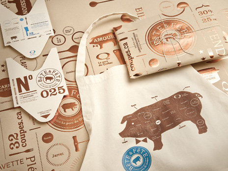
Title: Bête et Fête Invitation
In 2012, the Fédération des producteurs de porc du Québec (FPPQ) presented the ‘Bête & Fête’ event to celebrate Quebec pork meat. The design of the invitation was inspired by a typical butcher shop environment—meat ticket, kraft paper and apron. It placed the animal at the heart of the concept, making it the true star of this celebration, and was infused with a touch of elegance, to play up the nobility of pork meat.
Voice: 514 281-8901
Website: www.lg2boutique.com
Design Studio: lg2boutique Creative Direction: Serge Côté Design: Serge Côté, Sophie Valentine Copywriting:François Sauvé Account Manager: Audrey Lefebvre, Florence Gagnon Print Production: lg2fabrique
 Year: 2012
Category: Announcements/Invitations/Cards/Kits - Single
Title: La Vittoria New York Paris - Invitation
The black-stroke typeface, geometric shapes as well as the colors black and yellow are a nod to the urban style of the Big Apple while the antique rose combined with intertwined serif typefaces transport us instantly to the romantic City of Light. All the evening’s supporting elements were created with the contrast between the two cities in mind like this two-sided invitation.
Voice: 514 281-8901
Website: www.lg2boutique.com
Email: allo@lg2boutique.com
Design Studio: lg2boutique Client: Johanne Demers Client services: Marie-Claude Lacasse, Mariève LebrunComputer Graphics: Karine Allie Creative Direction: Claude Auchu Designer: Serge Côté, Maryse Verreault Print Production: Louis Dorval Writer: Pierre Lussier
 Year: 2012
Category: Announcements/Invitations/Cards/Kits - Single
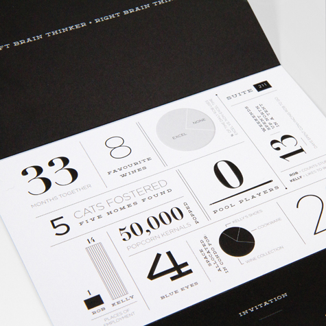
Title: A Meeting of the Minds (Rob and Kelly Sturino's Wedding Invite)
This invite playfully pits the bride, Kelly — a right brain thinker and designer — against her left-brain-thinking-accountant-husband-to-be, Rob. The invite is comprised of four panels which unfold perfectly to reveal the couple’s story. A tear-off RSVP postcard makes responding a piece of (wedding) cake. Rich printing and crisp embossing finishes the job.
Voice:
Website: www.compass360.com
Email: karl@compass360.com
Design Studio: Compass360 Design Director: Mark Buchner Designer: Mark Buchner Printing Company:Somerset Graphics
 Year: 2014
Category: Typeface Design - Single
Title: Illusion
The font used on the cover and throughout the magazine was created exclusively for this issue by the Little Burgundy creative team. Playing with the idea of perspective, and using the black and white palette of op-art as a base, the bold font uses depth to give it the illusion of double-vision
Voice: 514 747 2536 x3077
Website: Littleburgundyshoes.com
Email: reannaevoy@aldogroup.com
ALDO Group Creative Direction: Douglas Bensadoun Senior Art Director: Reanna Evoy Art Direction: Françoise Cournoyer Graphic Designer: Amanda Mocci
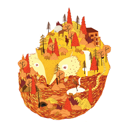 Year: 2014
Category: Craft Illustration - Single
Title: 2013 Christmas Fox
This christmas card was designed by Charlotte Rudelle, french illustrator. The illustration is inspired by the life and reality of living in Montreal through the eyes of a foreigner, especially as fall leaves and winter arrives.
Voice: 514 710 4088
Website: charlotterudelle.tumblr.com/
Email: charlotte@geodezik.com
Geodezik Illustration: Charlotte Rudelle
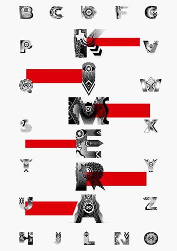 Year: 2015
Category: Typeface Design - Single
Title: Kimera
Kimera is a word driven from the original word "Chimera".Chimera is a mythical creature that has different parts like lion's head with a goat's body and a serpent's tail.Kimera is a project inspired by this marvelous creature. Each letter is designed by combining different shapes, which eventually give it a unique personality.
Voice: 658-349-5381
Website: vylxng.wix.com/portfolio
Email: vynguyenle24@gmail.com
Nanyang Polytechnic Designer: Le Nguyen Nguyen Vy
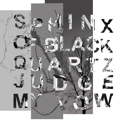 Year: 2015
Category: Typeface Design - Single
Title: Coalesce
Coalesce: Come together to form one beautiful mass or whole. A set of experimental typeface using everyday seen and natural mediums to collage for each alphabet.
Voice: 96680360
Website: edmundchen0.wix.com/portfolio
Nanyang Polytechnic Typographer: Edmund Chen
 Year: 2012
Category: Typeface Family Design - Series
Title: P22 Mackinac Pro
P22 Mackinac Pro is a general-purpose utilitarian design, incorporating most OpenType features. This family of four weights with corresponding italics has a large x-height, enhancing it's usefulness for a wide variety of text and display work. Contrast between thick & thin is modest; serifs and their bracketed transitions wear a soft radius. While these attributes nod to a letterpress appearance, Mackinac is a contemporary typeface of personal vision and synthesis.
Voice: (716) 885-4490
Website: www.p22.com
Email: p22@p22.com
Type Designer: Mike Beens Type Foundry: P22 / International House of Fonts
 Year: 2012
Category: Typeface Family Design - Series
Title: The Dyna-Fonts
The Dyna-Fonts are unique in that they both have a second alternate “personality” that can be accessed through the Stylistic Alternates button in the OpenType palette. Dynascript’s connecting script becomes a non-connecting italic, and Dynatype’s upright, non-connecting default becomes an upright connecting script. Both share the same aesthetic which harkens back to a style formerly known as “Zip-Top”, where the letters are weighted more heavily at the tops, purportedly to increase legibility.
Voice:
Website: MichaelDoret.com/AlphabetSoup/soup.html
Email: AlphabetSoup@MichaelDoret.com
Design Studio: Alphabet Soup Type Founders Designer: Michael Doret


