A New Design Era For Firmex
April 25, 2018
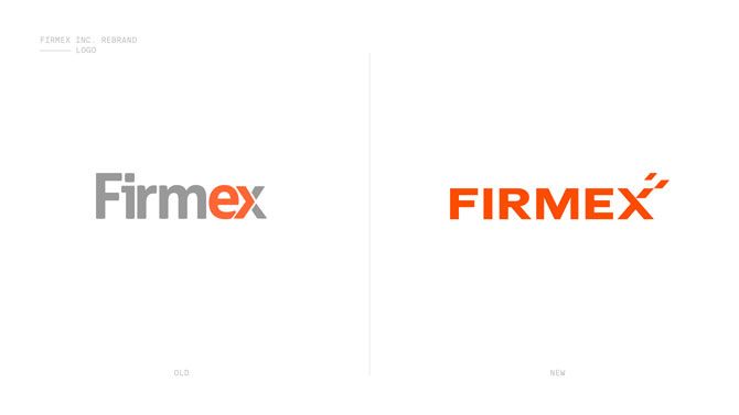

Firmex's old (left) and new identities
Toronto-based Firmex, a virtual data room provider, has undergone a major brand makeover. Under creative director Philipp Boltz, the Firmex design has been reinvented to showcase the company’s success and modernity in the digital age.
“The old brand was like a suit we’d grown out of,” says Boltz. Since its last rebrand in 2010, Firmex has transitioned from a start-up to an international global leader in its space.
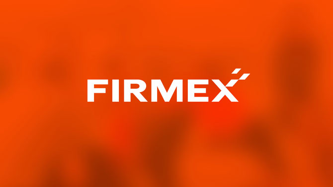
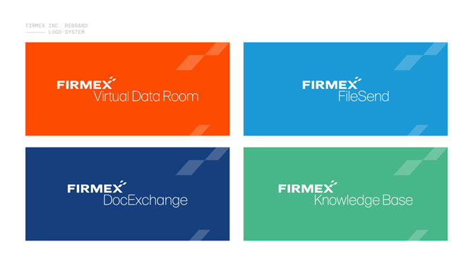
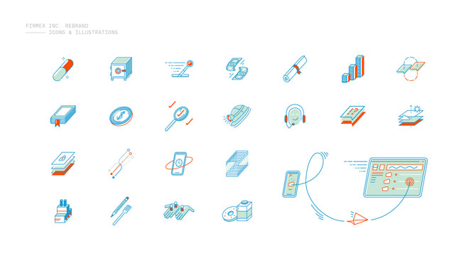
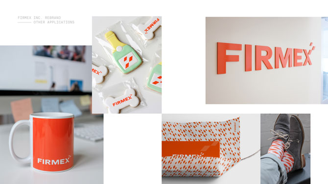
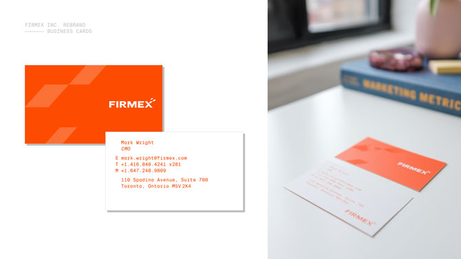
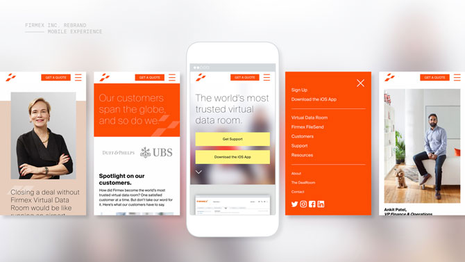
The redesign includes custom iconography, illustrations, photography and animation, and introduces a brand colour, “Firmex Orange”—which is more intense and bold than the company’s previous orange. Boltz and his team chose a number of complementary Pantone colours including sage, French blue and honest green. The new sans-serif typeface allows for versatility across all platforms.
“Firmex is an active, youthful brand that competes in a mature and crowded market. With the redesign, we had an opportunity to express our unique identity in a more authentic way,” notes Boltz.
One image that appears throughout the entire brand: pages and paper. The new logo features three pages breaking away from the “X.” “Our clients trust Firmex to manage and share large volumes of confidential documents online, so the concept of pages is tied into our core business and company DNA,” says Boltz. The Suisse Int'l typeface is used throughout, in four different weights.
Boltz says he hopes that the new design will bring the company continued success. “We’re growing and will continue to expand into other markets. Stay tuned!”—Sabrina Gamrot
Credits
Creative Director: Philipp Boltz
Copywriter: Steven McOrmond
Chief Marketing Officer: Mark Wright
Contributors: Trew Knowledge (website development), Angela Lewis (photography), Light & Hevvy (illustrations and animations)


