Applied Arts Judge Margherita Porra on the Virtues of Taking Your Time
June 21, 2019
Known for her unique brand creation, cultural trend clairvoyance and paired down, symbolic design, Margherita launched her design career in fashion, working with top Canadian and US brands.
With over 17 years’ experience in consumer goods, her work spans brand vision and strategy to identity, packaging, retail interior experience and product design. Fuelled by health issues and a passion for nutrition, her work in food and health & wellness has met with great success in breaking convention in stale markets. She has received numerous awards, including two Pentawards, the AACE award and the Canadian Design Exchange Emerging Graphic Designer of the Year.
Her packaging designs have been published in the Dieline, Taschen’s The Package Design 3, Applied Arts, Idn magazine, Lovely Package, Choi’s Package Book, Hightone Packaging Book, Pattern-Base Book, Georgia Straight, and Fashion magazine. She recently spoke on storytelling in package design and has written about the makers behind the package.
Margherita’s design philosophy is “Metodo Lenta Lavorazione” which extols the virtues of taking time to make things properly. This ethic is visible in this recent project.
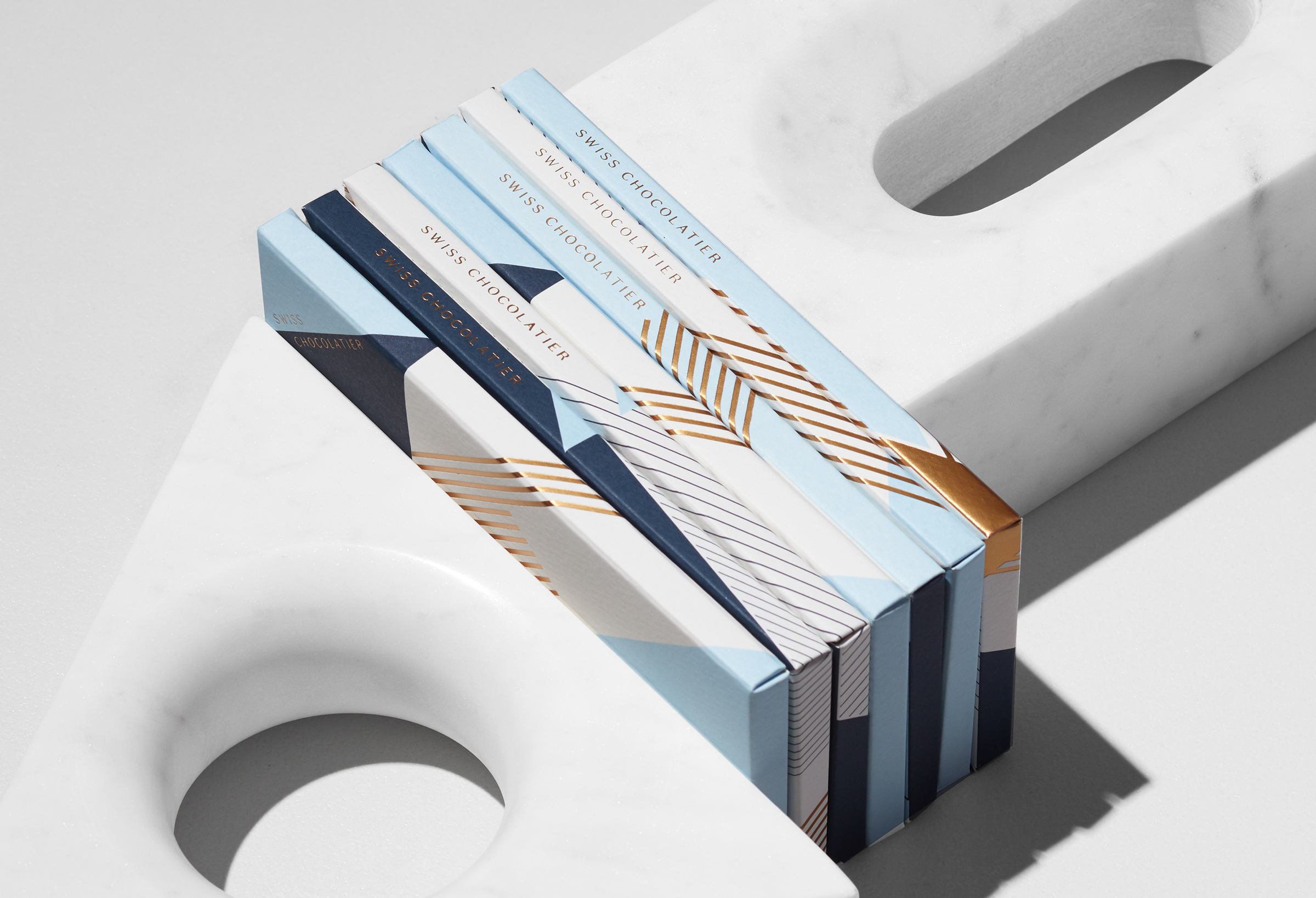
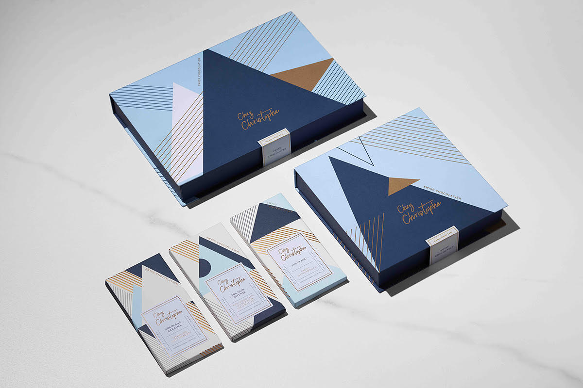
Project Name: Chez Christophe Branding and Packaging Design.
Description: The overarching art direction for Chez Christophe was based on the idea of love and its relation to moments throughout our ordinary life. Love knows no bounds, it extends beyond emotion to become a way of being and a way of living. Love is expressed through craft and passion for excellence in that craft. Once in a while, right in the middle of an ordinary life, love gives us the romance our heart desires. Loving is the ultimate act of feeling special. Emotions transcend time and live through the senses.
In celebration of the chocolatier’s Swiss roots, we were inspired by the Swiss Art Deco lacquer designs of Jean Dunand (1877-1942). Using geometric forms in primarily triangle formations and line work, we developed a graphic language that nods to the peaks of the Swiss mountain range, synonymous with the origins of the most delicious tasting chocolate.
We celebrated the founding logo with a contemporary update. By retaining the curvature of the founding logo, and updating the focus on humanizing the shapes, we were able to capture the aesthetic of romantic and approachable appeal. We have drawn the influence for the type of treatment from a pairing of Art Deco Geometrica & Formed shapes.