Becoming KD
August 7, 2015
Behind the rebrand of Canada's favourite mac 'n' cheese
When I was a kid and my dad went out of town on business, I looked forward to Kraft Dinner night, when my mom would throw on a pot of the mac ‘n’ cheese and add chopped wieners. What was likely a much welcome evening off from cooking for her was always a special treat for my brother and me. Eventually, Kraft Dinner — or KD as we called it — was the first thing I was allowed to cook on my own.
I still reach for one of those blue-and-yellow boxes every now and then, when I’m feeling nostalgic and need a quick meal (except now I take it with a liberal sprinkle of salt and pepper, sans wieners). Like me, most Canadians have a preferred way to eat their KD — and they have a favourite memory, too.
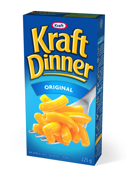
This was one of the insights Kraft Canada had before it announced last week that Kraft Dinner, Canada’s unofficial dish, had been renamed KD, reflecting the affectionate nickname shared by the nation. Research showed that 80 per cent of Canadians already called the product KD, and Kraft wanted to find a way to strengthen its relevance with those who grew up eating the noodles.
But what considerations need to be made when renaming a product that has been entrenched in a country’s culture since 1937? It’s not just about a new package, says Thomas Pigeon, founder and CEO of Pigeon Brands, which has been working on the Kraft Dinner account for more than 20 years. “The key is to manage equity transfer while being more emotive to additional consumers who might be interested in the brand.”
Pigeon says the new name was a natural evolution for the brand, and one that has been in the works for several years. For about 12 months, Pigeon, his Toronto-based team and his satellite office in Montreal worked directly with Kraft to develop the new packaging and brand strategy.
“What became increasingly obvious to stakeholders was that although the design said Kraft Dinner, what people called it was KD,” he explains. “KD has a universal appeal to people from all walks of life and all income levels. It’s one of the most beloved brands in Canada […] and it’s a standalone category here with little to no private label competition. You can’t fight against perception.”
“For a major multinational brand owner like Kraft, this is a pretty gutsy move for the brand. But it’s been done in a way that simply aligns the product with how consumers have referred to it,” says Pigeon. “There’s fun and approachability that is remarkably consistent to the overall brand.”
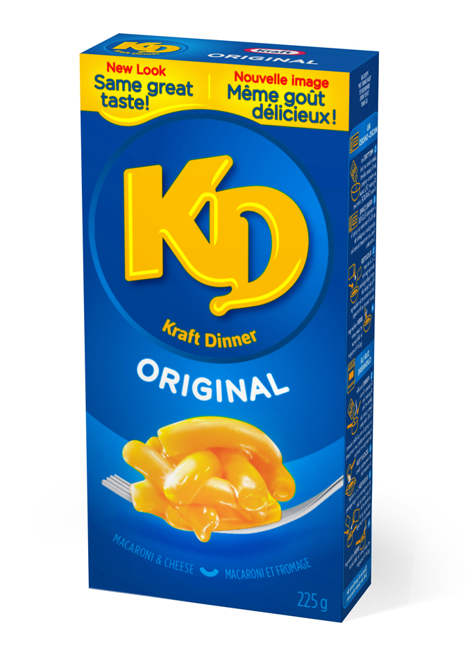
Part of what makes this redesign successful is that aside from the new name and a few updated visual cues, the branding doesn’t stray from what’s made KD stand out on the shelf.
“The colour franchise is deeply steeped in blue, and we kept that hero shot of the product to emphasize the taste experience of Kraft Dinner,” Pigeon says. “We didn’t try to redefine it and make it something else, or explore 32 different options just to show people we can draw. What we want on the shelf is an intelligent brand transition from the old design to the new — that intuitive sense is one of the things brand designers bring to the table.”
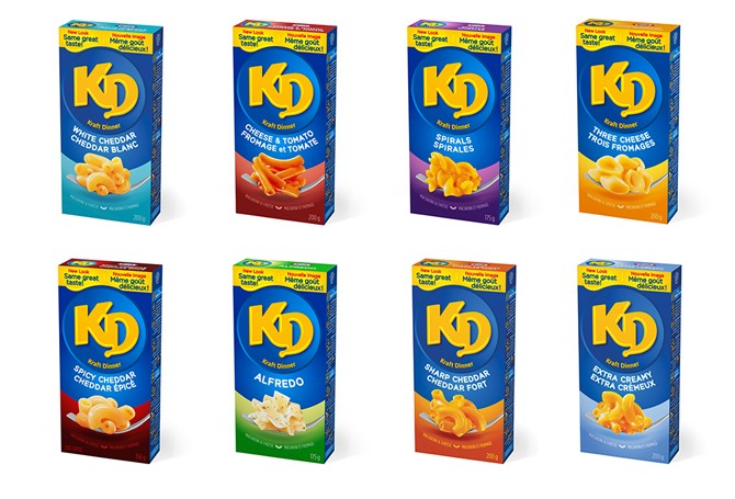
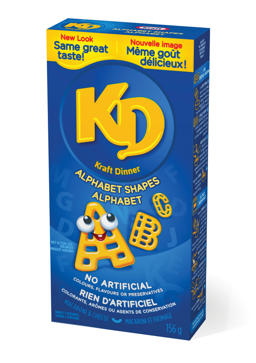
The new boxes feature a friendly, noodle-inspired typeface and round, inviting shapes. A bolder placement of different colours on the front and tops of the boxes indicate flavour and noodle varieties, such as KD Spirals or KD Spicy Cheddar. “Colour is the number one way that people navigate a shelf,” Pigeon explains. “Simplicity is bliss when it comes to brand. The design needs to be inclusive, but it also has to be distinctive.”
Pigeon says all of these efforts push the brand forward. “What you don’t want to do when you redesign a package — which wasn’t the case with Kraft Dinner — is change how people feel about it. You just want to consistently move the brand in a positive direction based on consumer lifestyles and beliefs.”
By evaluating how the brand would perform in terms of social integration, advertising and product rollout, Pigeon Brands created “locked-up, exportable design elements” to ensure the brand stays connected throughout future campaigns. TAXI is handling the advertising and Edelman is managing the PR.
“We don’t just design a package, but the foundation and communication element of a brand,” Pigeon says. “[Then] the client has the portal to see where the brand can travel.”
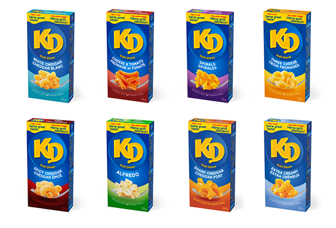
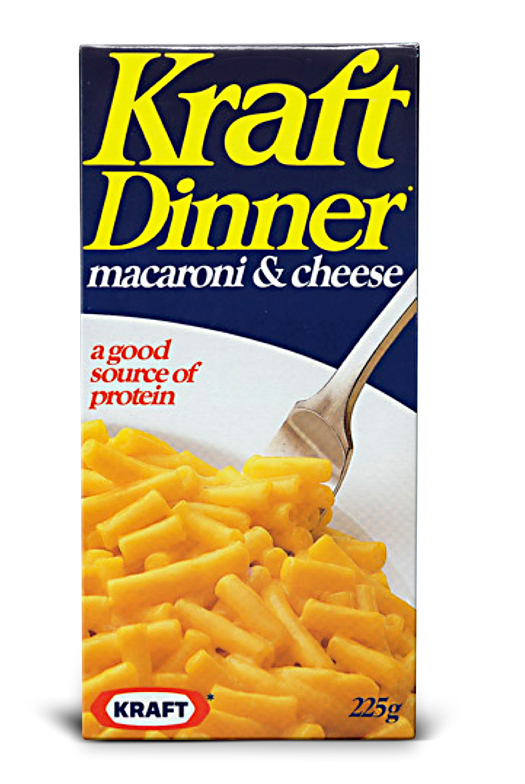
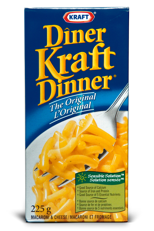
See Pigeon's evolution of the KD box below.
1995
1997 English-only and bilingual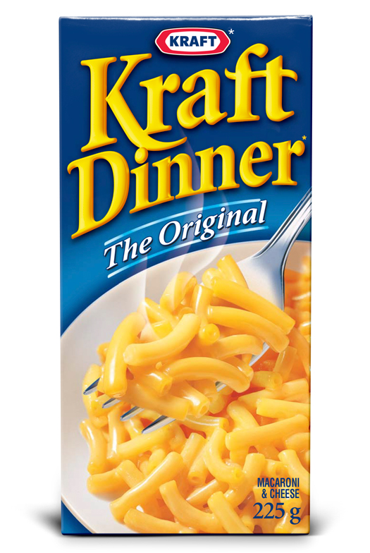
2008
2015