Build a Better Homepage
March 23, 2018

The humble homepage: give it a single goal to see success

smashLAB's homepage for SNAP
When you redesign your website, the homepage seems like a blank canvas. It’s your company’s “Hello, World!” and you can put anything on it.
Everybody wants to make a mark on that homepage. Sales wants product placement. Marketing wants social integrations. The content team wants to share stories. The brand manager wants to reinforce core messages. HR wants a Careers link. Operations wants to show hours and rates. And this list goes on…
When everyone has their way with that canvas, you end up with a cluttered painting. This means viewers won’t know where to look, or what to do. They’ll only find a mess.
If you fail to define the outcome, you fail
I shouldn’t compare a homepage to a canvas. It’s a bad analogy. A stop sign is a better comparison. A stop sign is singular. It does not provide options or ambiguity. It tells viewers to do one thing. Could you put more information on a stop sign? Sure. But you don’t—because that’d confuse viewers.
You might say, “Hey—our customers aren’t stupid. They’ll read through the options and find what they need.” —and I’d say you’re wrong. Most visitors will bounce from your website. Those who remain will read only 20% of the words on your page. As such, visitors will miss inexplicit calls-to-action. This shouldn’t surprise you. Users are drowning in messages, so, they learn to avoid them.
If you aren’t smart enough to show visitors what to do… If you can’t make that action clear… you will lose those visitors. As they look at your homepage others seek to pry them away. Emails, text messages, and phone calls interrupt them. Other browser tabs beg for their attention. Ambiguity on your part results in confusion. Once something shiny crosses their field of vision, they’re gone.
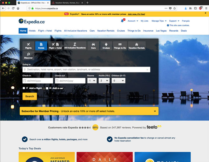
Big organizations often suffer from cluttered websites—because everybody wants their bit of homepage real estate. Expedia’s website shows a lot of options—that overwhelm the viewer.
Close the door, cover the windows, and answer one question
Want to build a homepage that works? Bring your colleagues together in a room with no distractions. Hide any website comps; you will not look at these. You will not talk about what the website could do. You will not look at your competitors’ websites. You will not talk about feelings, aesthetics, or technologies.
Instead, you ask one question: What do we want people to do, when they visit this page? There are many suitable responses. For example: “We want them to subscribe to our newsletter.” Or, “we want them to ask for more information.” Or, “we want them to donate to our cause.” What you want your visitor to do doesn’t concern me. What does, is that you define the action you want them to take.
That’s it. The first step in building a homepage that works, is in defining what you want it to accomplish. Until you do, you have no right to talk about how that page looks. Nor do you have the right to to ask whether you should add a carousel (you shouldn’t). Nor do you have the right to contemplate which social media widgets to include. None of these points matter until you define what you want visitors to do on your homepage.
This approach is efficient. It cuts through all the bullshit surrounding a website redesign. It casts aside questions of style and personal preference. It prevents department heads from getting sucked into a turf war. Defining the purpose of your homepage focuses your efforts. When you do this, you’ll realize that you can do the same elsewhere.
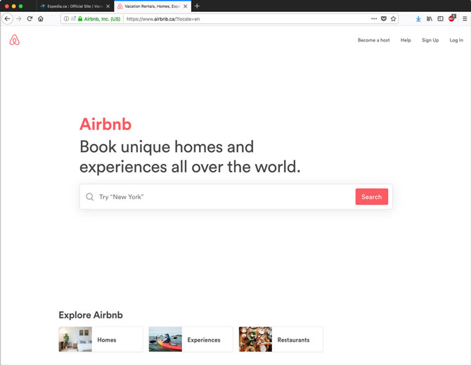
The one job of the Airbnb homepage is to get visitors to search their inventory. Sure, there’s other stuff beneath, but that’s secondary.
Treat every web page like it has one job
Create a list of every page in your website and identify the single thing you need each page to do. This might seem tedious, but it’s a valuable exercise. If you do it, your website will be better. It will be clear. It will direct the visitor. It will be free of unneeded content. And it will outperform your competitors’ websites.
Also, by identifying what you want visitors to do, you can start to measure such behaviour. When there are 10 random elements on a homepage, it’s hard to know what’s working. Focusing on one desired action makes it easier to measure—and optimize for.
“Wait a second, Eric. Does this mean I can’t put anything else on my homepage?” Oh shit, no. Of course you can put other stuff on your webpages. But, those items shouldn’t conflict with the primary purpose of the page. You can avoid such conflicts by making secondary items smaller and less conspicuous. (Also, avoid adding more elements than necessary.)
In life, those who attempt to do everything achieve little. But, those who do one thing well often outperform the rest. The same principle holds for your homepage—and every other marketing tool you create.
This article originally appeared here.
Eric Karjaluoto is partner and creative director of smashLAB, a Vancouver-based creative agency.


