Caps Lock: Design After Capitalism
Radical designer Ruben Pater looks beyond the current socio-economic order to imagine a more positive role for designers
November 25, 2021
I entered the working world of graphic design in 1979, just as the dogma of modernism—as expressed by the hegemony of Helvetica and flush left/ragged right page layouts—was in decline.
Postmodernism, which was well underway in architecture and firmly established in the more scholarly spheres of literary criticism and the social sciences, became for graphic designers an invitation to question Swiss orthodoxy, re-examine the historical forms rejected by modernism and to ironically embrace the more vernacular graphic language of things like bus tickets, tabloid magazines and lowbrow printed ephemera—stuff we were conditioned to consider below our station as elite crafters of visual communications. Functionalism was jettisoned in favour of fun.
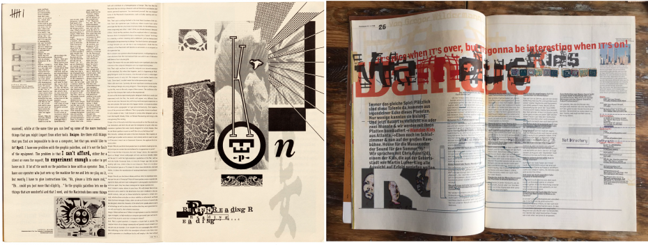
Spreads from Émigré (left) and Ray Gun (right), two of the most iconic examples of postmodernist graphic design’s rejection of Swiss International and embrace of deconstructionism. Credits: Left, Rudy Vanderlans/Zuzana Licko; right, David Carson.
While these exercises in historicism and deconstruction were liberating, their examination of the conventions of visual communication rarely went any deeper than the paper they were printed on. The opportunity to probe the underlying socioeconomic relations of design practice went largely unnoticed.
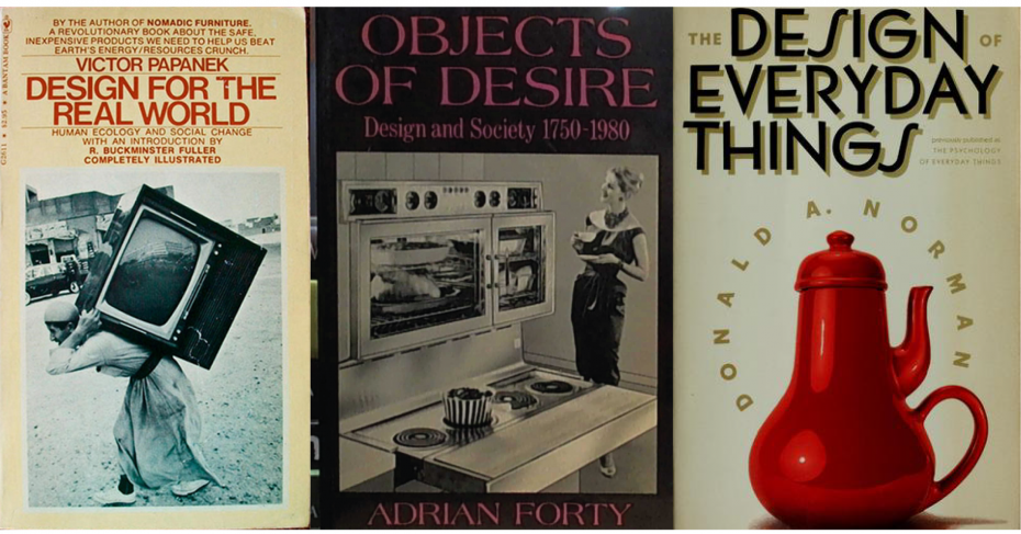
Three notable exceptions come to mind—Victor Papanek’s Design for the Real World (1971), Adrian Forty’s Objects of Desire (1986) and Donald Norman’s The Design of Everyday Things (1988). While these texts were focused more on industrial design than graphic design, it’s easy enough to see parallels.
To these three classics we may now add another, this one focused on graphic design. Caps Lock, How capitalism took hold of graphic design and how to escape from it, written and designed by Dutch author and teacher Ruben Pater, delivers exactly what its title promises.
Pater’s richly illustrated book is a wide-ranging critique of design’s own short-sightedness of what Karl Marx referred to as the "hidden social relations underlying money," and by extension, capitalism itself. Pater reveals those relations by exploring the various roles graphic designers have played throughout economic history, with most of the focus on capitalism.
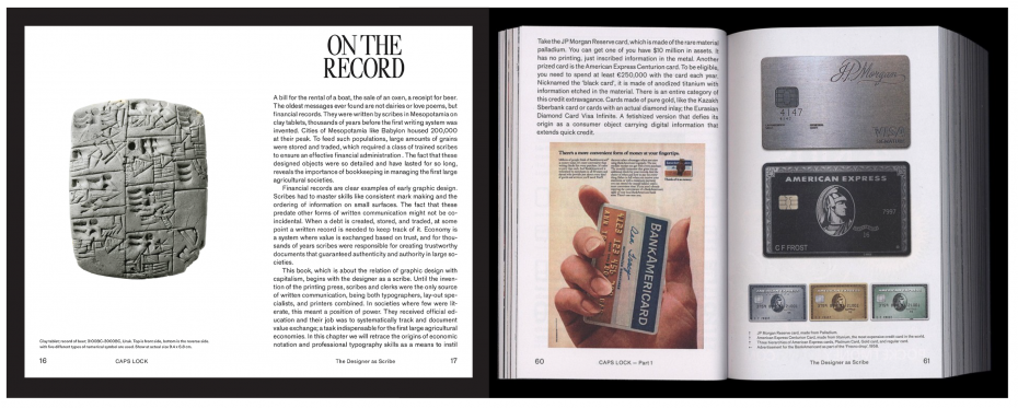
For example the book begins by examining the "Designer as Scribe," tracing the history of financial instruments, from clay tablets to credit cards to fintech apps and their designers’ role as extensions of the bureaucracy by which the nation state and market economies are governed.
In a chapter entitled "Designer as Salesperson," Pater examines the way in which design, in conjunction with PR and advertising, is often far more effective at covering up the true activities of a corporation than in revealing them. Using the Chiquita story—a well-documented cover up of political intervention and US military-backed coercion by the United Fruit Company in its bid to monopolize banana cultivation across Central America, Pater shows that design and its creative collaborators very effectively helped achieve that goal, even while the company itself admitted to killing thousands of farmers and labour unionists to protect its investments.
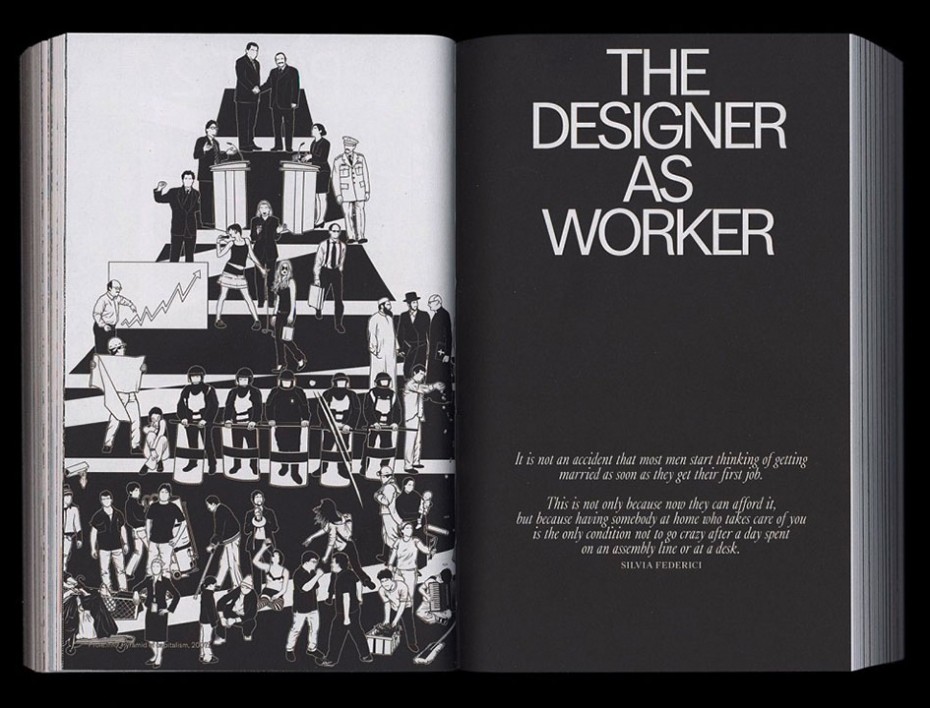
Pater repeats this formula across a total of 12 roles—designer as scribe, engineer, brander, salesperson, worker, entrepreneur, amateur, educator, hacker, futurist, philanthropist and activist. He carries out his socioeconomic analysis of how each role supports capitalism and then suggests ways in which designers can free themselves from their commercial bondage.
Most of his solutions involve not working for mass market brands, keeping your focus local, addressing community needs and issues, exploring alternative means of exchanging value, joining a union or starting a cooperative, or creating a lifestyle that is less focused on material rewards and more focused on nurturing relationships.
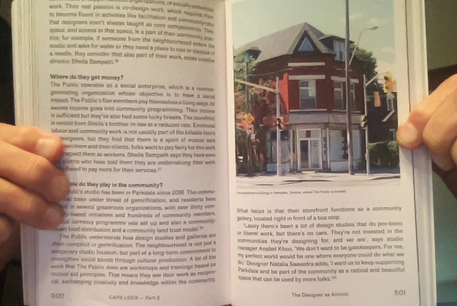
If this looks like Toronto’s Parkdale neighbourhood, it is. Street-level storefront studio and gallery of The Public, described below as a social justice-oriented design practice
If that doesn’t sound like what you went to design school for, it probably isn’t. Most designers are not taught to question the conventional business model of designer-as-consultant to corporate clients and consumer brands. Most are not taught about what kinds of systemic ills their work unwittingly supports. Very few are able to locate their work within the larger narrative arc of socioeconomic history. This book is a great place to start.
In my next column, we’ll speak with a group of Toronto-based designers calling themselves The Public, identified in Caps Lock as a "community-centred, social justice design studio." With capitalism most certainly on the edge of another collapse, the timing could not be more appropriate.
Will Novosedlik is a designer, writer, long-time contributor and former editor of Applied Arts Magazine. He is known for a critical perspective on the cultural and socio-economic impact of design, brand, business and innovation.


