Chain Reaction
May 8, 2017

During a small-scale branding exercise for Earls, two Vancouver design firms helped the restaurant realize it needed something much bigger—a company-wide rebrand
Objectives
Ever since Earls launched 35 years ago as “Earls Tin Palace” serving straight-up burgers and beer, the casual restaurant chain has undergone a brand update every few years as part of its mandate to stay original and to respond to the needs of its wide-reaching clientele.
But when Earls president Mo Jessa contacted branding studio Glasfurd & Walker and interior design firm Ste Marie—the two companies had an existing relationship from several other restaurant launches in their shared Vancouver base—in early 2014, it was with an altogether new goal: to start from scratch. Jessa wanted to build a test restaurant, or prototype, to see what might work for Earls down the line—and the designers had carte blanche to completely disengage it from the main brand.
“Brands that have been around over 30 years tend to do things a certain way because that’s ‘how it’s always been done,’” explains Phoebe Glasfurd, creative director and partner of Glasfurd & Walker. “Mo is a very ambitious person and he wants Earls to be relevant and innovative. The prototype was born of his desire to ensure Earls is always delivering the best, rather than running a brand through 66 restaurants and only then finding out whether it worked or not.”
As the brand’s first-ever prototype, Earls 67—the 67th in the chain—would be a huge departure for Earls, without any financial risk. Kristin Vekteris, vice-president of brand and marketing for Earls, says that before the test phase, there were fewer opportunities for true creative change. “We have a very successful business model, and every time we had an idea or something we wanted to try, we essentially had to break that.”
The Earls 67 project would take apart everything Earls had done for three decades before building it all back up again into one restaurant—and then some.
Strategy
Glasfurd & Walker, Ste Marie and Earls formed a large team that covered design, operations, brand, marketing, food and beverage. “I’ve never seen such a true collaboration,” says Vekteris. “It didn’t ever feel like agency and client. It was like they were a part of Earls.”
After six months of research, it became clear that contrary to the initial brief, not everything would be reevaluated. “This brand is always evolving and always changing,” notes Glasfurd. “But on the brand side, we noticed that Earls has always been innovative and somewhat irreverent with how they present themselves.”
Case in point: the restaurant’s fondness for fauna, from the kitschy, papier-mâiché scarlet macaws of its early decor days, to the sunglasses-wearing penguins of the 1990s, to the Rhino house beer that’s been on the menu since day one. Then there was the copy—phrases like “Eat a little. Eat a lot.” and “Fresh Food Fresh” had disappeared off menus in the mid-1990s, so Glasfurd & Walker brought them brought back. They were not only core to the brand, but also strong enough to carry it forward.
“In recent years, the branding had become a lot more corporate and some of that initial personality had been lost,” says Glasfurd. She and her team studied other international chain restaurants, as well as independents, before tackling the Earls 67 positioning. The brand’s cheerful, laid-back approach to casual dining kept coming up as its singular value proposition in the marketplace.
Appealing to both the loyal customer and the new one was more of a balancing act. “I don’t want to alienate the people who have been coming to Earls for 30 years, but I also want it to feel relevant and interesting to twenty-somethings,” says Vekteris. “So being design driven has been an important distinction that we’ve made in our company.” With that in mind, the Earls 67 location needed to be in a market with a long love for the brand but a steady influx of newcomers. The Bankers Hall outpost in Calgary, which needed renovating, became the prototype.
But it turned out that the prototype was not the end goal of the branding exercise. “Even before we launched [Earls 67], we realized that one of the things we wanted to do was shift our vision,” says Vekteris. “We wanted to ‘unchain the chain’ and become a collection of independently compelling restaurants. That came to mean each restaurant would be designed as unique to that location and that consumer, which is really exciting.”
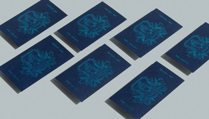
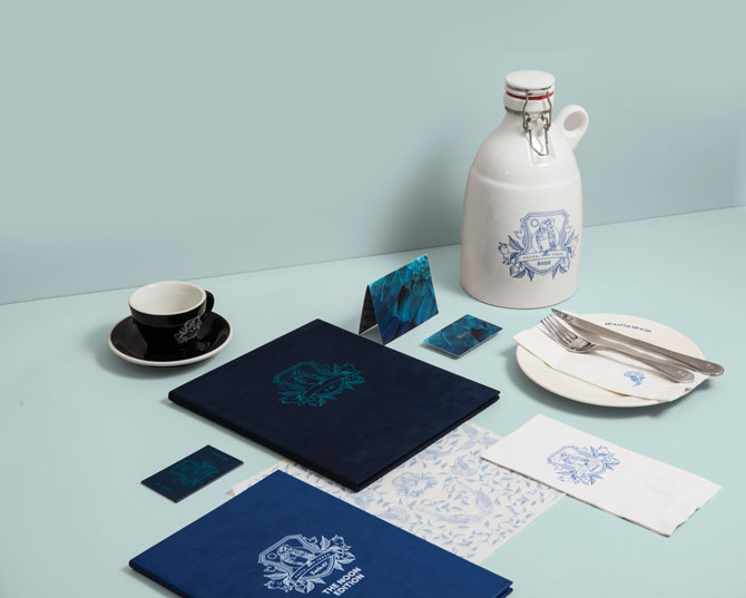
Earls 67 cards. See more images from Earls 67 in the top slider
Execution
Earls 67 hinged on the juxtaposition of refinement and whimsy, or what Glasfurd calls the “high-brow” and “low-brow.” The identity centres on a heraldic crest that renders the brand’s classic animals into elegant line illustrations. “At first glance, the emblem seems sophisticated and almost stately—and then if you look closer, there are penguins and pigs and rhinos and parrots within it,” says Glasfurd. “There’s this constant mix of flourish and fun in the right places.”
The serif and sans serif typefaces, Larish and Larsseit, play off one another, as do the mix of blue brand hues. When considering the colour of a restaurant, Glasfurd notes the decision extends far beyond the identity itself to how it will be used in the physical space. “We were looking for something holistic and integrated in the space so that it would feel light and natural,” she says. “Previously, Earls used a very bright, poppy red, and there were a lot of comments that the red in the menus looked jarring on the tables. Navy blue felt finished, and like it would sit very well in the bar area as well as the canteen.”
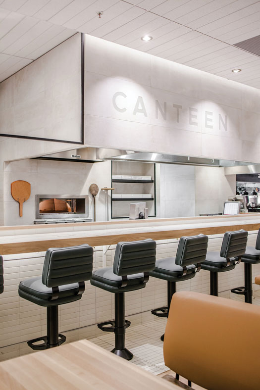 Earls 67 canteen. See more images from Earls 67 in the top slider
The interior favoured a similarly understated “something for everyone” approach, volleying between light and dark as the customer moved from the eat-in “canteen” area and coffee counter to the cozy Bankers Bar lounge, where guests could order growlers of beer directly to their table. Even the menu went through an overhaul to include healthier options that have since been rolled out to the remaining restaurants.
As Earls 67 prepared to launch in July 2016, work on an overall Earls rebrand—the official move to become “independently compelling”—was already well underway. Glasfurd & Walker delivered initial concepts for the company-wide rebrand based on Earls 67 in December 2015, seven months before the prototype even opened.
It was a remarkable convergence. Earls opened a new location in Orlando, Florida in September 2016, only two months after the prototype launched. “It’s quite a sophisticated design and you can see that the aesthetic of Earls 67 has influenced it,” says Vekteris. As the first post-prototype location to enter the market, “We wanted to launch [Orlando] really subtly, just to watch how our guests and partners reacted to it, and to understand how it worked in situ.”
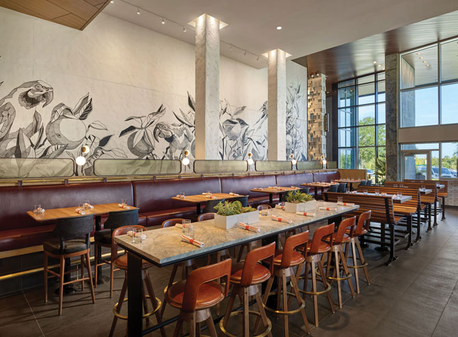
Brand rollout of the new Earls in Orlando, Florida
Challenges
“It’s been really unique to work with a client for two years before doing the big rebrand,” says Glasfurd. “It’s unusual, but in doing all of that research for Earls 67, we really understand what their needs are and how they change based on their market.”
For Earls, responding to the needs of its market—with its varied demographics in two countries—is the consistent challenge, but one that will be addressed with a greater focus on design and its new approach to tailor each restaurant to its location (all interior design subsequent to Earls 67 was completed by the internal design team at Earls). “One of the things I notice is that a lot of brands, including Earls, go through a full rebrand every four to five years, and brands are looking more tired more quickly,” says Vekteris. “We needed to create a brand that’s going to stay relevant and not be dated in a short amount of time. Earls is much bigger than Earls 67, and so we’ve now created this organic, big, flexible brand in an unconventional way.”
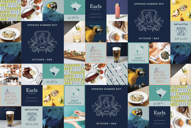
Some aspects from Earls 67 carried over to the new brand
Results
Earls 67 proved to be the ideal barometer for the Earls rebrand. “The biggest surprise for us was how quickly we would see whether things were working or not at the prototype,” says Vekteris. “We had a few thousand guests every week. So we literally saw what menu items were working, where people were sitting or not sitting.” Elements that received positive feedback made it into the full rebrand plan, and those that didn’t were cut. The non-linear timeline meant the team could also add any approved features to other locations in real time. This has allowed the full brand rollout to happen in a relatively short period.
“The brand look and feel is harder to measure,” says Vekteris. “After Earls 67, Phoebe [Glasfurd] and I wanted to dial up the playfulness for the rest of the brand. Earls is a place where you can be sophisticated, but we’re also a restaurant where you can come in jeans and flip flops and feel comfortable, so the overall brand needs to reflect that.”
An expanded colour palette allows for the option to use brighter colours set against the navy colour scheme, and the photography is even punchier. The brand crest remains, with four versions to allow for more flexibility. “We’re trying to set up the brand so there’s a sense it will be ever-evolving,” says Glasfurd. A Whistler, British Columbia location applies the new branding to a ski lodge, wheras a beachside spot in North Vancouver takes its influence from the sea.
By late October 2016, most of the brand elements had been implemented across 68 locations, and in late April 2017, the Earls 67 prototype was converted “back” to an Earls, with a renewed focus on not only the cohesive brand but also its discrete market in downtown Calgary.
“As a marketer, it’s been a different way to create a brand,” says Vekteris. “We don’t have a tight brand guideline. We work closely with Glasfurd & Walker on an ongoing basis to look at the brand holistically and understand where we want to take it.”
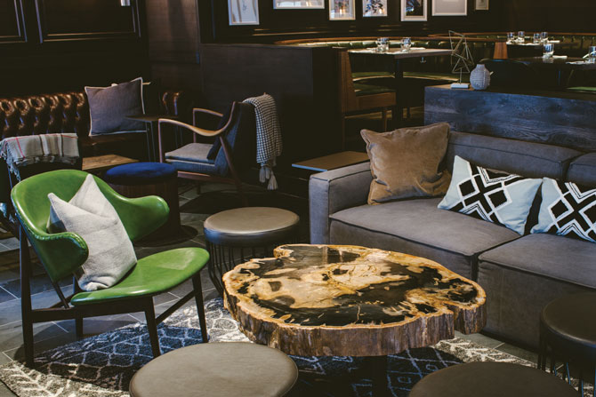
A renovated location of Earls in Whistler, British Columbia
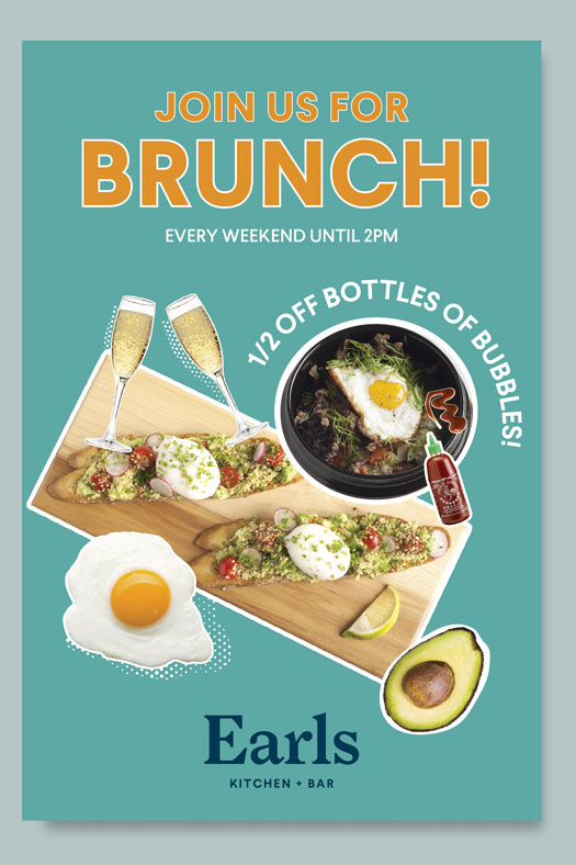
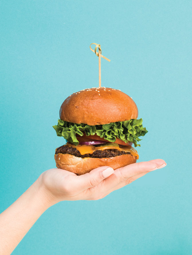 New photography for Earls brand rollout
CREDITS
Client Earls
VP Brand & Marketing, Earls Kristen Vekteris
Brand Team, Earls Jinnie Cho, Miko Bryson, Jacque Edwards
Concept Team Glasfurd & Walker, Ste Marie and Earls
Food, Bar, Operations Earls
Brand Glasfurd & Walker
Copywriting & Illustration Glasfurd & Walker
Managing Director Aren Fieldwalker
Creative Director, Design & Copywriting Phoebe Glasfurd
Project Manager Elliott Lewis George
Designers Corinne Theodore, Yuji Terada, Tigh Farley
Interior Design, Earls 67 Ste Marie
Creative Director, Ste Marie Craig Stanghetta
Interior Design, Earls Elly Chronakis, Abigail Stephens, Kimberley Hume
Parrot Photography Eydís Einarsdóttir, Studio 80s Photography
Food Photography John Sherlock, Tigh Farley
This article was originally published in the May/June 2017 issue of Applied Arts. See more photos in the top slider.
