Design Army Gives The Mocktail Club a Makeover
December 3, 2018
For their latest campaign, Washington, D.C.-based, Design Army rebrands and designs The Mocktail Club, a premium line of craft non-alcoholic beverages. Originally targeted to expecting mothers and health-conscious clients, Design Army has redesigned the drinks to reach a larger demographic.
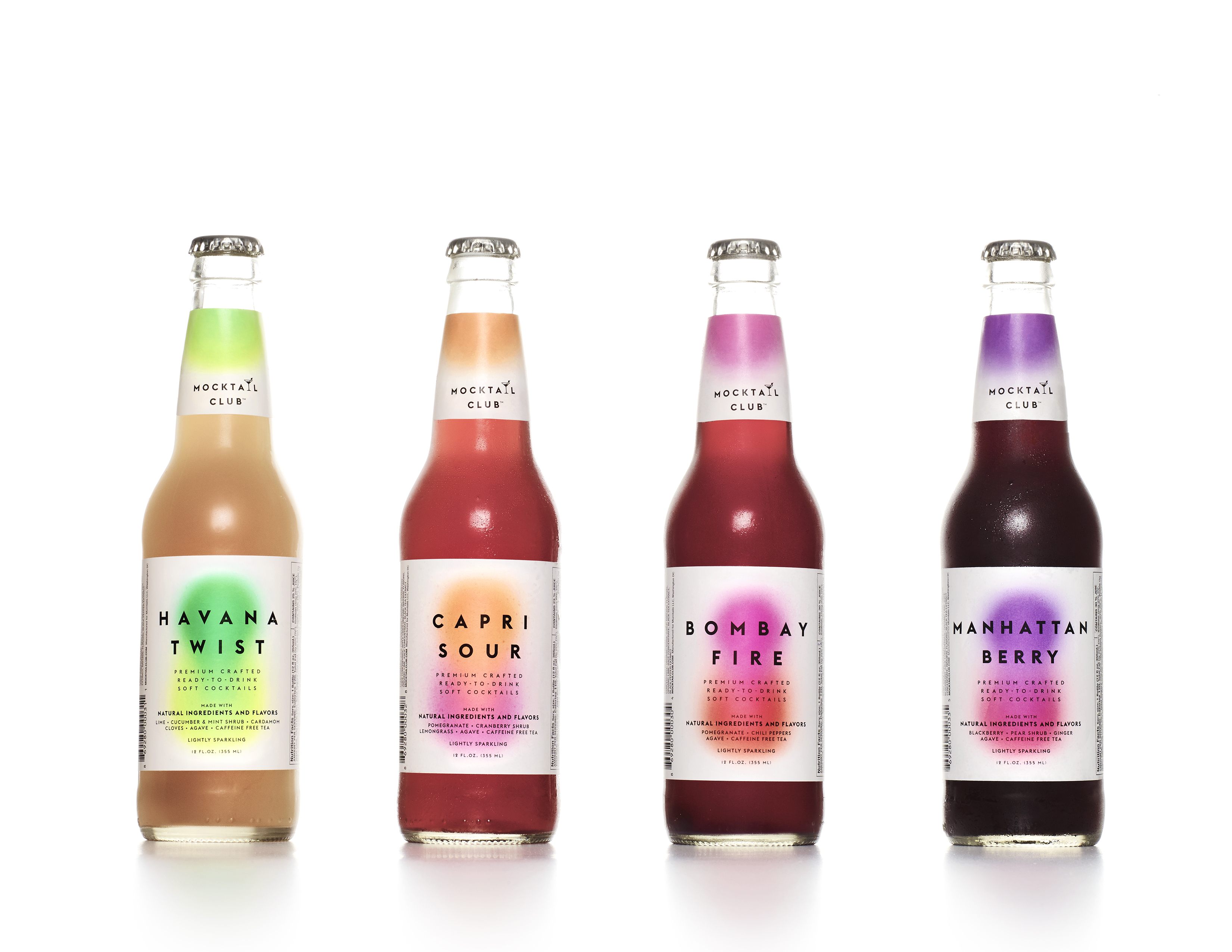
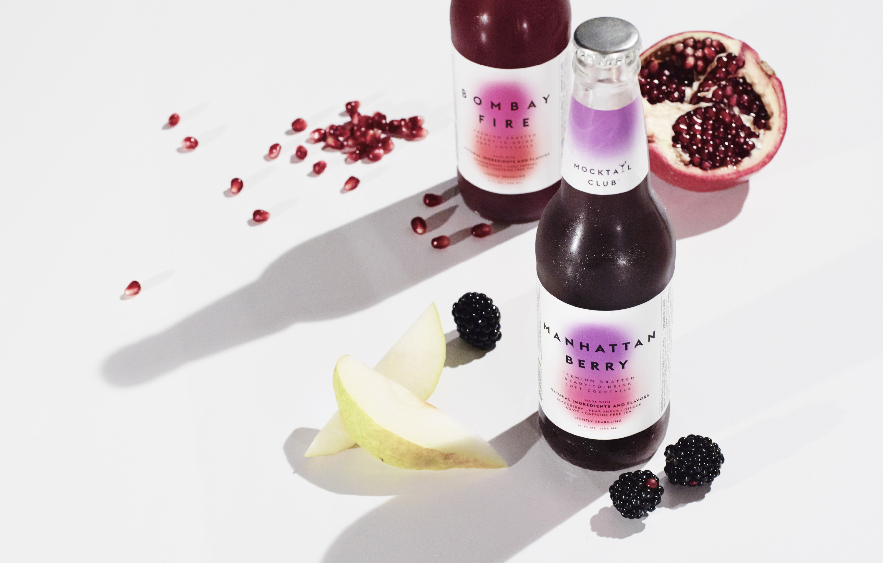
For this project, Design Army breaks the mould of typical non-alcoholic beverage packaging. The redesign revolves around the fresh ingredients and blend of fruits used in each drink. The team at Design Army combined distinctive colours to create a new imagery for the drinks.
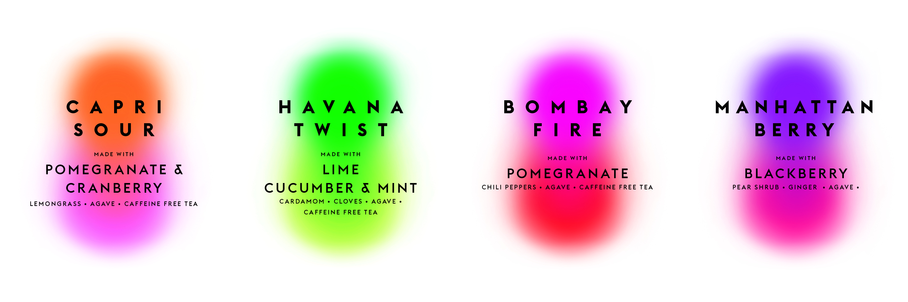
Take a look at the Havana Twist for example, the combination of green hues is a nod to the lime, cucumber and mint shrub used in each bottle.
These unique watercolour swatches allow for The Mocktail Club to stand out from their competitors on the shelf. The bold sans serif font and clean white background highlights the drinks natural ingredients, each using agave syrup- a healthier option than sugar.
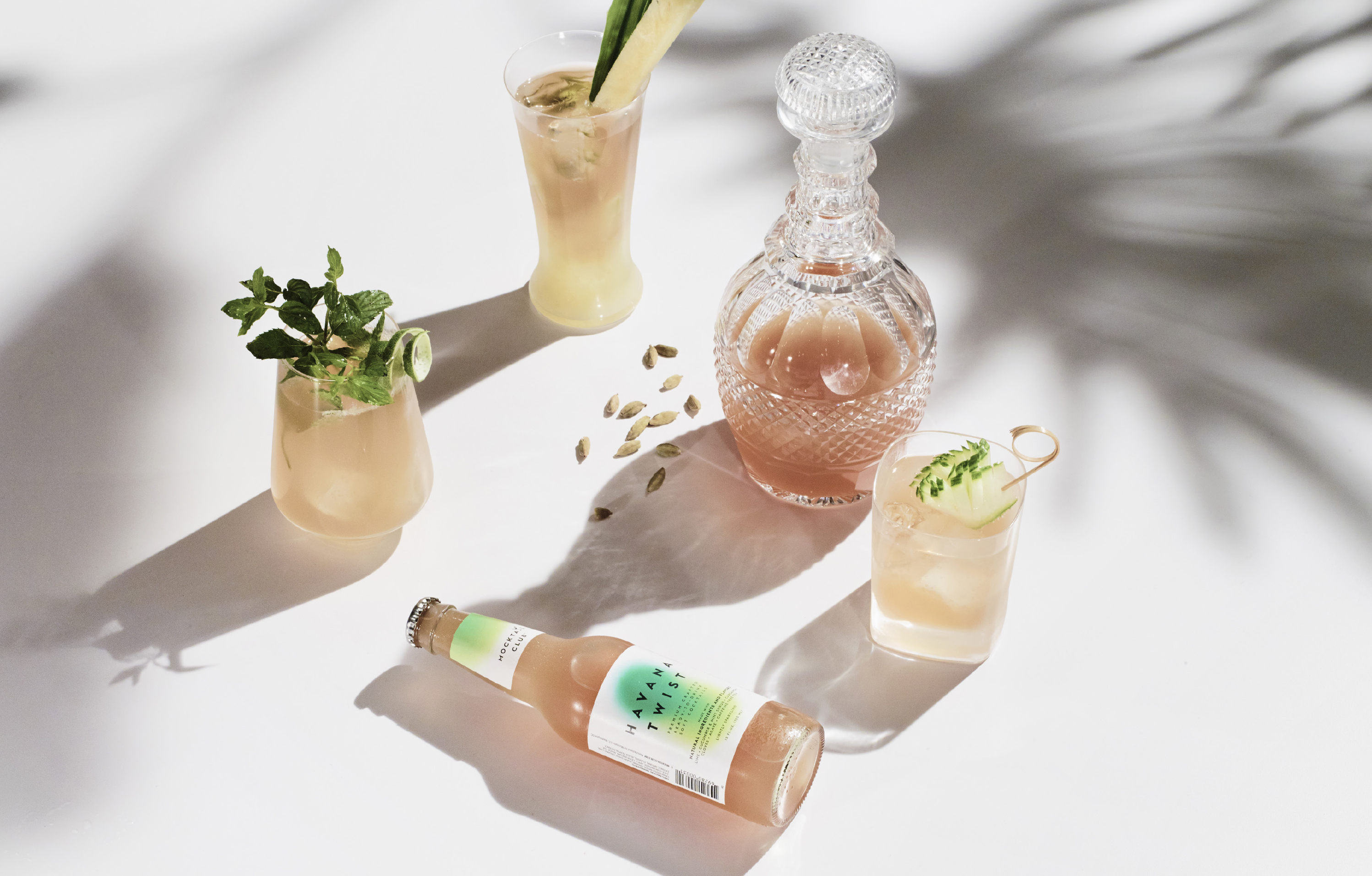
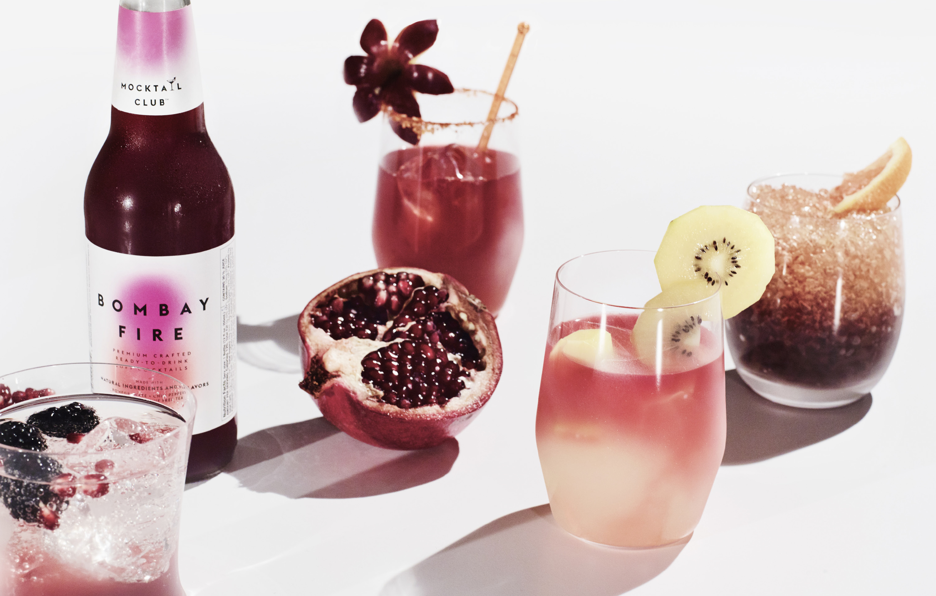
But what really ties the whole campaign together is the brand photography. Each photograph tells the product story of each drink. The photographs also showcase the ingredients used in each drink, further solidifying the benefits and flavours they have to offer.
"For Mocktail Club to resonate with broader audiences and standout amongst the countless juice/tea options, we took a minimalist approach to the saturated market. The clean white label speaks pure and natural, while the bold, blended colour mark gives the visual nod to flavour and feeling. And by keeping the label size small, it allows more of the product colour to shine through and step forward against competition," says Pum Lefebure, chief creative officer and co-founder of Design Army.