Designing with Data
March 9, 2018
Blending narrative, numbers and new technology, data visualization turns information science into an art form
Financial companies, NGOs and media organizations have used rudimentary data visualization tools for decades, publishing maps, bar graphs and pie charts alongside text to provide readers with a visual snapshot. Then, roughly a decade ago, as new graphics tools came online, eye-popping infographics took off. “It was the Wild West,” says Audrée Lapierre, creative director at FFunction, a data visualization studio in Montreal. “People were trying things that didn’t make sense. They may have been super-beautiful, but no one could understand anything.”
Data visualization has grown up a good deal since then. It’s not an add-on; it’s a medium unto itself, says Eric Rodenbeck, CEO and creative director at Stamen Design, a San Francisco-based studio. “It’s no longer in its infancy, but it’s still not fully mature.” Many of today’s most talked-about data visualizations rely on thousands if not millions of data cells. They guide the audience through a story to a desired outcome or action, but they also give the users the opportunity to dive below the surface and explore their own questions. “Data visualization today allows you to explore a goldmine of data, to extract meaning and exploit it,” says Lapierre.
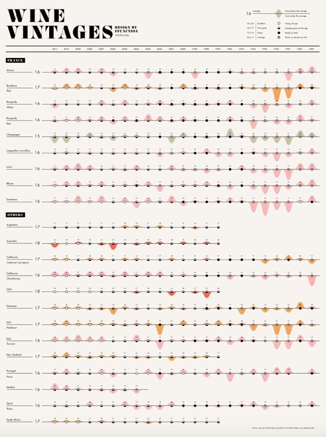
Ffunction's wine vintages visualization plots the drinkability of wines from 1989-2011.
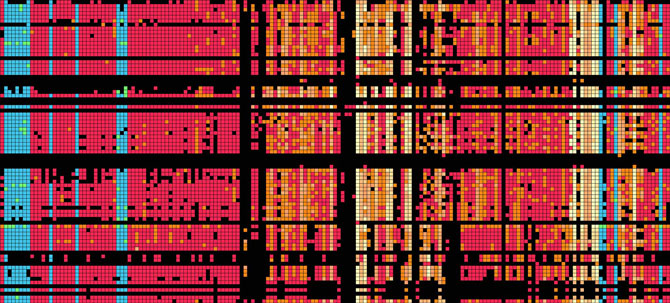
Stamen Design's work for The Banfield Lab visualizes a genome summary of complex microbiome environments
We live in an era of digital sprawl. (Five years ago, IBM estimated that sensors, cell phones, social media and other digital devices created 2.5 quintillion bytes of data daily.) The open data movement, along with new analysis and mapping tools, has made datasets for local health metrics, building permits, marine traffic, pop lyrics and dating likes and dislikes readily available for exploration. Packaging that data into graphics and animations is essential if users—scholars, decision-makers and the general public—are going to make sense of it.
Our brains are not very good at detecting patterns in data contained in thousands of rows and columns. But a clear picture can pop into view when it’s transformed into a series of visualizations. “Data visualization is always purpose driven,” says Alberto Cairo, the Knight chair in visual journalism at the University of Miami. “It enables you to extract something from the data or do something with it.” But data visualizations can also reveal gaps and anomalies. Increasingly, data visualization is forming the heart of a story or the basis for understanding a complex problem.
Every March 14 since 2013, Martin Krzywinski, a staff scientist in bioinformatics at the Michael Smith Genome Sciences Centre in Vancouver, has created a many-layered data visualization based on the number pi, a mathematical constant best defined as the ratio of a circle’s circumference to its diameter, but more often reduced to a handful of digits—3.1416, for example. (The digits beyond its decimal point are infinite.) His goal is to use interesting visuals to make you care about pi. The challenge, he says, is to pick an approach that isn’t directly connected to pi, but that teaches something about mathematics, art, and perhaps more.
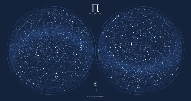
Martin Krzywinski's star chart visualizes pi
Last year, he used pi to invent a star chart (pictured above). It all started because “I was little pissed off with our constellations,” says Krzywinski. “Mythologies and shitty concepts of how things work had a place in the sky, but actual living things—that contributed to our success, were passed on through genetics, and have lived—get zero credit.” He began by transforming the digits of pi into a star catalogue, with each successive group of 12 digits forming the coordinates for a star and its brightness. Twelve million digits later—one million stars—he had a star chart. Krzywinski then went on to create 80 constellations representing extinct species such as the dodo bird, the giant vampire bat and the king lizard Basilosaurus. The result, “Pi in the Sky,” is wall-worthy art that covers mathematics, history, biology and mythology.
Storytelling through data visualization design can also uncover powerful truths. In 2013, the Andrew W. Mellon Foundation awarded US$750,000 to the Digital Scholarship Lab at the University of Richmond in Virginia to make an interactive American history project called American Panorama. Rob Nelson, the lab’s director, used part of the budget to hire Stamen Design to develop the software. “One of the challenges for us, design-wise, was attention span,” says Nelson. “We had to have a clear story that someone could absorb in a minute or two. But if people stayed longer or kept coming back, I wanted them to keep learning new things.” As a scholar, Nelson loved the complexity contained with the data, but telling a clear story that could be understood by many required the data to be aggressively edited.
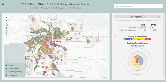
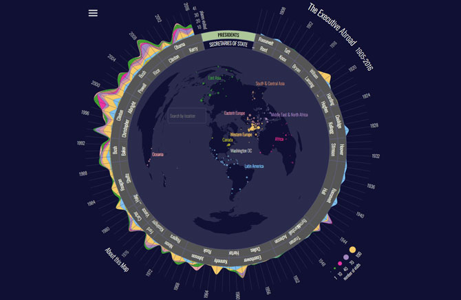
Some of the visualizations produced by Stamen Design for the University of Virginia in Richmond include "Mapping Inequality" (above), which explores redlining, and "The Executive Abroad," which charts international visits by U.S. Presidents (below).
The product (so far) comprises seven map-based data visualizations that explore the history of inequality, migration, slavery and economics in the U.S. Not only is it a good teaching tool, but also it’s produced fresh perspectives on the long-term impacts of government policy. Last year, for example, economists at the Federal Reserve Bank of Chicago further analyzed the data behind “Mapping Inequality,” a visualization that explores redlining, the practice of denying financial services like mortgage financing based on race or ethnicity. They found the effects of policies implemented in the 1930s lasted for decades, influencing levels of racial segregation, homeownership rates and home values. “We want these tools to be used by people who are the experts in the subjects to do new things and create new knowledge and arguments,” says Nelson.
Good storytelling with data visualization relies on sound data, the right visuals, the right amount of data and a narrative that connects with your audience (see "For Your Information," below). When merged effectively, you have a data story that can influence people and drive change. “It needs to be something that people care about and it needs to be more than just facts. You have to think about risk, conflict and tension,” says Rodenbeck.
As the quality, quantity and access to data improves, its usefulness will only improve. The past few years have seen a steady release of new, easy-to-learn developer tools, such as Tableau and the JavaScript library D3. Lapierre predicts there will soon be illustrator tools that let designers map shapes to data without coding, making data visualization even more accessible. Not only is the general public more comfortable with data visualizations and capable of understanding them, but also companies are beginning to see value in transforming the data they already have. “I don’t want to shoehorn it into another medium, but think about the history of photography,” says Rodenbeck. “It was revolutionary at the beginning, and you had to be technically savvy to know how to do it, and then it changed. You never could have predicted Instagram in the 1860s.”
For Your Information
Top data viz tips to pack a visual punch
1. Know the data. Understand your data before using it to answer questions. Is it a random sample of the population? What are the limitations? Alberto Cairo, the Knight chair in visual journalism at the University of Miami, offers a memorable logical example: If you’re mapping the number of heavy metal bands per capita, Journey should not be part of the dataset.
2. Clean the data. Look for misspellings and missing data, and standardize entries so that a single occupation isn’t divided into many, for example.
3. Select the data. Show all the data you need to show, but not more. Don’t simplify, but clarify. Don’t hide relevant data; visualizations must represent the data accurately.
4. Identify your outcome. How do you want people to interact with the data? Can you make it personal? “If you connect the user to the data, it will make the data visualization more interesting, shareable and engaging,” says FFunction creative director Audrée Lapierre.
5. Choose the correct graphic form. Look to the Data Viz Project, by Copenhagen-based infographic and design agency Ferdio, as well as information designer Ann K. Emery, for relevant designs and tips for picking suitable plots.
6. Provide context. This is the glue that holds the narrative together. Use text to link graphics, and offer insight. For inspiration, check out The Pudding, which produces beautiful visual essays that blend datasets with in-depth reporting.
______
Hannah Hoag is a Toronto-based journalist whose work has appeared in The Atlantic, Maclean’s and The Globe and Mail.