Digging the Data with Will Novosedlik
How data visualization is giving design a higher purpose
May 26, 2022
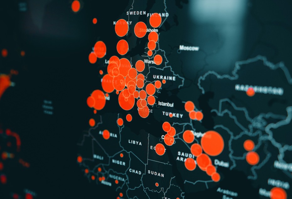 Photo: Clay Banks
Back in the early noughts, I taught the history of graphic design at OCAD. I used to say to my students, as a graphic designer you only have four tools to work with: shape, type, colour and image.
The internet was still young, there was no social network beyond Linkedin, and there was very little in the way of user-generated content because the key tool for that – the smartphone - was still in utero.
Clearly, a lot has changed since then, and now we have two more tools to add to the designer’s kit bag: sound and motion. The static printed page is like an aging relative whom we visit less and less, so completely has the younger, brighter, faster digital screen surpassed it as the vessel of our hopes, dreams, nightmares and . . . our data.
As with everything else, data is driving design these days, and increasingly sophisticated data visualization is the result. Data visualization has roots in many disciplines, chiefly cartography and statistics. As a subdiscipline of design, it has exploded in the last 10 years and its storytelling power has quickly evolved into something that has been able to leverage not just the history of mapmaking and the science of statistics, but journalism, graphic design, illustration, photography, videography, and 3D animation.
Rather than make you read what I have to say about it, better and far more exciting for you to experience these powerful narrative devices for yourself. These are some of the most intriguing examples of this vital and rapidly advancing form of storytelling and evidence gathering.
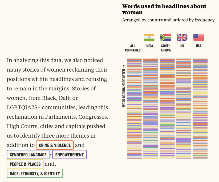
When Women Make Headlines studies how women are represented in the news. According to earlier data, women are news subjects only 24% of the time. But when and how they are mentioned reveals how they are viewed by society. This story visualizes the language used in women-centered headlines and how it has changed over time. Play with it. It’s mesmerizing – not to mention darkly revealing.
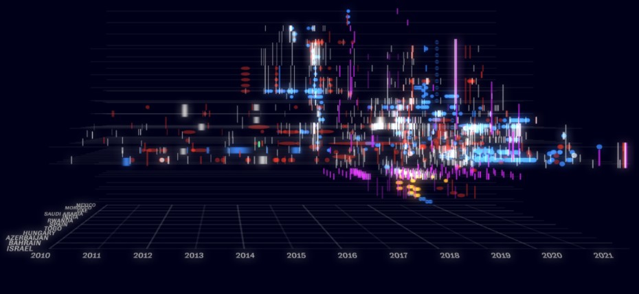
How the NSO Group Enables State Terror is a joint project of data visualization activist group Forensic Architecture, Amnesty International and Toronto-based The Citizen Lab. The joint project brilliantly maps the use of Pegasus spyware, a surveillance technology developed by Israeli security company NSO Group and used by governments around the world to target, track and commit acts of violence against journalists, human rights workers, activists and even in some cases, executives. To get a more in-depth view of how the platform works, go here. I encourage you to play with it to experience its full interactive powers. Bonus: sound design by Brian Eno.
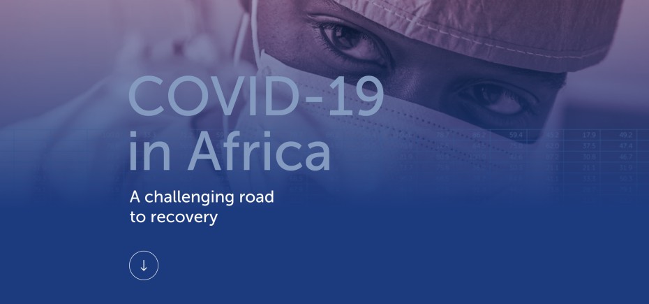
Lastly, you may have seen examples of ‘scrollytelling’, a data journalism technique which combines all of the elements mentioned above with the simple scrolling we all do whenever we are online to create. COVID-19 in Africa is a great example of how this works.
I used to despair about the future of design. But to immerse oneself in the world of data visualization is to open up a million possible futures for it. If I were starting out as a designer today, this is the door I would walkthrough.
Will Novosedlik is a designer, writer, long-time contributor and former editor of Applied Arts Magazine. He is known for a critical perspective on the cultural and socio-economic impact of design, brand, business and innovation.


