Don't Kick the Can
The humble tin can as a canvas for creativity
March 11, 2020
As a metaphor, the tin can has always had negative connotations.
In your grandparents' day, it was something they kicked around in the street in lieu of a soccer ball. Kick the can they called it. When your parents were kids, they would take two cans, connect them to a piece of string and call it a poor man's telephone. These days you think of it as something destined for the recycling bin.
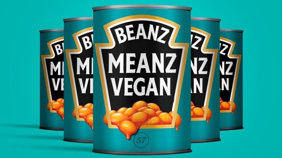
Enlightened marketers and designers see its journey to waste management as an opportunity for creativity. Innovation even. Take Heinz baked beans for example. Can there be a more commonplace container? A more prosaic product? Images of roadside cuisine come to mind. Yet Heinz has taken the rise of veganism as an opportunity to reframe the humble baked bean as a healthy, plant-based menu item. They haven't changed anything at all about the product. It's as if they're saying, We don't have to. We were vegan before there were vegans.
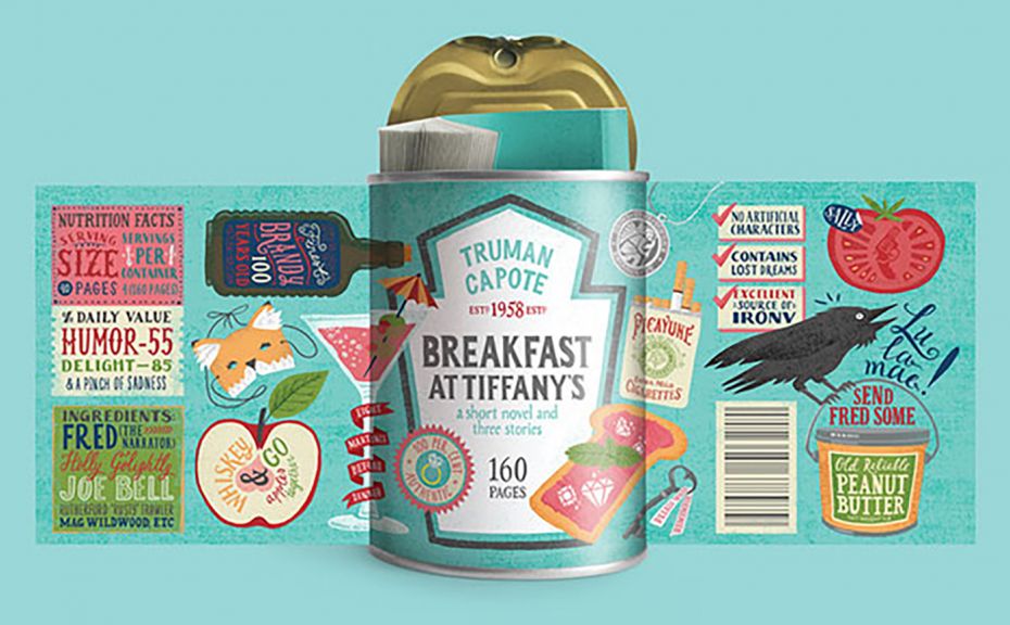
L.A.-based freelance package designer Maria Mordvintseva Keeler takes the famous Heinz crown-shaped mortise and uses it as a platform for a delightful dose of cognitive dissonance. She takes three novels with meals in their titles (the other two are Naked Lunch by William Burroughs and Anne Tyler's Dinner at the Homesick Restaurant) and stuffs them into a tin can as if they were meals for the mind. Check out the ingredient and nutritional claims. Based on this self-promotion I would hire Maria in a heartbeat.
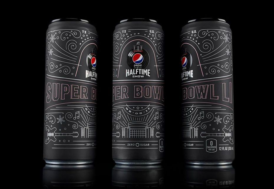
OMG, then there's the arch designer Mauro Porcini. Pepsi's Ferragamo-shod, Prada-clad Italian expat Chief Design Officer has been gleefully restaging the iconic American brand as a platform for highly expressive design experimentation. Here he takes the commemorative pop can to Elysian heights, fully committed to the understanding that branding has gone way beyond product and deep into the realm of experience. It's also an acknowledgement of the fact that everything we make in this business is ephemeral, reduced to a moment and then gone when the next marketing opportunity comes along.
The package may be a physical object, but it is only in our hands for a few minutes. Porcini's genius, like his fashion sense, is that he completely grasps that his job is to celebrate those few minutes and pack as much into them as he can. Otherwise, it's just a can of pop.
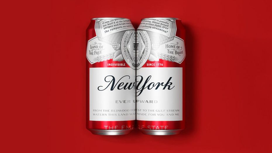
Who said you can't teach an old dog new tricks? Here Budweiser reimagines, resizes and repositions the traditional trade dress on its seasonal summer brews. In this edition, it celebrates the 11 states in which it is brewed by putting the state's name front and centre and selling it only in the state that brewed it. The other 39 will just have to settle for the regular label. Design credits go to Jones Knowles Ritchie.
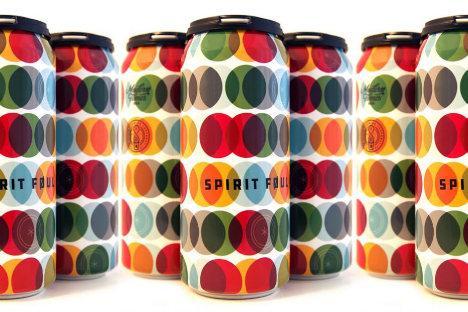
Brewer Spirit Foul (don't you love how Shakespearian that name sounds?) brings back the eye-tingling, mind-bending vibe of op-art to turn its cans into the merchandising version of trippy wallpaper. The only problem is after drinking three of these the overlapping circle pattern could be a bit dizzy-making. On the bright side, that might just be a sign that you should be calling for a ride home instead of drinking and driving. Wow. A beer with a built-in safety test!
These cans are canvases for creativity. Package designers everywhere would salivate to have clients with this much of a sense of adventure. If you are going to put something on the shelf, make it memorable. Buying groceries is boring. It's a chore. Make it more fun, people.