Field Trip & Co. Tells an East Side Story
April 17, 2019
When it comes to hospital fundraising, the competition for eyeballs and wallets can be fierce and the market fragmented.
There’s no particular reason to elevate the reputation of any hospital above that of its peers, especially in a market like Toronto, which is home to some of the world’s leading health care facilities. They’re all good at what they do. They’re all challenged by reduced government funding and chronic austerity. You just can’t say ‘my hospital’s better than yours’, or ‘my hospital needs funding more than yours does’. They are all in the same boat, fighting the same financial and bureaucratic headwinds.
So what do you do if you are a community hospital in an overlooked part of town? This was the challenge for Michael Garron Hospital, which recently changed its old name – Toronto East General – to that of its biggest donor. A few years after that rebrand, it’s now the hospital’s foundation that has put itself out there in search of funds with a campaign brand of its own. And it’s got some serious competition.
Until recently many hospital fundraising campaigns portrayed the patient as a victim and her doctors and nurses as the tirelessly heroic agents of her recovery. The Sick Kids Foundation has completely blown that trope out of the water with its VS campaign of the last 3 years by making both the patient and her caregivers as heroic as Olympian athletes. No victims, only champions. It is the most ambitious fundraising campaign in recent memory and has raised a billion dollars so far.
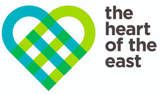
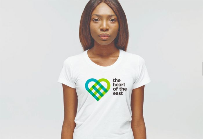
“Not everyone has a VS-sized budget though. The Michael Garron Hospital would need to do with a lot less”, as Creative director Alison Garnett of Field Trip & Co. points out. And the campaign had more than one job to do. “Because the logo was new, this campaign isn’t just about fundraising: it’s also about raising awareness of the brand.” As for the logo, Field Trip has crafted a wonderful ‘woven heart’. Explains Garnett, “It’s a symbol that communicates both compassion for and integration with the fabric of what is the most diverse community in the entire metropolitan area.”
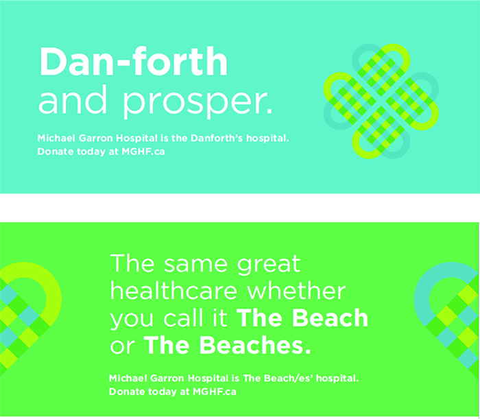
That ‘woven heart’ became the visual workhorse of the campaign, allowing it to be positioned in different ways to support the specific message being delivered. Since this was targeted only at east end neighbourhoods, the campaign doesn’t appear in any other parts of the city. Out of home is supported by online and social.
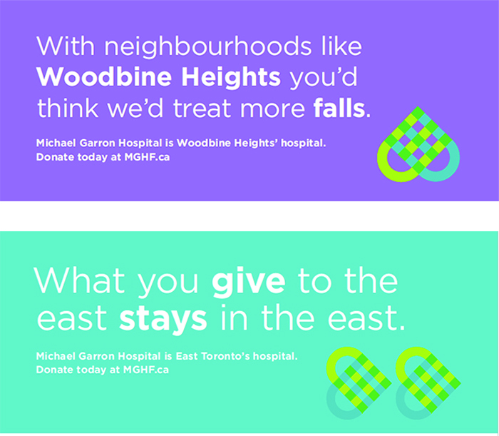
The Heart of the East delivers an important message on a limited budget, appealing directly to the identity of each of the east end communities it serves. It uses the design tradition of minimal imagery with maximum meaning to get that message out in as many local variations as possible. It gives the saying ‘less is more’ a whole new meaning. wn


