FIFA: From Fabergé to Football
July 9, 2018
The FIFA World Cup's graphic title cards on TSN are as rich in execution as they are in symbolism
Ah, the World Cup. Like the Olympics, this quadrennial sports fest does its best to command or attention for the few weeks that it takes the world’s national squads to fight their way to the prize.
The current contest has been one of the most exciting in recent years, with plenty of stunning upsets as favourites fall to lesser teams and underdogs knock them off the road to ultimate victory. Who thought Germany would be eliminated? Or that Japan would almost bring down Belgium? Or that Russia would even come close to winning a spot in the quarter finals?
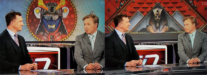
If you have been watching this in English Canada, you may be tuned in to TSN’s coverage of the tournament. If you are, you may or may not agree that the graphics designed for the opening sequence and the screens on set are almost as exciting as the games themselves. For a design and brand wonk with a passion for visual semiotics, TSN’s packaging of the games is an absolute joy ride through what can only be described as a nostalgic throwback to the Russia of the Romanovs.
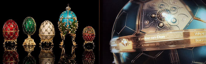
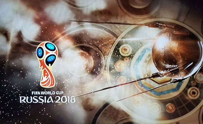
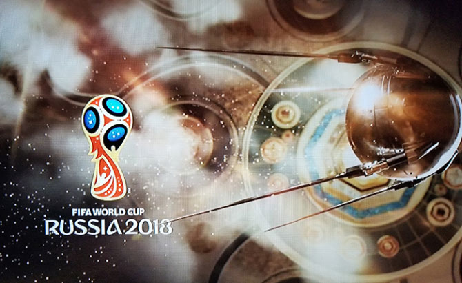
Looking at the opening sequence, it doesn’t take too long to realize that the overall concept owes far more to Fabergé than it does to FIFA. We are taken on a breathless tour of a mythical landscape populated by icons from both Russia’s imperial past and its more recent Soviet era. Bejewelled Vostoks, gilded Sputniks and heroic locomotives mingle with metallic dragons, birds of prey and music box ballerinas as we careen through a visual narrative as richly appointed as the façade of the Hermitage museum. Flying past bridges and palaces we finally arrive at our destination: a Fabergé-like football that opens up in a flash of blinding light to reveal the coveted cup.
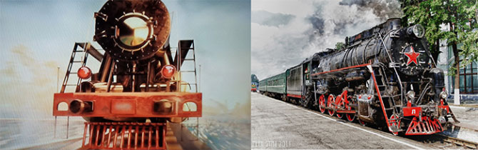
As someone who was brought up as a modernist, the visual “imperialization” of icons pulled from the Soviet era is of particular interest. Take the locomotive for example. The classic Soviet version—a coal-black engine with a big red star in the front has been transformed into a red-hot, golden-nosed iron horse. Fun to compare it to its more revolutionary portrayal as a symbol of the USSR’s industrial might. Even more fun is the representation of a Vostok rocket taking off with as much gilding and filigree on its giant boosters as a royal carriage.
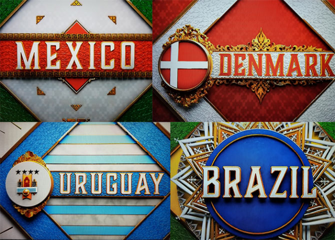
Then there are the team insignias that appear onscreen whenever a particular match is being discussed. Pharoahs, Samurai warriors and Day of the Dead skulls are mined for their imperial symbolism. And the country names are dripping with the kind of filigree you might find on the dress uniform of a Hapsburg-era field general. Deliciously, grandiosely over the top.
Considering the grandiosity of this visual buffet, one is tempted to look at it within the context of present-day politics (you knew I would get here eventually, didn’t you?). It’s more than clear that Russia is working hard to recover its pre-revolutionary imperial glory on the world stage. Hosting FIFA is a key PR move in this effort. What’s curious is how a Canadian designer (I’m assuming this was done here) would have so perfectly represented these imperialistic ambitions. You almost wonder if Vladimir Putin wrote the brief.
Will Novosedlik likes playing in traffic at the intersections of business, brand, design and innovation. He's worked both as a consultant and client on brands such as Telus, TD Bank, Bata International, Williams-Sonoma, Vodafone and Deutsche Telecom in Canada, the US, North Africa and Europe.


