Frédéric Tremblay: re-imaging an historical icon
Reliving Montreal's Olympic Pride
January 31, 2020

Frédéric Tremblay is a Creative Director at lg2 in Montreal, QC
Frédéric started his career as an illustrator and gradually transitioned into advertising. Over the past 15 years, he has worked on the repositioning of several major Quebec brands such as Maxi, Boréale Microbrewery, Desjardins, and Montreal Olympic Park. His work has been recognized by Applied Arts, The One Show, Art Directors Club, the Marketing Awards, CRÉA, Grafika, and Communication Arts. For Frédéric, photography and illustration are essential to creating advertising that defies the norms of creativity. He believes an idea cannot live without a perfect visual performance.
Frédéric is currently judging our 2020 Photography & Illustration Awards. When we asked him to share one of his projects with our readers, he chose one that is emblematic of his belief about the symbiotic relationship between design and imagery. It answers the question of what to do when you have something of such historical and social significance: create a design focused on imagery that speaks for itself.
Project: Montreal Olympic Park rebrand campaign
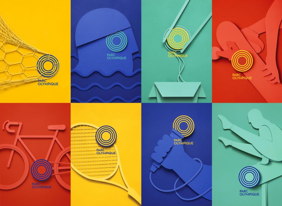
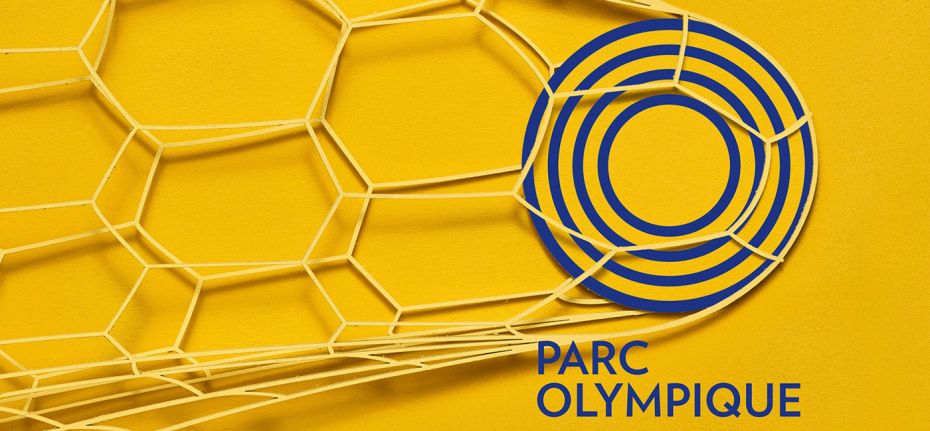
The campaign aims to build the Olympic Park’s notoriety. The objective was to turn the Park into both a tourist destination as well as a local destination for sports, culture and leisure.The idea was to leverage the historical and current identity of the Olympic Park by showcasing its logo and colours. The use of symbols and universal iconography makes the brand easy to understand, without the need for text. Evocative imagery made up of simple and colourful graphic elements that speak for themselves was used to further build on the historical and vintage identity. The visual rendering relies on the use of artisanal materials and a handmade process.

Twelve evocative posters that leverage the Park’s historical and current identity were developed. All elements were handmade. Eighty vector shapes were laser-cut in 1/16” thick cardboard. After 4 layers of paint and 8 hours of drying, it then took 6 hours to assemble the elements. To create the desired perspective and texture, no glue or string was used. The shapes were superimposed using stacks of coins and shot to achieve the final effect.

These beautiful, simple, dynamic and colourful graphic elements that are self-explanatory and highlight the historic nature of the Olympic Park, create a sense of pride and belonging amongst Montrealers and Quebecers. The visual identity will connect with tourists by creating a sense of wonder while inviting them to visit a historic site that is unique and impressive in size.
Aimed primarily at Quebecers who want to enjoy the facilities and/or relive Olympic history, the campaign was also aimed at the 2 million tourists who visit annually from all over the world. The campaign was launched on social media and using the bus shelters surrounding the Olympic Stadium as well as POS.


