From Graphics to Beer: The Journey of Martin L’Allier
March 4, 2019
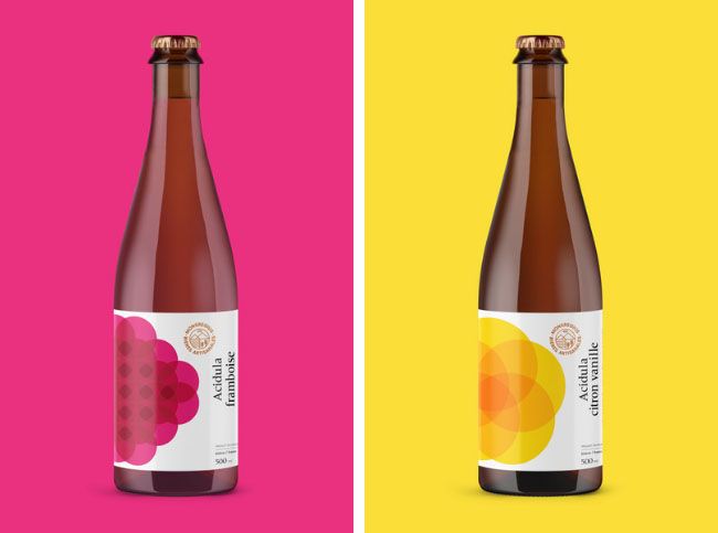
Sour Fruit Beers. Acidula Framboise (left) and Acidula Citron Vanille
Mixing work with alcohol is usually a recipe for disaster. But for Martin L’Allier, mixing business with pleasure allowed him to turn his passion into a career.
L’Allier has worked as a graphic designer for the last 20 years. A graduate of UQAM and the Royal Melbourne Institute of Technology (RMIT) he designed within the business and arts sectors.
Five years ago L’Allier found himself at a crossroads. Advancing his career would lead him to the management side of design. At the same time, the work he was designing began to feel too corporate. A change of pace is what he longed for.
Today, L’Allier is the founder and artisan brewer of MonsRegius, a brewery housed in the foothills of Mount Royal, Quebec. A life-long lover of beer and wine, L’Allier has found the combination of work and hobby to be quite enjoyable.
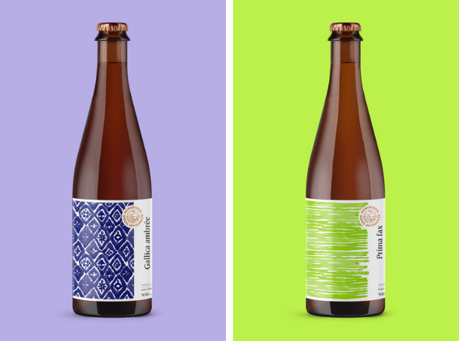
Table Beers. Gallica Ambree (left) and Prima Fax
At MonsRegius, L’Allier’s designs all aspects of the 26 beers he brews. That includes t-shirts, glasses, packaging and of course, labels.
“It took me a couple of years to learn the basics and to shift professionally from a designer to a business owner,” he says. “Around three to five to feel comfortable.” This process started while L’Allier set out to explore other breweries in Quebec – to get an understanding of key flavors and brewing practices.
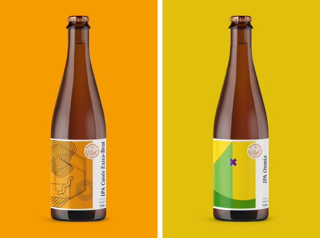
IPAs. Cuvee Extra Brut (left) and IPA Omina
The first hint of L’Allier’s design background is the logo for MonsRegius. Clean, distinctive and simple, he describes it as a “seal for the beer.” MonsRegius is Latin for Mont Royal and the golden crown, mountains, water, and wheat elements tie together the elements of the company – location, ingredients and value.
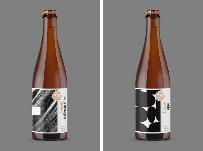
Consumers are tipped off to the ingredients by design. Red circles for raspberries for example or dark lines for heavier brews. L’Allier also notes that his labels are a nod to the world of wine, with their simple yet contrasting colours. Because of this, he is hopeful that wine-lovers will stop and have a closer look at the product – and even buy it. “[Our] labels standout on the shelves, for wine-lovers, it’s a universe they recognize.”
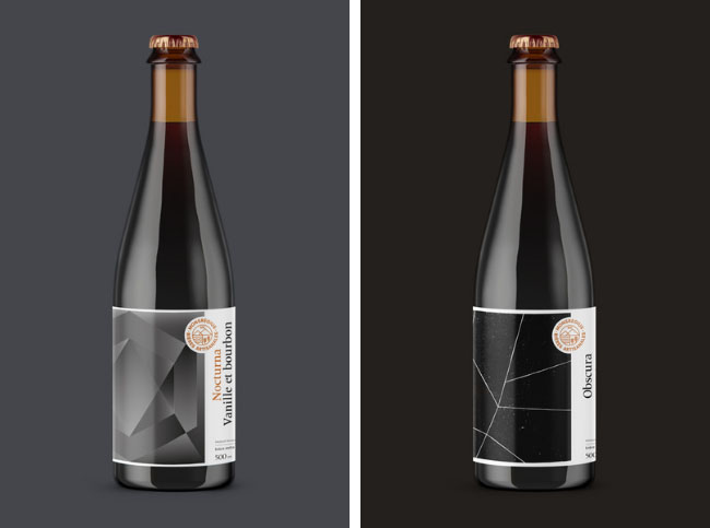
Porters and Stouts. Nocturna Vanille Bourbon (Stout) and Obscura (Porter)
“Our graphics give you an illusion and a few subtle tips to the poetry behind the beer,” he says.