High Design: Canadian Cannabis BRANDING Sparks Up
June 21, 2018
With cannabis legalization around the corner, Canadian designers are finding ways to elevate a burgeoning new industry despite strict packaging regulations
The road to cannabis legalization in Canada could best be described as one littered with design disappointments. First, it was the news that some provinces, including Ontario, would limit cannabis distribution to government-run stores, limiting marketing opportunities. Then, in March 2018, it was the unveiling of the Ontario Cannabis Store (OCS)’s branding by Leo Burnett Toronto.
Critics thought the modest OCS logo was, well, kind of boring. But while design nerds balked at its simplicity and corresponding $650,000 price tag, it was hard to deny that it was an improvement on the alternative. Acid-green logos, pixelated marijuana leaves and garish cartoons have long dominated cannabis design—or the lack thereof.
In fact, the OCS logo was building on what’s been happening since 2001, when medical marijuana was first legalized in Canada. Since then, cannabis producers have focused on making products look as clinical as possible, with aesthetics to match Big Pharma’s.
It’s only now, with the legalization of recreational cannabis underway, that design can finally be taken to an, ahem, higher place. By March 2018, more than 2,000 trademark applications had already been filed for cannabis products, including tinctures, topicals, edibles, drops, concentrates, sublinguals and even good old-fashioned bud. There are storefronts to create and websites to build. Then there are the associated lifestyle products to design and market, including clothing, vaporizers, grinders, papers and stash jars.

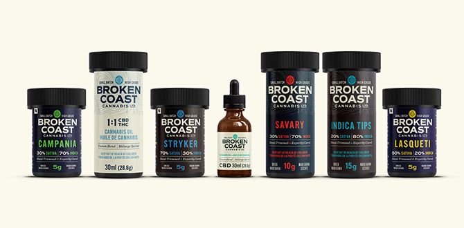
Broken Coast Cannabis line, designed by BC-based Webb Creative
It should be an exciting time for designers and agencies working in Canada, in an industry valued at around US$37 billion. Instead, they’re faced with a daunting task. How do you convince consumers to try a product that’s been stigmatized for decades, when that stigma is only being further reinforced by proposed government regulations?
A leaf by any other name
It’s the morning after Health Canada has announced its suggested plain packaging guidelines—yet another design disappointment on the path to legalization—and Berkeley Poole, for one, is not impressed. She’s not upset that Health Canada has suggested that products will need to have a single, uniform colour with a standardized font, or even that graphics and images won’t be allowed.
No, her biggest beef is with the mandatory “universal symbol” indicating that THC is within the package. “That THC symbol is very stoner-y; I question the decision there,” says Poole. “It looks like something someone made in PowerPoint.” That icon of a cannabis leaf only makes Poole’s job harder. The creative director behind cannabis brand house Hiku and its award-winning Tokyo Smoke brand, she’s already responsible for differentiating nearly identical products in a soon-to-be-crowded marketplace, educating consumers and challenging years of misconceptions. And now, she has to potentially do it while slapping a marijuana leaf on her products.
It may seem like a small thing, but that marijuana leaf is counterproductive to the goal of the emerging recreational cannabis market. In order to normalize the product, designers are steering clear of “420,” “weed,” “pot” and “getting stoned.” Instead of bright greens and Rasta colours, natural hues and cool colour schemes are favoured. Even Snoop Dogg’s Leafs by Snoop line wouldn’t look out of place if it were stocked in Indigo’s lifestyle section.
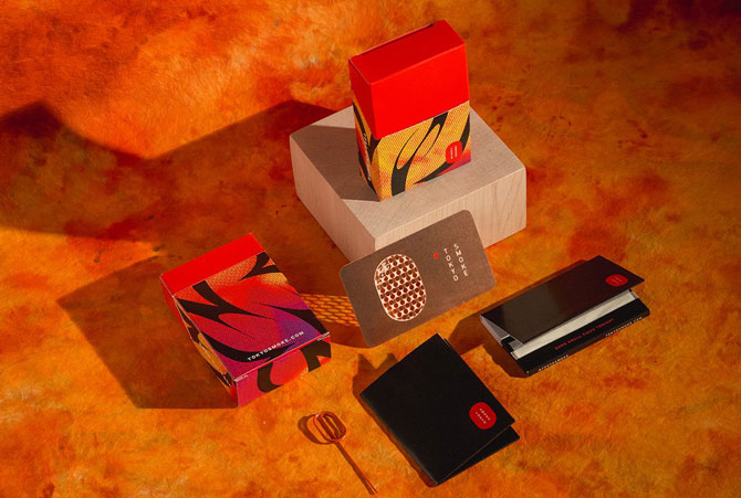
Tokyo Smoke's 420 Burn Kit
However, this wasn’t the case when Poole first started working with Tokyo Smoke in 2016. “There was a really pervasive visual language, but it wasn’t one that I could connect with or the people I know could connect with. The idea of a high-end approach to cannabis seemed smart to me and I really gravitated towards it,” she says.
For inspiration, the 31-year-old turned to Tokyo Smoke’s target demographic: her peer group. Sitting down with friends, she discovered that the narrative thread for cannabis use was counterintuitive to the image of the lazy stoner eating Cheetos and binge-watching Netflix. Instead, she found that her friends—everyone from chartered accountants to lawyers to photographers—were using the drug with “thought and intention” to enhance productivity.
She set about creating an immersive experience for the product. Today, Tokyo Smoke has six cafes across Canada, with five more set to open later this year. Modern, urban and sleek, each location sells cannabis accessories and clothing, and looks no different from an indie coffee shop. In fact, you can order a coffee at each of their flagship locations.
Since what Poole refers to as the company’s “humble beginnings”—which led to Tokyo Smoke being named the “Best Brand” at the Cannabis Awards in 2017—a lot has changed. “Before, the imagery associated with Cheech and Chong and stoner stereotypes was so pervasive, and now you’re seeing this crazy proliferation of design-centric brands,” says Poole.
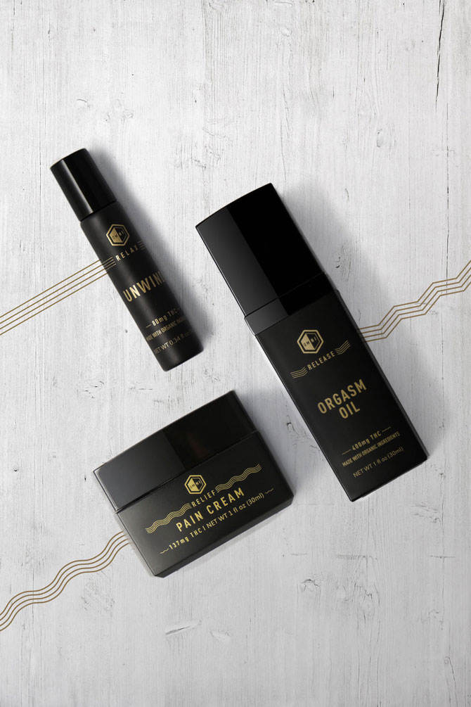
Connekta, a Vancouver-based cannabis design and branding agency, created refined packaging for local Omni Botanicals, a line of cannabis-infused wellness products
Building a grassroots industry
This proliferation of brands has also led to the emergence of advertising agencies specializing in cannabis design.
For Nanaimo, British Columbia’s Hired Guns Creative, which does marketing and design for breweries, wineries and distilleries, it was only natural to expand its portfolio to include cannabis.
“With cannabis, it’s literally grassroots,” says Richard Hatter, creative director at Hired Guns. “To get in on it at ground level and help shape it is a huge opportunity.”
Hired Guns’s first big project was for Kola, a client that wanted mature branding that wouldn’t look like “a mushroom poster from the ’70s” and that would allow its cannabis capsules to stand out from all the other brown pill bottles on the shelf. With strong typography, a holographic prism foil and a rich black background, Hatter created a modern and sexy design, which was named one of the 10 best cannabis packaging designs by The Dieline. Unfortunately, if Health Canada’s proposed guidelines are accepted, the design can’t be used. Not all is lost though—it helped Hired Guns land six new cannabis contracts.
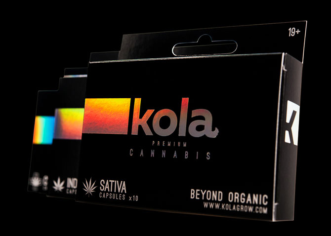
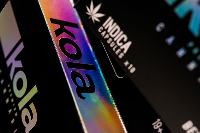
Hired Guns Creative's packaging for Kola Premium Cannabis
But while the prospective client list is endless for agencies like Hired Guns, convincing producers—who have long relied on word-of-mouth marketing and Ziploc bags packaging—that there’s value in professional branding can be an uphill battle.
“When you come with an actual quote, you knock the pants off some of these guys. They just aren’t expecting it,” says Hatter. “So you just have to show them the numbers and plead that case to them.”
It’s not just the cost that’s problematic. The push for modern, contemporary design risks alienating the very community that fought for legalization. For those who have worked in the cannabis industry for years, this was the most disappointing aspect of the OCS logo—that the company preparing the brand didn’t have any existing stakes or experience in the cannabis space.
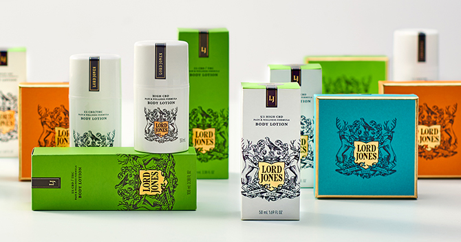
Canadian designers will be looking to the US, where recreational cannabis is legal in eight states, for inspiration in this emerging market. California-based cannabis company Lord Jones enlisted Minnesota’s Werner Design Works to develop its brand identity
“It seems like everybody is trying to dabble in this,” says Dessy Pavlova, instructor of cannabis marketing, sales and drug development at Kwantlen Polytechnic University. “It’s very frustrating to the people who really know the plants, the industry and the target market.”
Ultimately, everyone is working towards the same end goal—ensuring that cannabis becomes just another standard consumer product on sold on shelves. Perhaps that’s why all the designers I spoke with were skeptical that the proposed plain packaging guidelines will stick.
Hatter was one of those designers. “They’re trying to handcuff some of the most creative people in the world,” he says. “So good luck—we’re going to figure things out.”
____
Jessica Wynne Lockhart is a writer whose work has appeared in Applied Arts and Toronto Star.
This article originally appeared in the Summer 2018 issue of Applied Arts. For design tips on creating for this emerging market, pick up the current issue at one of these stockists.


