If It Ain’t Broke, Don’t Redesign It
May 17, 2016

Sometimes, the only thing that needs fixing is the brief
In the pre-Internet days of advertising, there was a lament voiced whenever a client asked for a new campaign to replace one that was only a few months old: The client got tired of the campaign before the public did.
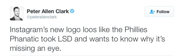
In the digital age, the reinvention of brand assets has become so common that it’s no longer a source of surprise. Derision, maybe, but not surprise. Last month, I talked about logo redesigns spearheaded by the non-designer CEOs of Yahoo! and Uber. Last week, the change no one asked for came from Instagram.
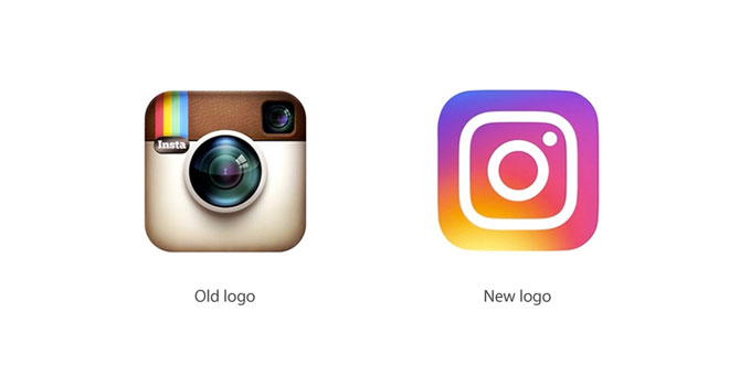
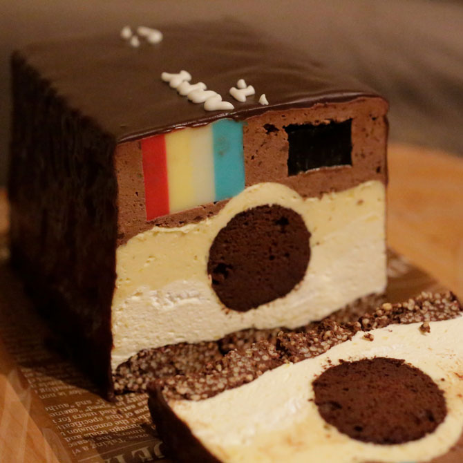
Instagram’s head of design, Ian Spalter, acknowledged the passion his users have for the old logo, a passion that drives them to honour the brand with things like fan art and ambitious baking projects.

Yes, Spalter recognized that Instagram had a beloved logo that was one of the most recognizable icons on anyone’s smartphone screen. So, of course, it had to change, whether the Internet liked it or not.
And the Internet did not.

Had Instagram confined itself to simply updating its logo, it might have gone the route proposed by Danish designer Michael Flarup.

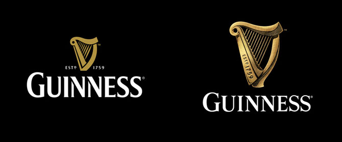
Or, it might have followed the lead of Guinness by freshening the brand in ways that ordinary users would barely notice.
But in the cases of Uber and Instagram, a mere freshening of the logo was the least of the asks. Consider what Travis Kalanick had to say about his reboot of Uber:
We exist in the place where bits and atoms come together. That is Uber. We are not just technology but technology that moves cities and their citizens. So today, we’re excited to roll out a new look and feel that celebrates our technology, as well as the cities we serve.
Or Ian Spalter’s rationale for redesigning Instagram:
Brands, logos and products develop deep connections and associations with people, so you don’t just want to change them for the sake of novelty. But the Instagram icon and design was beginning to feel, well…not reflective of the community, and we thought we could make it better.
In each case, we can work backwards to what might have been in the brief. Celebrate our technology! Celebrate cities! Reflect the community! Make it better!
In this world, there are phrases that are guaranteed to make clients purr with delight whenever they’re dropped into a PowerPoint deck. Celebrate our technology and Reflect the community are but two of them in a list that probably numbers in the hundreds. So, yes, in a client document, they are wonderful crowd-pleasers, much like the purple-wrapped chocolates in a tin of Quality Street.
But in a creative brief, they are recipes for disaster, because they have no real meaning. As of last September, Instagram had 400 million active users. So how does a designer reflect a “community” when it comprises such a large swath of humanity?
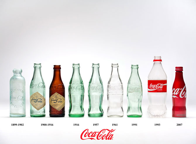
As an antidote to such wispiness and imprecision, consider the 1915 brief that led to the Coca-Cola bottle. The problem to be solved was easily understood. Coca-Cola’s plain bottle and paper label were easily copied by competitors. So, in what was quite possibly the most elegant and inspiring brief in all of marketing history, the client asked for a “bottle so distinct that you would recognize if by feel in the dark or lying broken on the ground.” As the client noted, “We are not building Coca-Cola alone for today. We are building Coca-Cola forever, and it is our hope that Coca-Cola will remain the National drink to the end of time.”
Marketing has evolved in many ways but, alas, successful internal communication has not been one of them. The digital revolution allows us to do everything faster than ever. And that includes implementing really bad decisions.
Toronto freelance copywriter Suzanne Pope is the founder of Ad Teachings.