It Takes All Types
April 4, 2018
In praise of the erudite typographer
For whatever it’s worth, I’ve taken the Wechsler Adult Intelligence Scale—better known as the standard IQ test—twice in my life, at a 20-year interval. Both times, the score was the same and was evenly split between verbal and visual intelligence. Which means I’m either just as good or just as bad with words as I am with images.
For the first half of my career, I earned my living off the visual side of my brain, as a graphic designer. For the second half, I switched to the verbal side, earning a living as a strategist and a writer. And as a writer, I have often used words to talk about images, so am still a slave to the bicameral equivalence indicated by my WAIS scores.
So it was with extreme delight that I visited the website of my friend Nick Shinn, sole proprietor and practitioner of the dark art of type design at the eponymously named Shinntype foundry. While browsing his catalogue of some 32 fonts, I was slowly seduced by both the visual and the verbal, which in the case of type design are as integrated as those two sides of the human brain can imagine.
For here is not only a body of typographic design but also a series of very erudite meditations on the origins of each design, informed as they are by a mind that is able to link the obscurities of typographic history to the current cultural context in which the types will be used. Take for instance his description of the font called Panoptica:
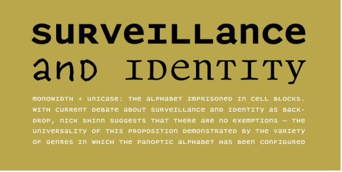
“Monowidth, unicase: the alphabet imprisoned in cell blocks. With current concern over surveillance and identity as backdrop, Shinn suggests that there are no exemptions, the universality of this proposal indicated by the diversity of genres to which the Panoptic effect has been applied.”
Unicase is the name given to fonts with only one case—as in the ancient Roman alphabet, which consisted of caps only. Monowidth refers to the fact that each letter in the font is the same width. And of course Panoptica refers to the concept of the panopticon, which views the all-seeing eye of CCTV and the Internet as a reprise of philosopher Jeremy Bantham’s 18th-century prison design with the watchtower in the centre surrounded by cells along the circumference. Hence the metaphor of an “alphabet imprisoned in cell blocks.” Here Shinn leverages the loss of privacy as inspiration for what is indeed a very unique family of typefaces.
If you have been a Globe and Mail patron for any length of time, you have been looking at Shinn types for years. He has developed the fonts for four of the last five redesigns of the venerable national daily. Shinn’s Walburn and Pratt Nova have both been pressed into service to help the Globe earn its daily bread.
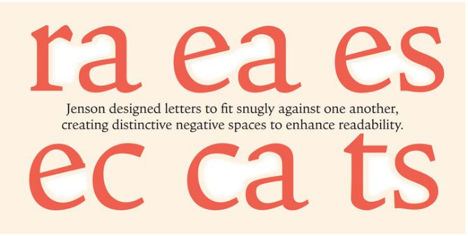
One of my favourite little meditations is for Shinn’s Goodchild font:
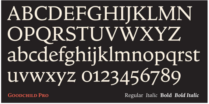
“The essence of any typeface is a visuality which neither words nor measurement can fully convey, and it is this concept of form which the type designer seeks to express by various syntactic means; narrative, philosophical, and associative. As the definitive model of the Roman letter for 350 years, Nicolas Jenson’s type of the 1470s has become inscrutable; the more it is propagated, the more mysterious and protean the concept of ‘Jenson’ becomes, the richer it is as a mine of meaning, and the better a foil for reinterpretation. Roll over Bill Morris, tell Bruce Rogers the news.”
Here Shinn has managed to enfold three periods of history in his scholarly net, starting with Nicolas Jenson in the 15th century, to the late 19th century’s William Morris and his Kelmscott press, to the early 20th century’s Bruce Rogers, designer of the famously Jenson-esque Centaur font.
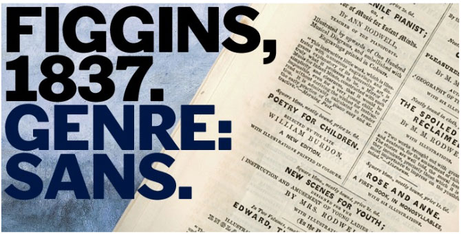
As you move through the description of each font, what emerges is a very post-modern sensibility—a mind that observes the world through the lens of typography, as adept at invoking Foucault and Frankenstein as it is at reframing Goudy and Gill in its quest for typographic reinvention. The word “recontextualize” comes up often, as in this comment on the font he calls Figgins:
“To meet the burgeoning demands of commerce, type founders in 1830s London introduced a plethora of new fonts which abandoned the traditional nib-informed model. Most radical were bold, capital-only designs with almost no stroke contrast, stripped bare of serifs. To all intents and purposes these minimal expressions of utility were identical to 20th century functionalism. Recontextualizing one of the original sans fonts, Shinn offers an alternative proposition to the myth of modernism.”
Shinn’s erudition places him among a very small group of practitioner/thinkers whose understanding of typography’s power as both a producer and product of culture is to be treasured. One is reminded of Robert Bringhurst’s Elements of Typographic Style or Alexander Lawson’s Anatomy of a Typeface. With his elegant balance of both visual and verbal expression, the world definitely needs more Shinn.
Will Novosedlik likes playing in traffic at the intersections of business, brand, design and innovation. He's worked both as a consultant and client on brands such as Telus, TD Bank, Bata International, Williams-Sonoma, Vodafone and Deutsche Telecom in Canada, the US, North Africa and Europe.