Jeremy Gladstone: Re-envisioning Toronto's urban landscape
When everyone wants in on the vision
December 13, 2019
Jeremy Gladstone is Principal & Creative Director of Gladstone Media Inc. in Toronto

Gladstone Media is an award-winning strategic marketing, advertising, and multimedia production company in Toronto, with a focus on lifestyle brands and real estate marketing. Jeremy believes Gladstone Media’s success is because they try to give the viewer a true multimedia experience, and integrate a vast array of media platforms into their designs, from time-lapse photography and 3D fly throughs, to motion graphics and film production. Prior to starting Gladstone Media, Jeremy was responsible for the art direction of many high profile productions in television and new media, including Valentino Fashion Show - fall line – Toronto 2008, CBC's The Hour with George Stroumboulopoulos, The Much Music Video Awards, Intimate and interactive with Janet Jackson, The Giller Prize, The Gemini Awards, and Jay Z on M.O.D, as well as many others. Jeremy has also worked on major projects for: MTV, TSN, Bravo, Star TV, The History Channel, Global, and CTV, among others.
That's what happens when you get very good at something: everyone wants you. In the super-sized ad agency world, you generally won't find two major head-to-head brands using the same agency. But when you've got your own firm, and you've got a knack for a niche, you'll likely be creatively challenged with sometimes seemingly identical clients all wanting you to work some of that same magic on them ... only different, please.
Here's where that real estate marketing (hidden in the first sentence) comes in. Toronto, like many other major cities, is bursting at the seams with condo developments. They're all competing for the same investors, and with all hoarding and cranes looking pretty much the same, it's up to magicians like Gladstone to create a unique brand for buildings that's don't yet exist. Jeremy was a recent Applied Arts judge, and we asked him to share some of his work. Instead of the flashy motion work he's been known for, Jeremy sent examples of how Gladstone Media turns piles of bricks into communities with unique personalities. Take a look at what he's shared:
Project: Upper East Village
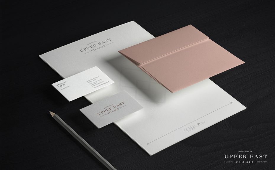
Our client, Camrost Felcorp, was developing a master-planned community in Leaside, a neighbourhood with a reputation for being tight-knit and selective about the types of developments they welcomed into their area. Our intention was to create a brand that seamlessly integrated into this well-established community - one that felt as if it had always been there. The name Upper East Village was chosen to give this project a fresh, luxurious feel as Toronto’s “Upper East Side”, establishing it as a part of the fabric of Leaside and paying homage to the location and its longstanding residents. For the logo, we chose to combine a strong neoclassical font with an unornamented sans serif counterpart. Together in a stacked logo with geometric elements, it communicated simplicity in a marker that could withstand the test of time.
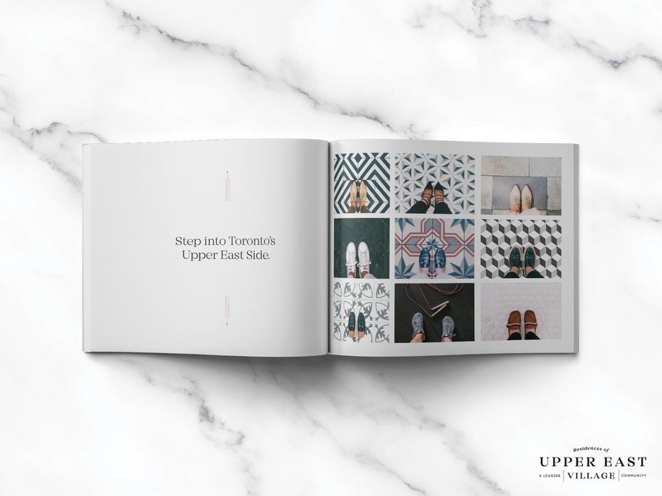
The tagline “Step into Toronto’s Upper East Side,” set the tone for activity, luxury, and lifestyle while leveraging Leaside’s reputation as a desirable neighbourhood with more to offer than just its location. Besides original photography set against the backdrop of spring, highlighting the draw of the area’s greenspaces and outdoor activity, all collateral was peppered with Instagram-inspired images of people’s shoes (representing various aspects of our targeted demographic) against varying tiles and flooring, which provided texture and pattern to the brand’s image.
Project: Exchange District Mississauga
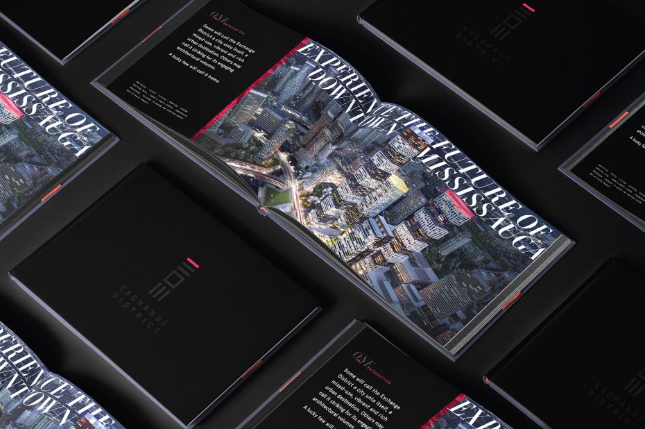
The Exchange District is an exciting new master-planned urban community in downtown Mississauga (just west of Toronto). This mixed-use community integrates residential condos with a pedestrian-friendly lifestyle, with a range of shopping, dining, and entertainment within the vibrant new district. Our brand had to reflect the dynamic future this project would bring to Mississauga. The overall brand envisioned a new future of downtown Mississauga through modern and futuristic design. We chose stark black as a backdrop for the brand palette and incorporated the bright, neon colours of the three towers’ jewel box toppers—pink, yellow, and blue—used to introduce each new tower as it was released to the public.
Project: Stockyards District
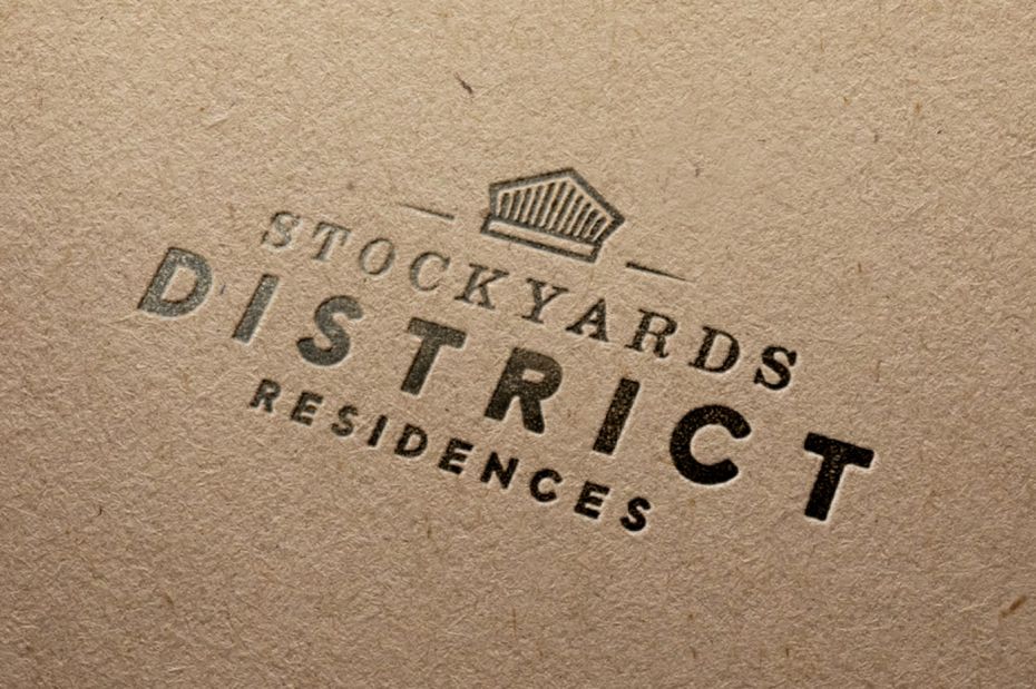
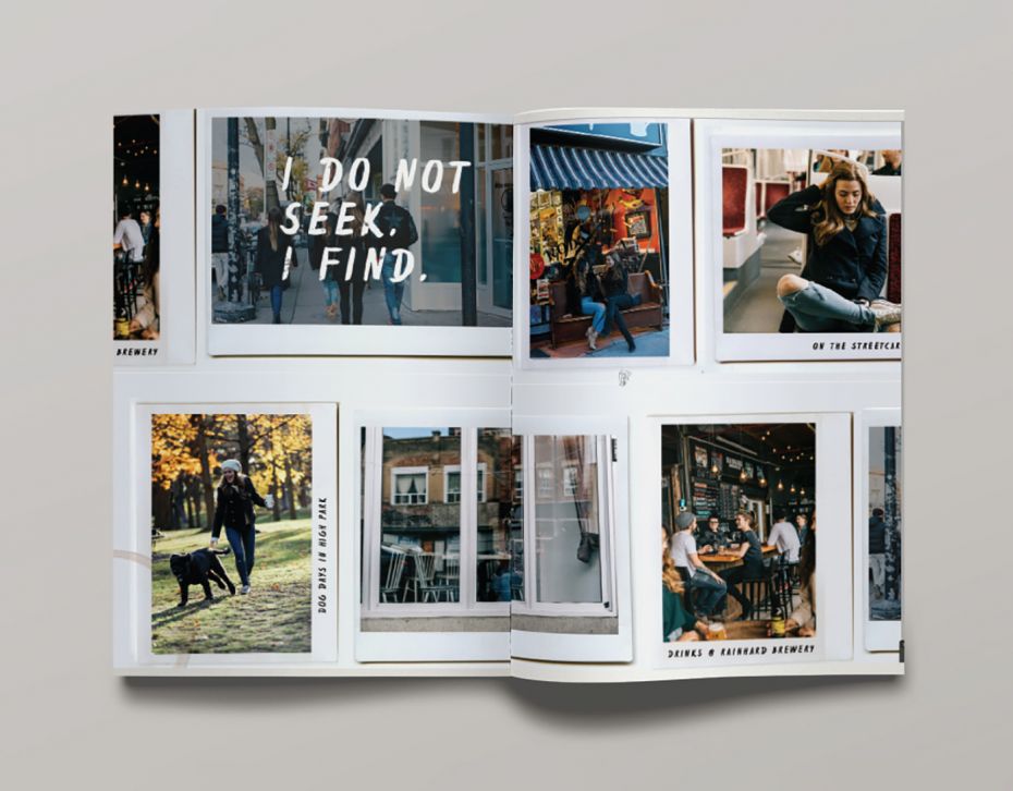
Our client, Marlin Spring, was developing a new condominium on St. Clair Ave. West in the Stockyards District, a former host to Toronto’s meatpacking facilities and a location close to the Junction, a unique and creative young community. With the goal of attracting first-time homebuyers and carving out a young community identity akin to the Junction we chose the name Stockyards District to unite the community as a formally branded ‘district,’ an element of the moniker that is reminiscent of cool and urban dwellings. We developed a logo that combined a symbol - the grill of an antique steam train, used to reference to the railway lines in the area - and two rustic typefaces, one with an imperfect, typewriter-like mood, contrasted against a second, bold sans serif. Each had the uniqueness of appearing incomplete to give the effect of being aged or having imperfect ink coverage.
Verbiage that supported an attitude or feeling of creativity and discovery was paired with quotes from famous artists: “Be yourself, everyone else is taken” (Oscar Wilde); “A dream you dream together is reality” (John Lennon). For print collateral, we created a scrapbook-like effect by pairing our original imagery and artist quotes with tactile, nostalgic design elements like Polaroids and retro embossed labels. The final brand was unconventional and edgy, and felt young against the backdrop of a thriving creative community, while still honouring the history of the Stockyards location.
... and you thought these new developments just seem to spring up magically out of nowhere.


