Meet the Maker
December 4, 2015
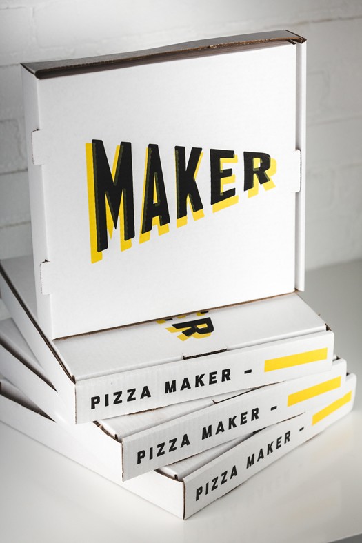
For the newly minted Maker Pizza, that means crafting the best-tasting delivery pizza — and looking good while doing it, too.
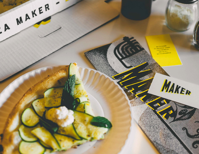
Pizza joints are abundant in Toronto, so if you’re going to open a new one, you’d better have something that sets you apart.
Shlomo Buchler, a former partner at city cult favourite FBI Pizza, recently struck out on his own and approached creative agency Community to develop the brand’s visual identity and name.
“The brief was to have the best delivery pizza in the city,” says Art Mandalas, Community’s president and creative director. “In our research, pizza has become very generic between things like value proposition and time guarantee. Those things give a negative view of what pizza delivery is like.”
Buchler secured a large space on Cameron Street off Queen Street West to house the new facility. He envisioned a pizza-making factory, which informed the name, says Mandalas.
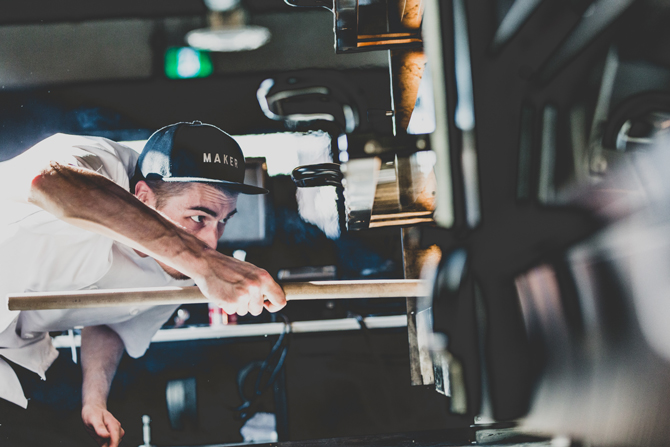
“How great is that? So when you visit the space, you’re going to the source, going to the maker. We’re hero-ing the person behind the crafting of the pizza.”
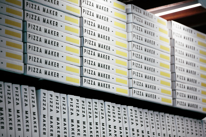
The Community team created several other ways for the customer to interact with the pizza makers, adding a yellow rectangle to the delivery box where the person who crafted the pizza can sign off. And if the pizza isn’t initially cooked to the exacting standards of the brand, the maker recreates it.
“It makes an instant connection with who’s behind the pizza,” says Jenny Vivar, associate creative director at Community. “Often the maker is the person that goes unnoticed and uncelebrated, and we really wanted to highlight them.”
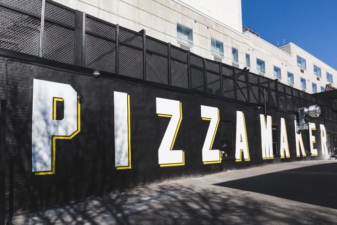
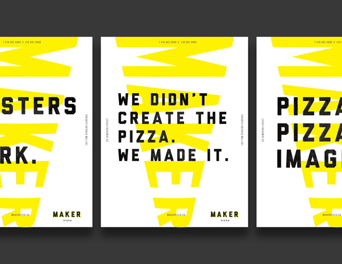
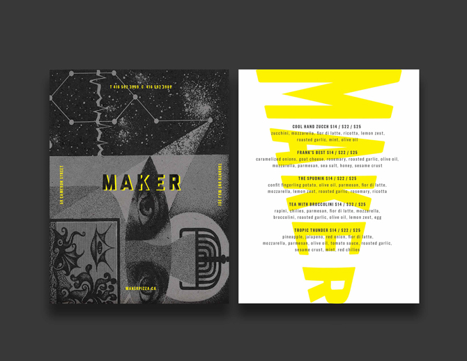
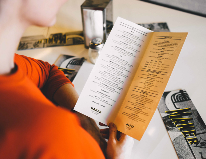
In their initial meetings, Vivar says Buchler referenced the movie 12 Monkeys as a loose inspiration for the design direction. Vivar extrapolated and took influence from Russian constructivist design. “A lot of the imagery we were inspired by had a magical mysticism,” says Vivar. “Stuff that says, ‘there’s something in the works’ or ‘there’s something in the making.’” In this way, the cover of the menu and the website allude to what Maker is, but not completely.
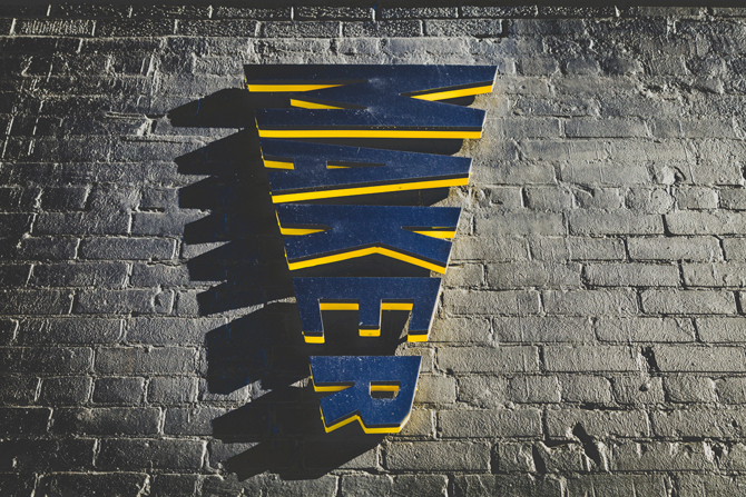
“From a visual perspective, we feel there’s been a lot of visual pollution when it comes to pizza branding. We went with a simple, utilitarian brand that would cut through a lot of the noise,” says Mandalas. One of the more striking elements is the formation of the Maker letters in the shape of an iconic slice. Avoiding the rustic Italian look was another key driver. “Pizza is ownable by everyone,” Mandalas says.
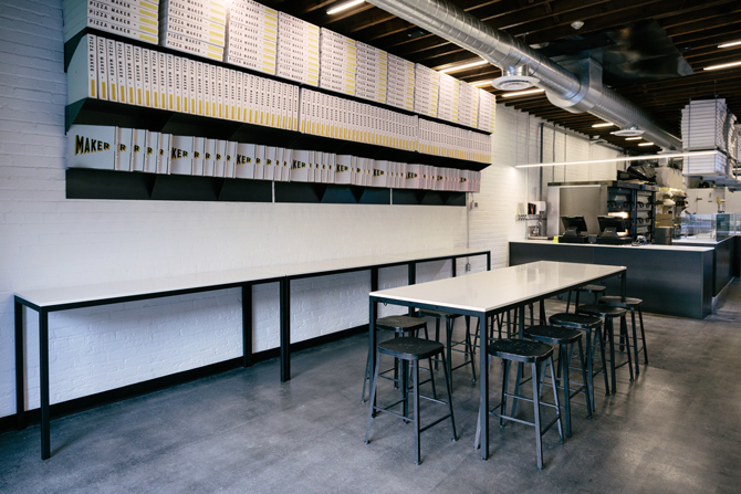
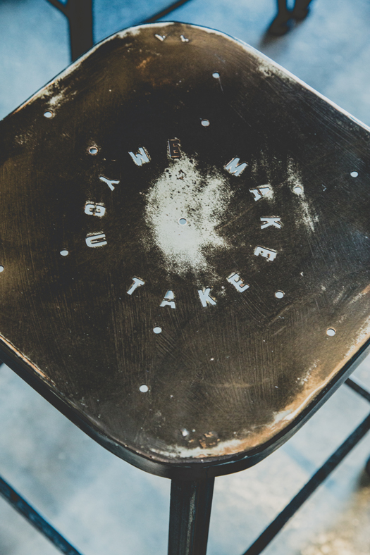
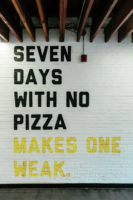
Community extended that philosophy inside the small eat-in area of the Maker Pizza HQ. With almost 90 per cent of the space dedicated to the kitchen and delivery service area, the eat-in area takes on an intimate, communal feel. Stools stamped with “We Make You Take” form a ring around a long table. “The seating feels like it’s part of the staff’s cafeteria. You get the feeling that you are lucky to be in the presence of the makers making the pizza,” explains Mandalas.
Vivar sums up the new brand simply. “It’s created a movement,” she says. “People are celebrating not only the taste of the pizza, but what the maker represents culturally.”
