Noise 13 Designs for the Cannabis Market
November 26, 2018
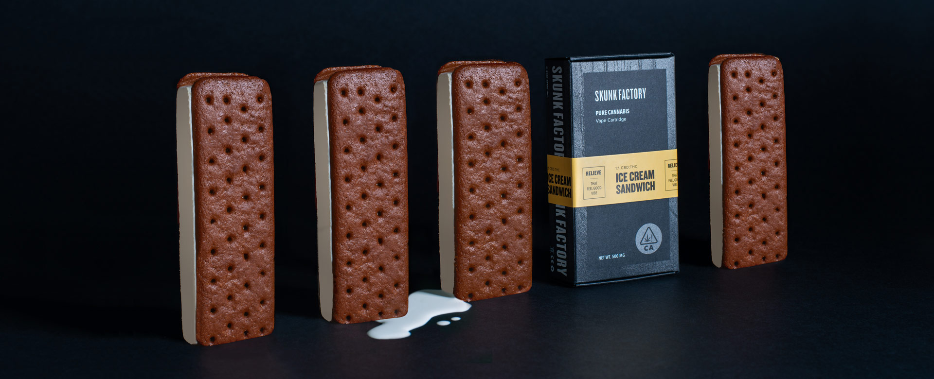
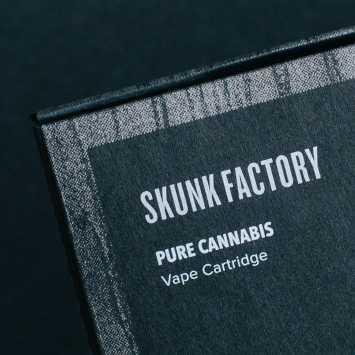
When Skunk Factory, a cannabis company, approached San Francisco-based agency Noise 13 to create a new brand evolution they knew exactly what they were looking for. They needed a new packaging design for their vape kits, cartridges and flower, that would reflect their brand identity and attitude, all timed with their market launch date.
To complete this task, Noise 13 closely worked with the company to better understand their brand goals and production methods. This in turn gave the creative team the background to create an elevated packaging, that reflected the quality of the products that Skunk Factory creates and sells.
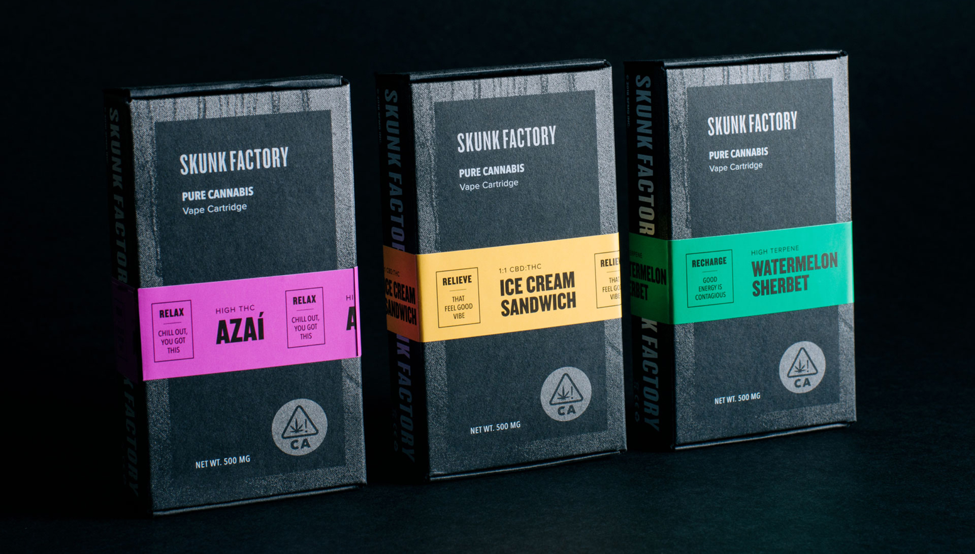
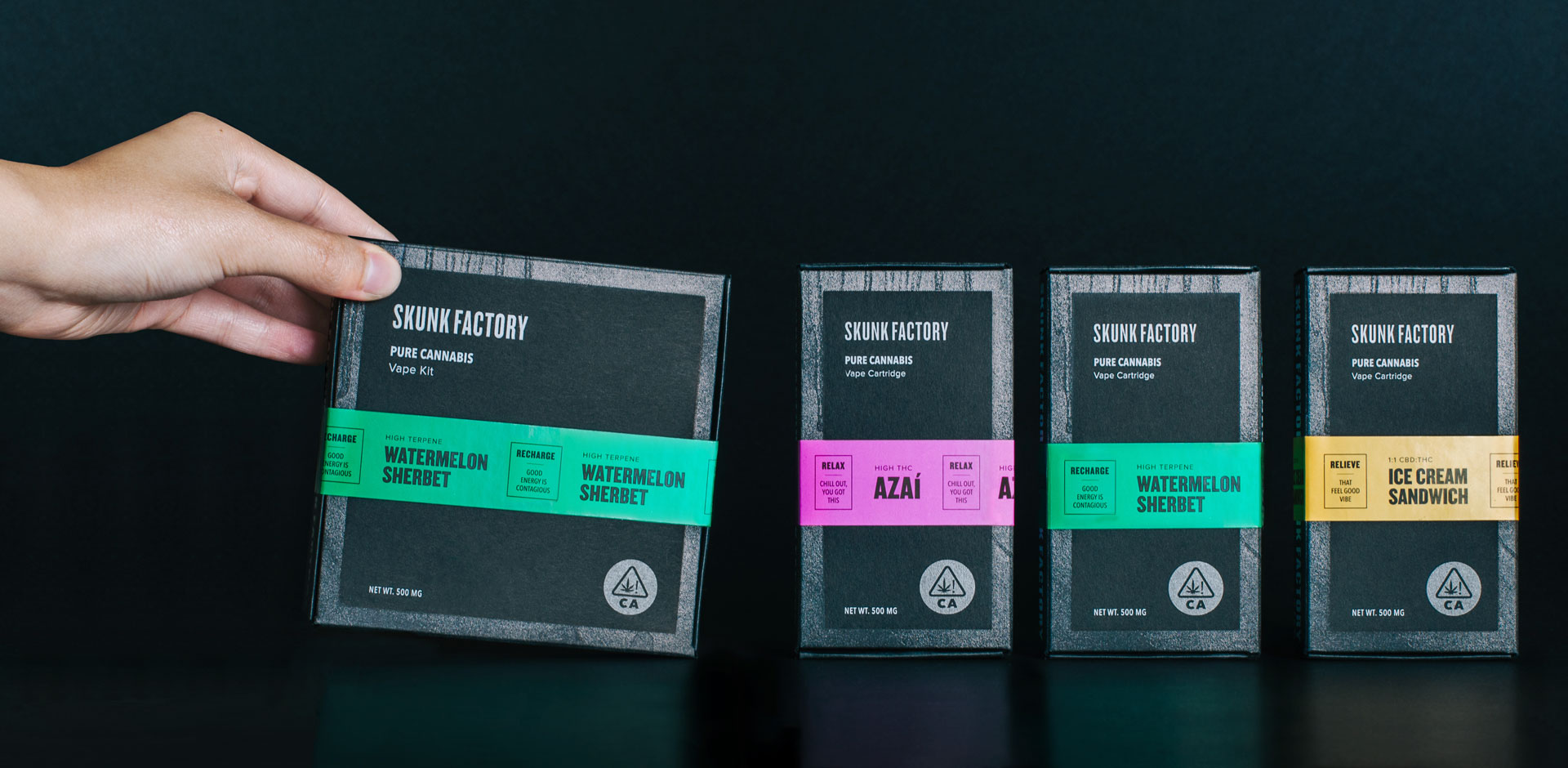
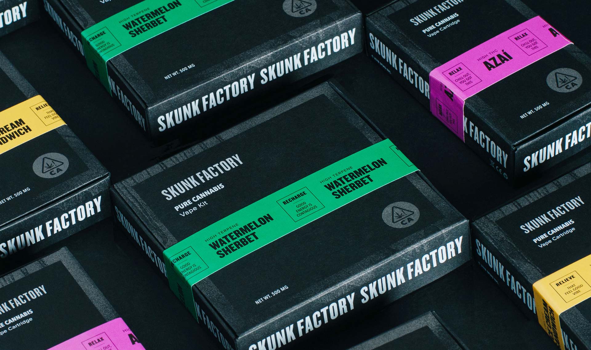
The team at Noise 13 was inspired by street-style fashion and applied this to their design. Not only did this perfectly match Skunk’s attitude, it resonated with their target market of young cannabis users, aged 25+. Bright colours, repeated lines of texts and stripes can be seen throughout the packaging and are all nods to busy city life.
The base packaging consists of uncoated, black paper stock with a matching colour palette of silver, white and black. The flavour indicator on each product is reminiscent of caution tape – another nod to street-style.
Although this brand evolution project looks fun, it wasn’t without its challenges. Besides working within the regulations of cannabis packaging (and researching child-resistant and tampering technologies), Noise 13 and their printing partner CA Lithos had to play with the silver spray paint texture, ensuring that it would read on highly absorbent stock.
“Our goal for the project’s overall personality was to create an unapologetic, sophisticated and culture-forward brand. Our mood boards took inspiration from edgy fashion brands to graffiti art to the details on high-end chocolate packaging,” says Dava Guthmiller, CCO and founder of Noise 13.