Orange Keel Creates Innovative Packaging for EarthFresh Foods
June 20, 2018

Packaging challenge: How do you make a potato, that humblest of foods, sexy?
Orange Keel, an Oakville, Ontario–based brand strategy and design agency, recently wrapped up a mission to do just that for potato purveyor EarthFresh Foods, which has been in business for 55 years.
When the Orange Keel team started the rebranding process three years ago, they held a workshop with their client to solve a common problem: EarthFresh had to strengthen its connection with not only its consumers, but its internal staff as well. They honed in on the company's values, emotional and functional benefits, and attributes. "They wanted to tell their story to their consumer and create an emotional connection," says Muna Lallas, owner and creative director of Orange Keel. That led to developing a new company-wide outlook.
“We find that with a lot of companies, there is no mission statement. They’re like a machine that just keeps going,” she says. “Internally, they’re now all speaking the same language. They know it’s a company about capturing the high ground on sustainability and innovation, so they’re able to stand by that.”
The Orange Keel team developed all aspects of the rebrand, from the tagline “Real Fresh” to creative copy, collateral and displays. They also designed the website and created an online recipe library to foster a deeper connection between the brand and consumers.
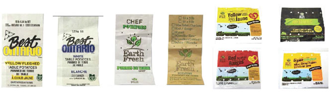
EarthFresh Foods original packaging
One of the main goals was to unite the company’s various lines of potatoes in packaging that felt both distinguishable yet cohesive as a whole—something the products had not previously achieved. Orange Keel sought out to make the "common uncommon" in their packaging solutions.
“We started building their family tree—their standard line, specialty line and organic line,” says Lallas. “Now, every time they look at a product, they will see what category it falls into.”
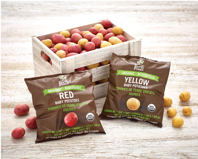
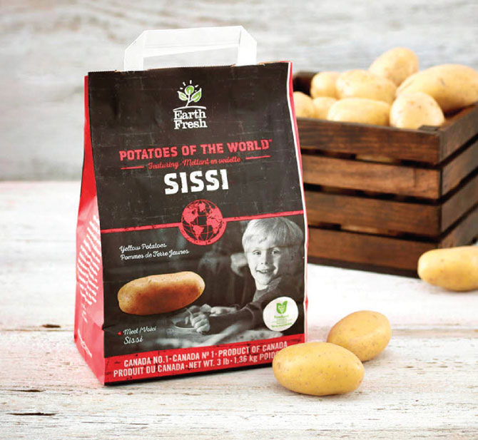
The standard line, packaged in white bags, tells the EarthFresh story using Trade Gothic, a midcentury typeface that was commonly used among tradespeople. The specialty line, featuring potatoes from around the world, uses photography to tap into consumer emotions, and the organic line is packaged in “earthy” dark-brown bags. “We were really excited to come up with that, because with organic we often think of green,” notes Lallas. “We played a lot with the print process, using matte colours that you don’t often see in a potato bag.”
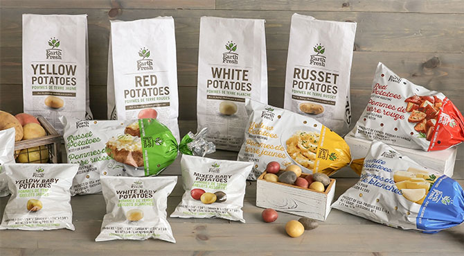
EarthFresh Foods new packaging
Orange Keel solved other pain points for the consumer, like identifying on the package which potatoes are best for roasting, baking, boiling and mashing.
“The biggest challenge was how to create something more innovative—it’s potatoes, but we wanted to make it really interesting,” says Lallas. “We went with a minimalistic approach, romancing the potato with a hero image.” While many competitors house their potatoes in a plastic bag with a handle, Lallas knew that paper would not only be a more sustainable choice, but also would underscore the brand’s “natural” look. Orange Keel designed a paper bag with a handle, a style that hadn’t previously been used on the market.
“There’s an element of convenience there because the consumer can pick it up by the handle and walk out,” says Lallas. They also created a light-blocking polybag for EarthFresh's 10-lb sack of potatoes, which won in the Food & Beverage category at the 2017 PAC Global Leadership Awards.


