Procrustean Bed in Pink or Blue
Gender Creative Kids and Leo Burnett Create The Genderless Poster
August 9, 2021
Gender, like colour, is a spectrum. However, colour is often used to enforce and perpetuate gender norms (XX, pink and XY, blue). We’ve all seen the occasionally catastrophic gender reveals and their preponderance of pink and blue, let alone toy and school supply designs, clothing, and more. Children are processed into gender norms from birth.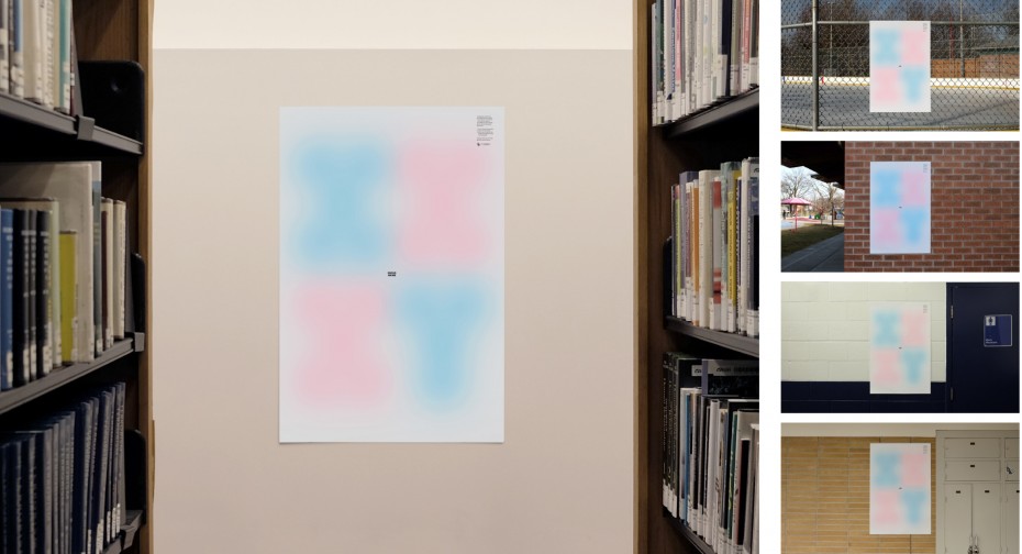
Montreal-based not-for-profit Gender Creative Kids is trying to change that. Since 2013, their mission has been to support trans, non-binary, and gender-fluid youth’s affirmation within their families, schools, and communities. They do this, as the mission statement on their website states, “By empowering parents and their children, educating communities, offering innovative and evidence-informed resources, and advocating for the rights of trans youth, we aspire to a world that is a safe and joyful place for all children.”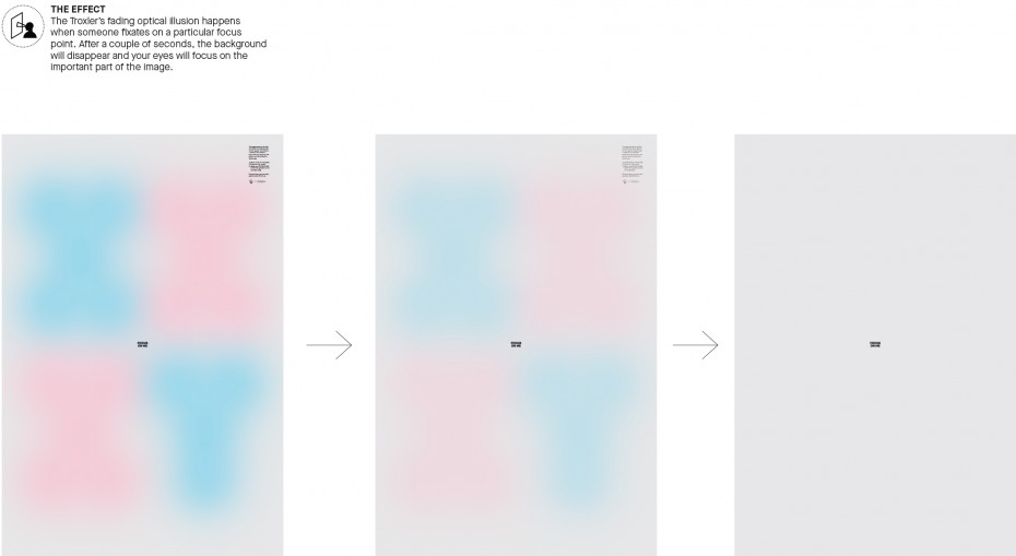
Leo Burnett worked with Gender Creative Kids to help spread awareness to the pigeonholing nature of gender norms with their 2021 Design Awards winning genderless poster. When you stare at the centre of the poster where the words “FOCUS ON ME” are written the colours of pink and blue fade away thanks to something known as the Troxler fading optical illusion. The poster’s viewer is left to focus on the individual and not the illusion of a strict gender binary.


