Putting the House in Order: The Curling Canada Rebrand
March 3, 2015
Inside Hulse & Durrell's new identity for the national sport assocation Curling Canada
If there were an Olympics for brand identities, this one for Curling Canada would definitely be on the podium.
Vancouver-based branding firm Hulse & Durrell executed a top-to-bottom new look, name and direction for the storied company, which heretofore had gone by the Canadian Curling Association.
“Over the last few decades, all of their event properties were created in one-offs or silos,” says Hulse & Durrell partner Greg Durrell. “It resulted in a very diversified brand, and it was beginning to water down their programs. With this project, they wanted us to create a systematic approach to how events would be organized.”
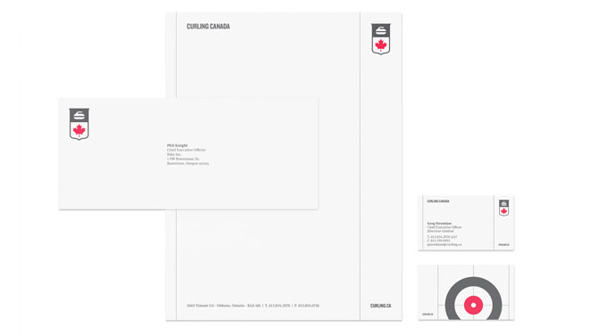
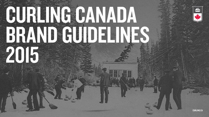
That they did — Hulse & Durrell developed a new identity, outlined in a 51-page brand-guideline document that nods to both the association’s history and the modern look of Team Canada, a previous Hulse & Durrell rebrand. “We wanted to create a unique identity for curling, but still have it connected to the master brand,” says Durrell. “All of the athletes that represent Canada on the international stage should share some DNA in terms of how their branding is presented.”

Greg Durrell and business partner Ben Hulse first met in 2007 while they were both on the design team for the Vancouver 2010 Winter Olympic and Paralympic Games. There, they helped to develop the entire look of the Games, from medals to publications to mascots to merchandise. They started the Team Canada overhaul in 2011 on behalf of the Canadian Olympic Committee, setting into motion everything from a new strategy to a new brand identity. Since then, they’ve worked with the International Olympic Committee on a website relaunch for olympic.org.
Needless to say, they were well equipped to handle the rebrand for the national curling association, which oversees curling development and promotion across the country alongside the regional associations in every province.
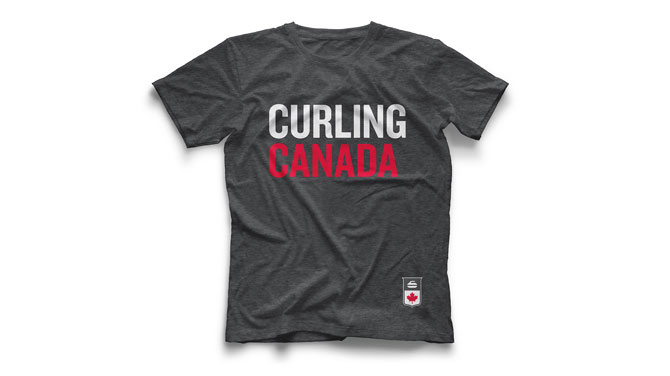
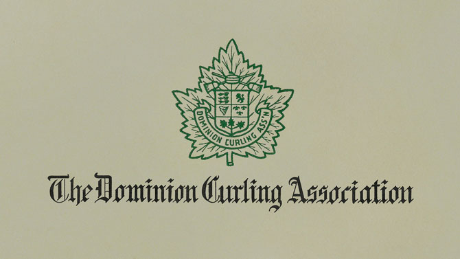
The first move was to streamline the name, which had a bit of a complicated history and didn’t work seamlessly in English and French. The Dominion Curling Association, a national men’s league, originated in 1935 before it became the Canadian Curling Association and sub-branch Curl Canada in the 1960s and ’70s. In 1990, Curl Canada merged with the Canadian Ladies’ Curling Association, which had formed in 1960.
Keeping in mind the long history, Hulse & Durrell landed with Curling Canada early on, favouring it for working in both languages.
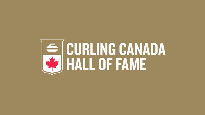
“After that, it was about really trying to find that nonverbal mark to communicate the essence of the organization. We wanted to distill it down to a reduced and iconic form,” Durrell explains of the choice to include the simple curling rock and maple leaf. “Then we needed to find a container that would bring it all together. The Canadian Curling Association had a long history of shield iconography on its club jackets, and it was the centrepiece of their logo for events.”
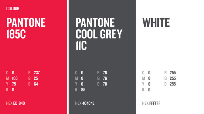
The rebrand employs a red colour, Pantone 185C, for its obvious connection to the maple leaf and Canadian flag. The grey stone of a curling rock inspired the other dominant colour, Pantone Cool Grey 11C, says Durell. “The grey also added an element of class that really reflected the value of the sport.”
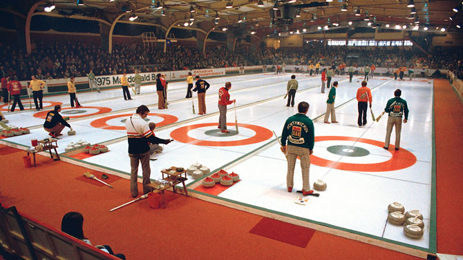
The branding launched last week at the 2015 Tim Hortons Brier, one of the premier curling events in Canada, and athletes will continue to debut the brand across the remaining tournaments this winter before picking up again for the fall 2015 season. The new, responsive website will have a renewed focus on content and is still in the process of being rolled out.
Durrell says he’s happy with where he and Hulse have landed in their sport-marketing niche. “When you break it down to what these organizations are doing — they’re doing positive things for the country. The more kids that participate in sport, the better their mental and physical health,” Durrell says. “If we can continue helping organizations like Curling Canada rebrand, they can attract better corporate sponsors. And when you have better corporate sponsors, you get better athletes. And when you have better athletes, the country does better on the podium. It’s cyclical.”
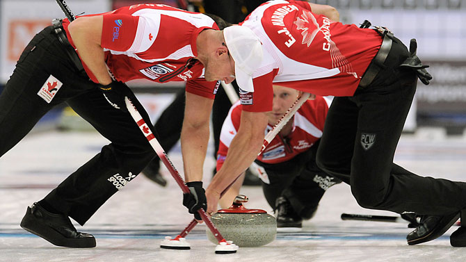
See more photos below, and in the top slider.