Q&A: Martin Dupuis
November 8, 2018
Martin Dupuis of Les Évadés is the art director for their Cinéma du Parc poster series. If these images look familiar, it's because they are. Dupuis' poster for Blade Runner was the cover of our 2018 Photography and Illustration annual. Since publishing last winter, the poster series have won in our Design and Advertising Awards-for a total of three different awards. This is the first time in Applied Arts' history that the same piece has won in three different award sections! To celebrate this milestone and figure out what makes these posters so award-winning, Applied Arts talked with Dupuis about the design of the posters, the inspiration and the feedback.
What did Cinéma du Parc ask you to do for this project?
Raphael Dostie and Jean-François Lamarche from Cinéma du Parc got together with Les Évadés at the start of that year to talk about upcoming projects and told us that the movie theatre was going to start bringing back the idea of showing midnight screenings. This thrilled me to no end as their list of movies consisted of a bunch of favourite films of mine. We designed a branding for the midnight screenings with designer Julien Roudaut and had the luxury of picking from the 9 scheduled films to make posters.
Can you walk us through the design process for this project?
Finding the perfect illustrator was the essential puzzle piece at the heart of it all, and getting my head around structuring a visual system that would work for each film but also function as a series.
Sometimes you have a specific illustrator in mind right from the start, in this case I had a general feeling of where I wanted to land but it took some looking around. That grey zone of not knowing exactly what you want until you see it. And in this case it was all kinds of interesting work sparking all kinds of different directions the project could take.
But I kept returning to an image done by illustrator Massimiliano di Lauro for EFFE magazine that really helped me clarify my ideas. It had two figures in the middle with elements around them. I liked the look and feel of his style and liked the pairing up of characters. So that was the jumping off point – finding characters and playing off the emotional resonance of their interactions within the films.
How did you brief the illustrator?
Of the nine films playing I figured we had the budget and momentum to do three but I presented five choices to the illustrator. Luckily Massimiliano was very generous and is as big of a film fanatic as I am – so he suggested we go all in and do all five. My job was to find the right characters, objects, quotes and dictate the logistics of our system.
As an art director my most important job is casting the right person. After that, ideally I step back and give them room to do what they are good at. Sometimes that means very little interference where everything falls into place and other times it means a lot of guidance and micro managing when it’s off the mark.
How was your experience working with the illustrator?
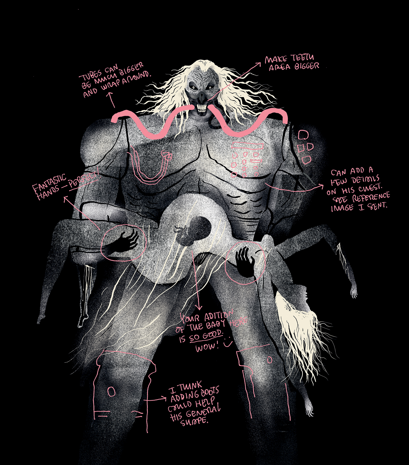
Working with Massimiliano was really easy and smooth. Once we got a few done and adjusted to how each other worked everything fell into place pretty easily. He was great to work with, it really clicked and felt good.
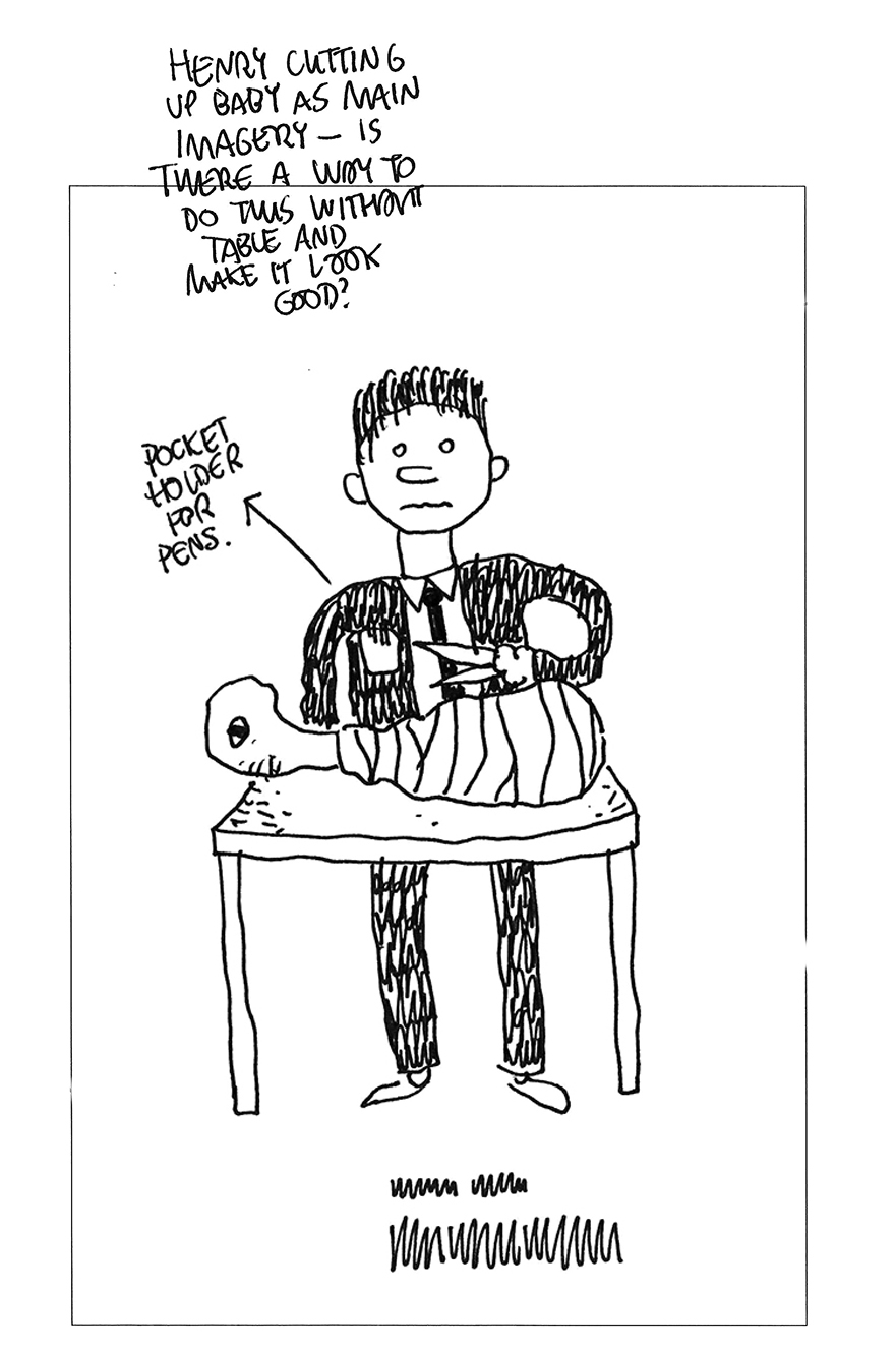
He’d send me a first draft; I’d suggest a few ideas and we’d go to a second or third draft if needed. It was all worked in layers, so sometimes at the very end I got the raw files and was able to channel my OCD and micro manage the last little details on my own.
The collaboration had a really nice outcome in that we each felt like the work got pushed to places that we couldn’t have done on our own. That’s when you get surprised as you’re working and that’s when it gets exciting and fun. We’d routinely write back saying how much fun we were having and how fun it was working together.
How did you decide on what scenes or characters to illustrate?
I already watch all these films on a regular basis, but this time around part of the fun was re-watching them with the specific goal of finding the elements I needed to make the visual system work. So lots of obsessive viewing while taking photos for Massimiliano to have precise references in my brief.
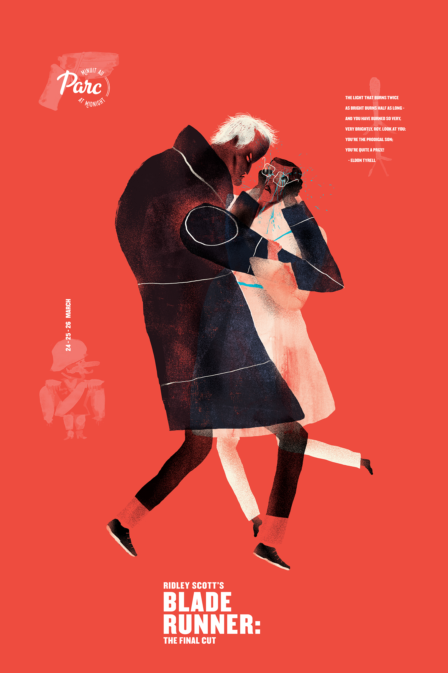
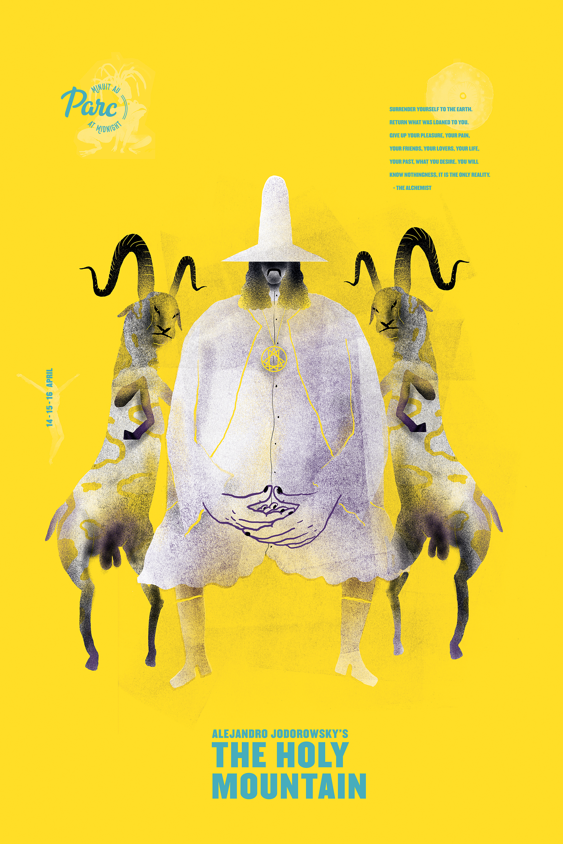
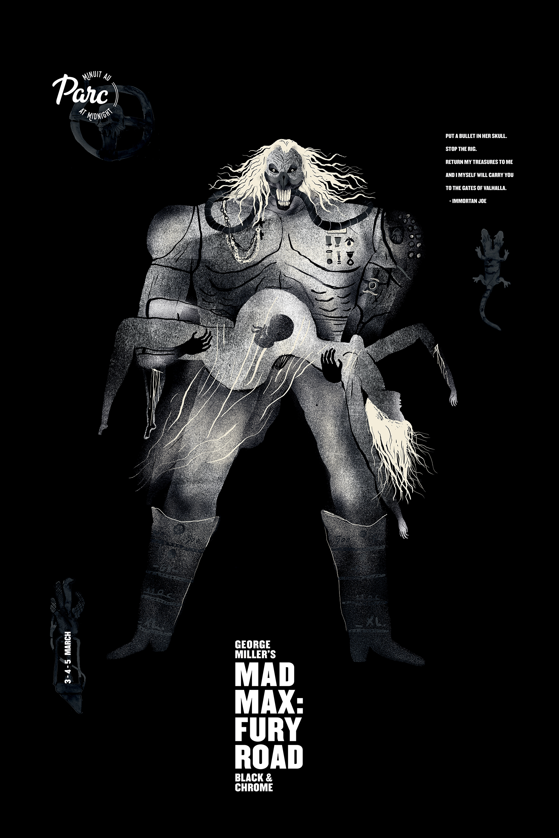
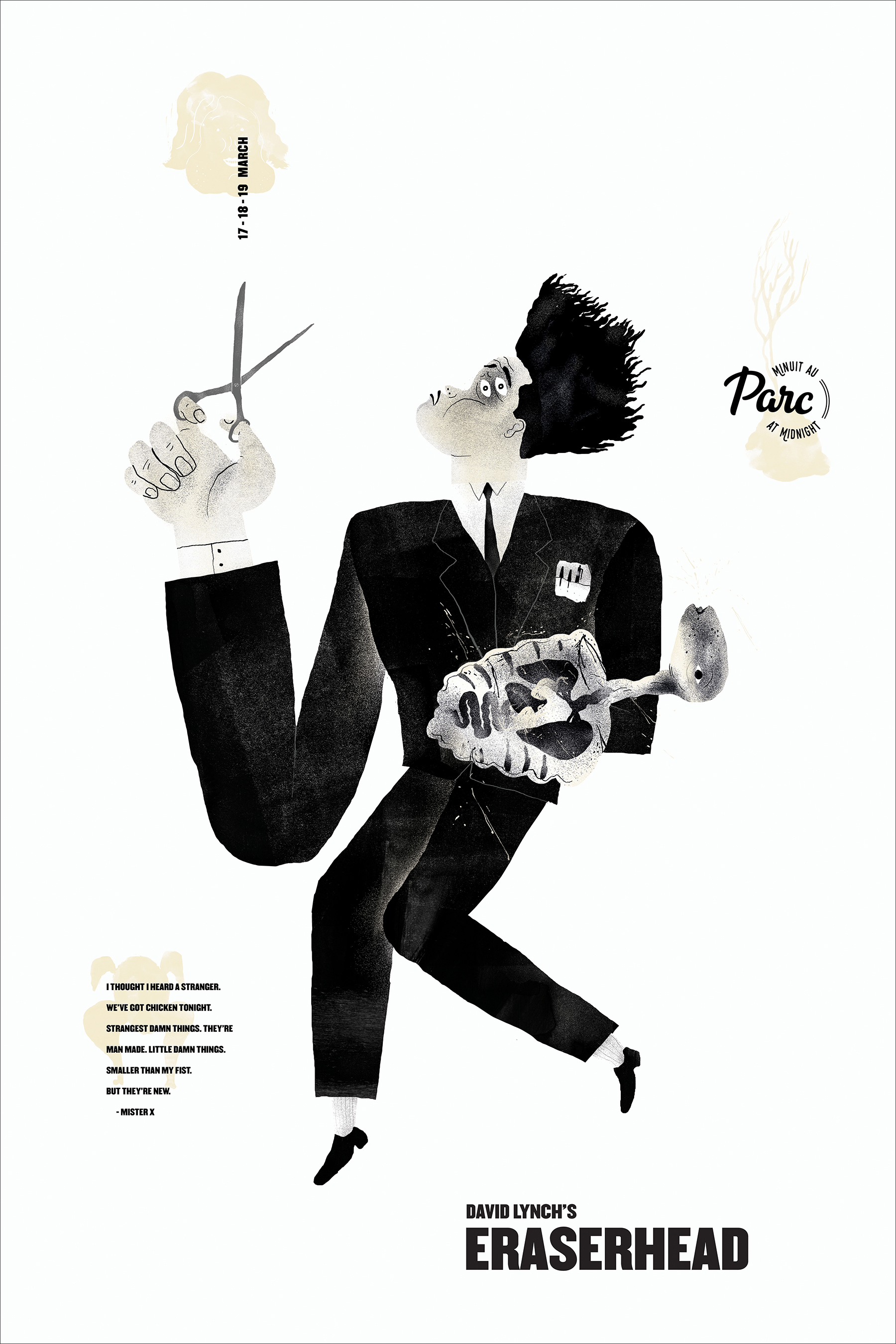
Some films on the list were more popular than others, so as a rule I tried to stay clear of the obvious visual choices and tried to be a bit more creative. Blade Runner is a good example. The standard favourite scene for many fans is Roy Batty dying at the end, the tears in rain quote … so I stayed away. Immortan Joe from Mad Max was too great a design to pass up, so no Mad Max in the poster. However, the symmetrical Jodorowsky figure sitting between the goats for The Holy Mountain is actually a pretty popular image related to the film, but I couldn’t resist. It’s my favourite poster of the series.
This is what’s so great about doing posters for older films in this context - they don’t have to function in the same way as a poster made for a new film. The fans and target audience already know these movies by heart, so the imagery can go into directions that are more specific, obscure and unexpected. This is where really fun work can get done.
What design work do you think consciously or unconsciously inspired you on a project like this?
The design work that comes out of The Criterion Collection by Sarah Habibi and Eric Skillman is the high water mark for me in this area. The idea of injecting older films with a sense of the new and giving the proper attention and care into the visual presentation of movies is their specialty. Looking closely at the work they put out is like a mini design school. Some films I’ve discovered directly because of how they pulled me in with their packaging designs.
What has feedback been like?
There has been some really great feedback and momentum; people have been really kind. Part of what’s been good about the attention is that it’s made it easier to approach other illustrators to work with me as I keep doing more posters. That’s all I really want.
At one point I heard that Denis Villeneuve had maybe seen and liked the Blade Runner poster, so I actually printed him a copy and brought it over to his agents office as a gift in case it was true. He wasn’t there (he was editing Blade Runner 2) but they were really nice and showed me a few things in the office like one of the original circle drawings for Arrival and one of three existing production books made for Sicario.
What was the hardest part about completing the posters?
The deadlines were tight. Also, just wanting to do a great job … that energy ends up pushing you but also kind drives you crazy. Hard to find the right headspace of push and pull in those situations.
What is your favourite thing about them?
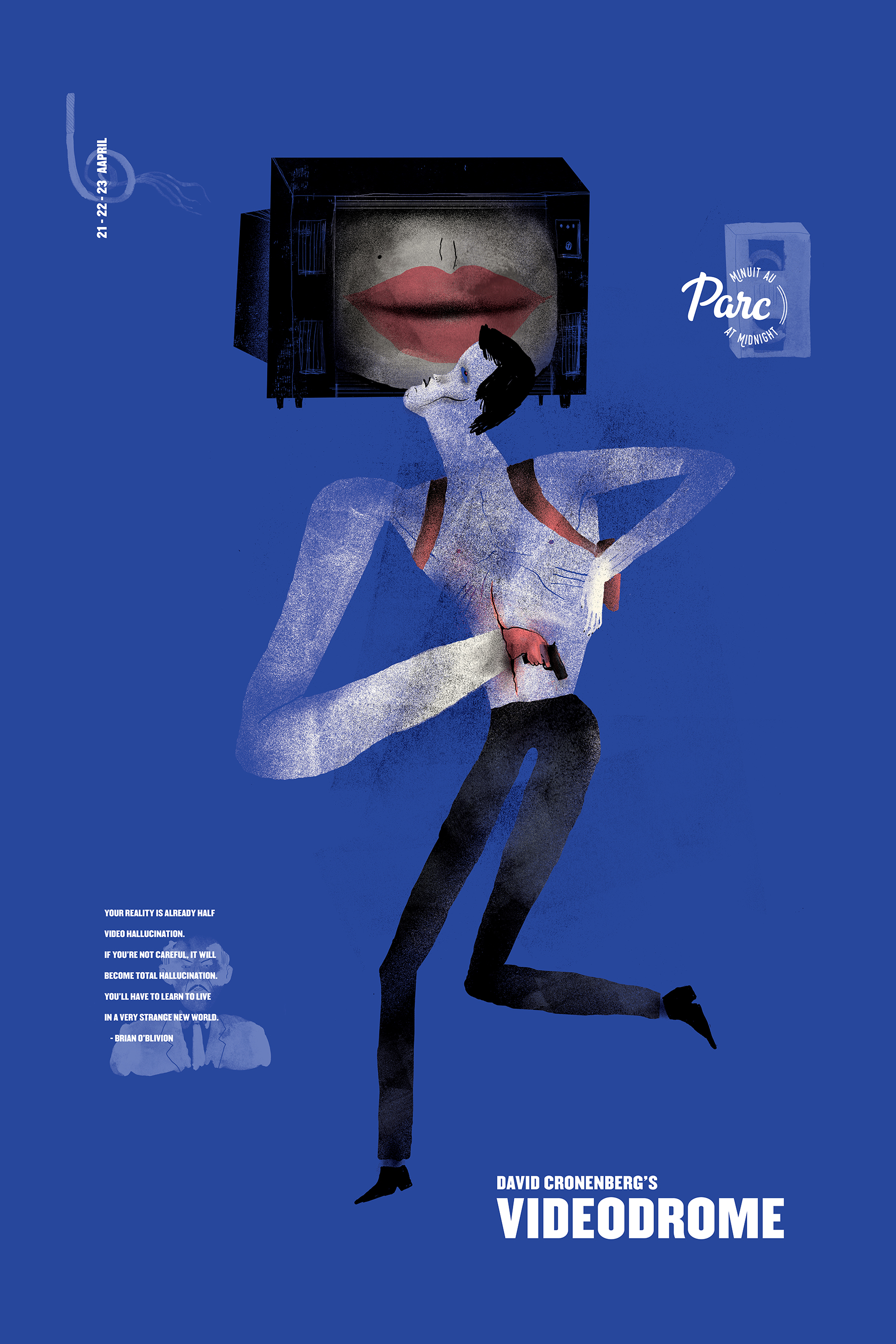
In general they represent a lot of hard work, of me taking charge and feeling that my energy was put in the right place. If we get into specifics, I really like how Massimiliano was able to play with proportions and literally stretch the possibilities of what we could do. Favourite details include the hulking arm holding the scissors for Eraserhead, the tiny hands on Immortan Joe and powerful visual impact the baby has in the dead center of the image. The blue blood in Blade runner, horns on the goats for Holy Mountain and thin legs in Videodrome.
Unfortunately it doesn’t happen as much as it should, but it is such a breath of fresh air when you get to work for clients you like for a product you actually believe in with creatives you really admire. I was pretty thrilled to get to do this.


