Richard Bélanger: Brand identity personified
Meet Design Awards judge Richard Bélanger
March 2, 2020

Richard Bélanger is Creative Director at Cossette in Montreal, QC
Richard brings a unique sense of style and unerring aesthetic design ethics to each project. For the last 20 years, he’s been coming up with ideas that make a statement – both visually and communicatively – and encapsulate all the signature qualities of the brand identity. He has worked on a diverse array of accounts ranging from museums to startups, NGOs and large Canadian and international corporations, easily moving between the worlds of art and design, as well as business and branding. His work has garnered local and international industry recognition, including design’s highest honours.
These attributes made Richard a natural choice to judge our 2020 Design Awards, which gets underway later this month. For the proof of some of that award-winning work across a diverse client mix, here's a peek at some of Richard's recent quintessential brand identities, with his own behind-the-scenes notes. And if these projects seem familiar, you may have seen them at a recent awards show, or even in a recent Applied Arts Awards Annual, or, you've been in Montreal, where these works are now familiar parts of the city's design landscape.
Grand Quay : Remixing the code
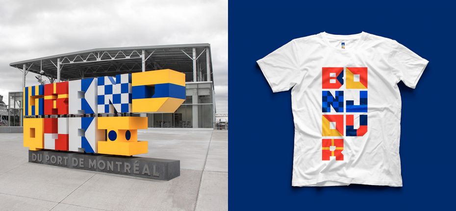
"The maritime landscape of Montreal has always featured multicoloured flags, used as a visual code to communicate with sailors from a distance. Drawing inspiration from this vibrant language, we created a brand identity for this unique point of entry into Montreal that’s attractive and welcoming, as well as a typography that’s doubly original. First, it anchors the Grand Quay’s identity platform firmly in its history, which makes it both strong and functional. Second, and even more interesting, each letter created represents the maritime flag it corresponds to, thereby transforming a coded system into a language shared between the Quay and the whole world."
Montreal Children’s Hospital Foundation : Heal. Love. Bond.
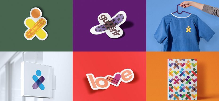
"At the heart of this identity are three words that support the Foundation’s purpose and are a part of everyone’s daily life: Heal. Love. Bond. These three words, transformed into universally recognizable symbols, are at the heart of the new identity. An identity as warm and welcoming as the Foundation itself. Daring, clever, and diverse —representative of every child it helps. An identity filled with hope that goes beyond the barriers of language. A living, universal and unifying brand."
M TELUS : Show must go on
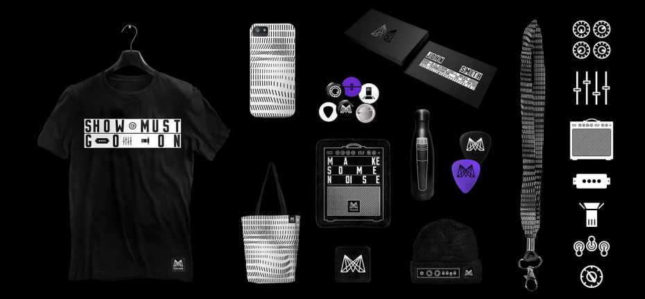
"M TELUS is a brand identity for the world-class concert venue. The “M” is a tribute to the musicians, craftspeople, and the art of performing, and is inspired by the mighty energy of music. Solid and anchored in the present moment, the identity evokes the grandeur of a show, the power of sound, and the moment when a concert sends vibrations through every person in attendance."
And if you still want to enter your own work for this year's Design Awards, contact vicki@appliedartsmag.com ... but hurry. There's only a tiny window of time remaining!


