Stamp of Approval
July 17, 2015
A decade-old postage project gets a new life
Sometimes getting client approval is a monumental process, one that can take weeks, months, even a year or two. When it finally happens, it’s a huge relief. So how does it feel after 12 years?
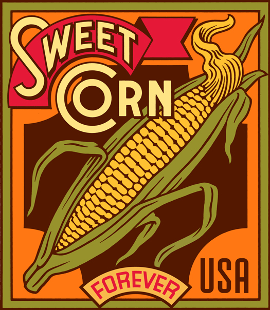
LA-based letterer and designer Michael Doret started a series of stamp designs in 2002, when he was first commissioned by the United States Postal Service (USPS) to create a set of six stamps illustrating American produce. He worked on concepts for Cabbage, Grape, Persimmon, Pineapple, Sweet Corn and Lemon, even working some up as far as a hand-coloured comp or final digital rendering.
Doret referenced vintage labels and seed packets when developing the direction for the stamps. “I’ve always loved the vintage fruit and vegetable crate labels — I have three or four books filled with them,” he says. “But I don’t specifically take elements from any of them. I view them to get inspired, and then try to capture a feeling.”
As it often goes when there are a lot of people involved in the design process, the stamp project got caught up in approvals and eventually stalled. Doret went on with his career, working on recognizable logos such as the one for the New York Knicks, and opening up his own type foundry, Alphabet Soup.
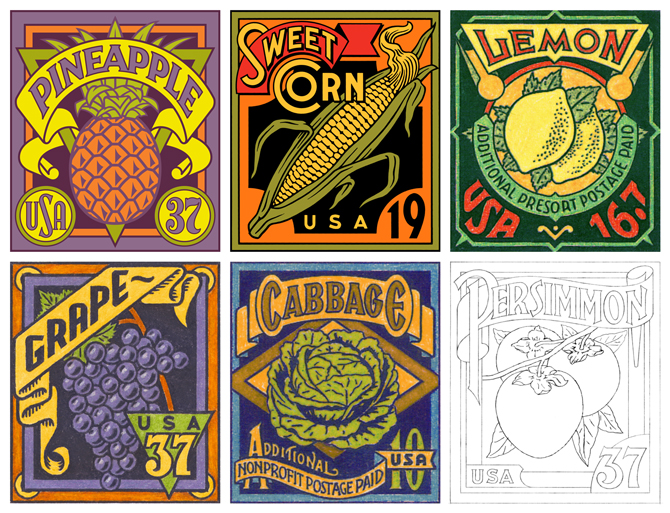 The 2002 series reached this stage of completion
In May 2012, art director Antonio Alcalá of Washington, DC’s Studio A contacted Doret about illustrating a different stamp project for the USPS. It got Doret thinking: what about the produce stamps he’d worked on over a decade earlier? “When I saw this opportunity years later, I just decided to ask if they might reconsider,” he says. Alcalá approached the USPS with Doret’s idea to resurrect the fruit and vegetable project, and the initiative started up again, this time with a completely new approval team. The final approval came in 2014, and the stamps are available this summer.
The USPS liked the Sweet Corn concept from the first set, but chose other fruits and vegetables to replace the ones Doret had already worked on — something the artist says he initially had mixed feelings about.
“I still really love some of my initial ideas, but the new set has more consistency throughout in terms of colour and design,” he says. “In one sense, the new ones hold together better as a series. But the earlier ones were maybe more interesting in their variety.”
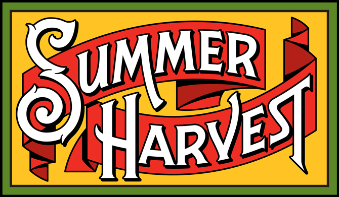
Logo design for Summer Harvest series
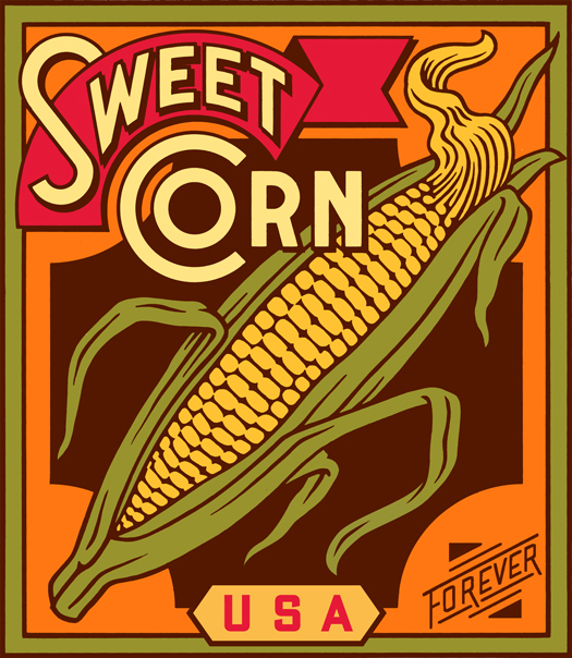
The new series called “Summer Harvest,” echoes the vintage fruit label idea and focuses on seasonal, American fruits and vegetables: the aforementioned Sweet Corn, Tomatoes, Watermelons and Cantaloupes. Despite initial attempts to make the new set look and feel different from one another, Doret eventually settled on a uniform design with similar placement of titles and the “Forever” banner (meaning the stamp is always accepted regardless of current postage rates). He did vary the lettering style for each stamp’s title, and coloured the letterforms in white for consistency and contrast. An early concept for a fifth stamp, Squash, was eliminated.
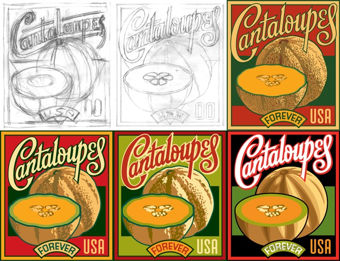
Working on stamp design always presents scaling problems for any illustrator. “I can’t design them at that small size, but I have to consider what happens to them when they are reduced,” Doret explains. “The biggest challenge was trying to figure out how to represent the cantaloupe. It started out fairly detailed but I soon realized that the detail would get lost when reduced down. I finally got rid of the texture altogether.”

Evolution of Cantaloupes stamp design included eliminating the fruit's texture
He also completed a Summer Harvest title logo, included on the stamp booklets available here. “My work changes and evolves. If I had to initiate the project now, it might have been very different,” Doret reflects. “It’s not that easy to get back into something you started years earlier. But what ended up being really helpful is that [the USPS] decided to scrap all of the selections, so I was starting fresh.”
See an evolution of the Sweet Corn stamp below, and more photos in the top slider.
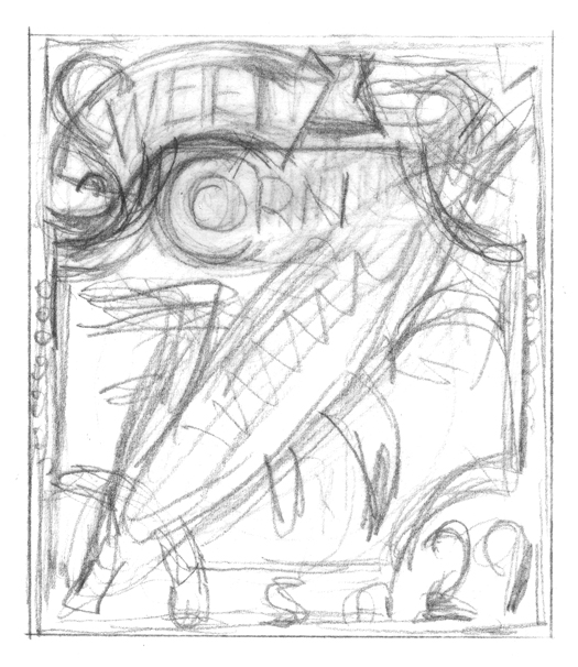
Rough sketch from the 2002 series
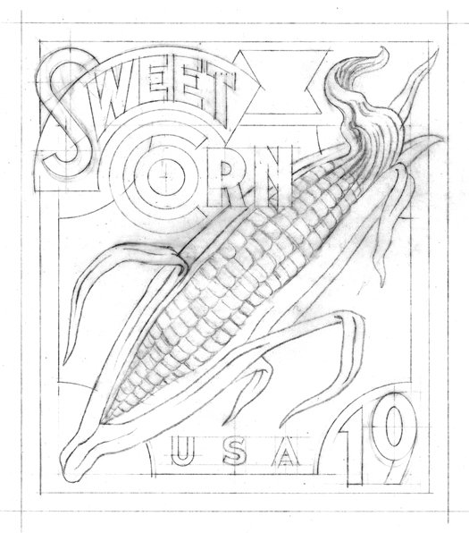
Sketch from the 2002 series
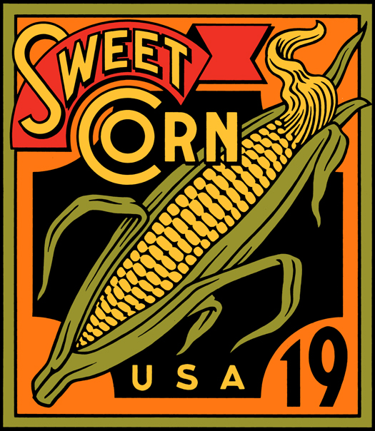
Digital rendering from the 2002 series
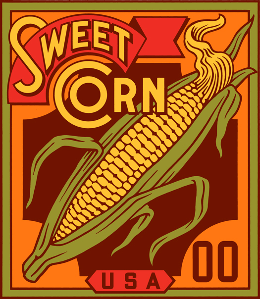
Digital rendering from new series
Digital rendering from new series
Digital rendering from new series

Final Sweet Corn image used in new series


