Turning the Table: Barbara Woolley
A look at amazing work by our 2021 judges
July 23, 2021

Barbara Woolley is the “Woolley” of Hambly & Woolley. As a founding Partner and Principal of H&W, Woolley is responsible for a wide range of clients including Harry Rosen, University of Toronto, Donald Ellis Gallery, Canada Post, and ParticipAction. She is an OCAD University Design graduate, a Registered Graphic Designer and has previously chaired The Advertising & Design Club of Canada. Woolley’s extensive design experience, reputation in the community and numerous accolades made her an apt addition to our 2021 Design Awards jury. We asked her to share a recent project that she was particularly proud of and she picked one that aptly represents H&W’s “simple, hard-working design with clarity of purpose.”
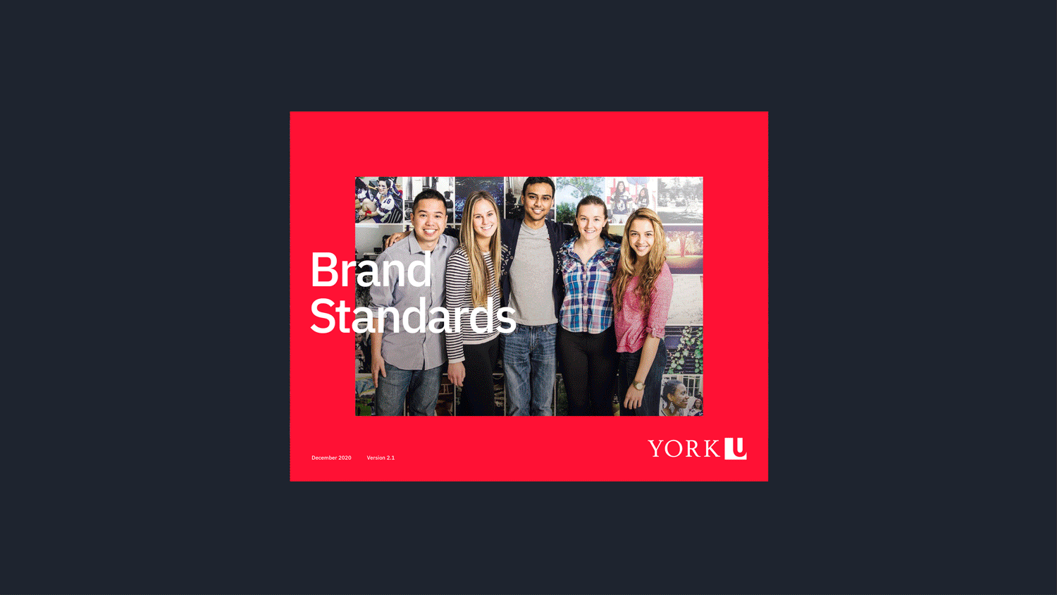
York University is Canada’s third-largest university and a leading international research and teaching institution. In the winter of 2020, just before COVID would turn the world upside down, H&W was engaged to create a new visual brand design system for York. This comprehensive system needed to reflect the university’s desire to bring to life its strategic positioning of positive change. The new branding permeated all aspects of York’s marketing and communications, and it also needed to be reflected in its new University Academic Plan, in other words, it needed to be done before school started.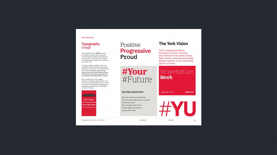
The system was designed to progressive and dynamic, reflecting the school itself, while being easy to use and adopt to ensure that it was implemented across the various departments and faculties of the university. Universities the size of York resemble small cities, and the brand needed to be able to tell its story across multiple channels and multiple audiences—from the President’s Office, to Recruitment, Advancement, Faculties, Departments, Divisions, Schools and Sub-brands.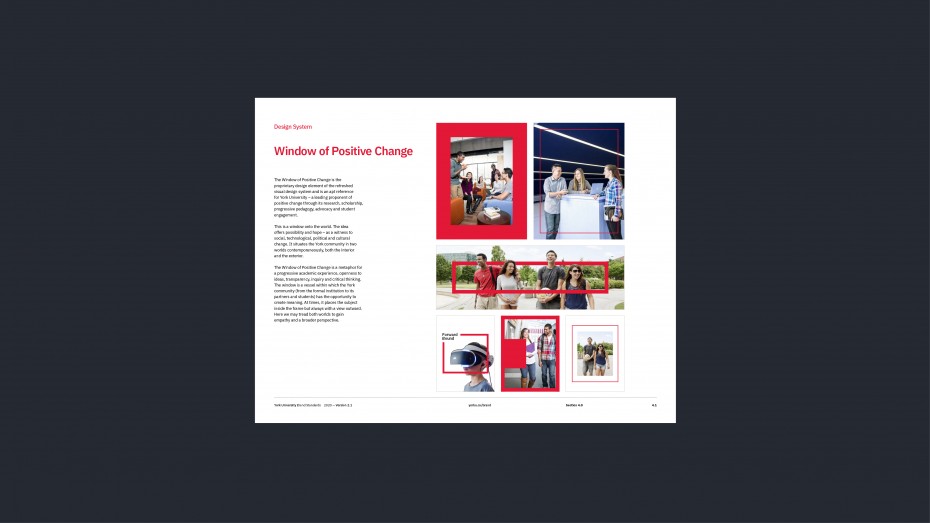
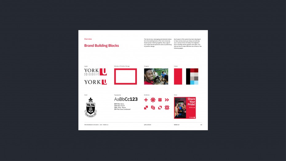
Working with York’s internal Brand & Marketing team H&W made several recommendations including and official font family, a proprietary design element “The Window of Positive Change,” an updated colour palette, a versatile set of custom emblems, ways for the multitude of faculties and sub-brands to maintain their unique identities while adapting to the new design, and a comprehensive set of brand guidelines.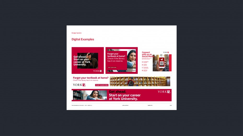
Our world became especially digital this year, and H&W’s design was developed to be digital first and served as a foundation for York’s completely overhauled website. All this work while classrooms and workplaces shrank to small squares on screens under the spectre of COVID.
We are enormously thankful for Woolley taking the time to be on our jury and share her work with us. You can see more of H&W’s work at their site here and on their Instagram here.


