TURNING THE TABLE: MIKE MEADUS
A LOOK AT AMAZING WORK BY OUR 2021 JUDGES
December 17, 2021
Mike Meadus is Executive Creative Director at AdFarm, one of North America’s leading full-service AgriMarketing agencies with offices in Calgary, Kansas City, Guelph, and Fargo. He’s also a decorated designer and illustrator who specializes in branding and corporate identity design. With nearly 30 years under his creative belt, including senior stints at some of Canada’s largest agencies, he’s had his work regularly recognized by Communication Arts, Applied Arts, Graphis, ADCC, Art Directors Club, and London International Awards, and has won Pencils at both The One Show and D&AD. He’s been a judge for Communication Arts, London International Awards and Applied Arts, and has had his design, illustration and art direction featured in Lürzer’s Archive, Contagious, LogoLounge and Taschen’s ‘Advertising Now’ coffee-table book series.
We were so pleased to have Mike as a part of our 2021 Advertising Awards Jury, and are immensely grateful for his generous donation of time and expertise. We asked Mike to share a recent project with us and he shared the following bit of agribusiness.
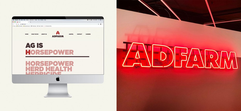
After nearly 35 years in the Western Canadian and Midwestern US marketplaces, AdFarm’s visual brand was overdue for a new look. Like the changing landscape of agriculture itself, the agency needed to put forth a modern image that reflects its all-new personality, reinvigorated purpose and long-term goals.
(Interestingly, I started work on this rebrand before I started at the agency, so they must have liked where I was going with it.)
The new look is inspired by the hard work and combined efforts needed to take agriculture from the field to the world. A simple, classic tractor silhouette that represents the first letter of the company name summarizes this effort.
By pairing a classic “barn red” and a rich “soil brown,” it forms a bold, iconic, easily reproducible, and instantly memorable summary of both where the company comes from, and the ongoing efforts to always keep moving forward in this ever-changing industry.
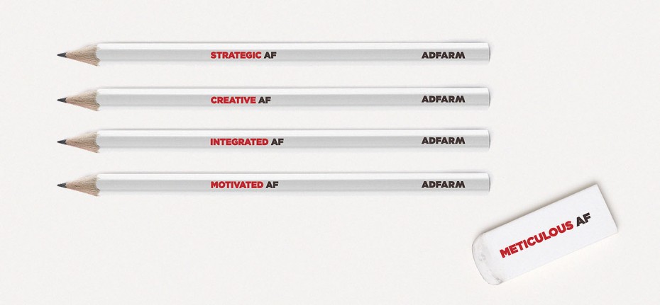
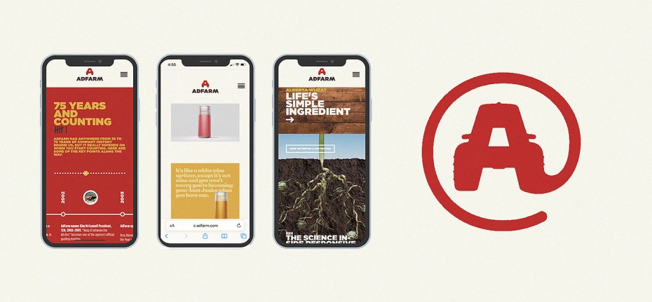
The new logo was incorporated across the entire AdFarm landscape including neon signs, giant features in a brand-new office design (which was completely built during the pandemic), a full stationery package, a cheeky pencil set that played with our “AF” initials, trucker hats, hooded sweatshirts, client swag and an all-new website that officially launched the new look.
The new brand made its debut in early 2021 (still during the pandemic) to overwhelmingly positive feedback from the agency’s clients, staff and the agricultural community. It continues to be the core inspiration for the company’s path forward and the centre point for the rallying cry that “Ag Is Everything.”
(Now if only we could get to a place where we can have an official in-person re-launch party.)
To see more of Mike’s work visit AdFarm’s website here and his personal website here, and AdFarm’s Instagram here and his personal Instagram here.


