Warhol's Variations: what fifty Marilyns can do for brand identity
September 7, 2021
How many Andy Warhol retrospectives can you see and still enjoy? For me, it took a year and a half of Covid lockdown to give the ubiquitous American pop artist a fresh appeal. The exhibition, organized by Tate Modern in London, in collaboration with Museum Ludwig in Cologne and the AGO in Toronto, has brought many art-starved museum-goers to the reopened gallery floors.
The expansive retrospective reminded me that unlike literary works (which I found to be the best remedy for lockdown boredom), visual arts don’t need to be limited to a singular showpiece; they can happily exist in multiples. It made me rethink a project I’ve been developing for the past year: a series of knitted replica animations and graphic storyboards. I realized that working towards one perfect colour and form combination is not always necessary. In fact, it can become detrimental to the project.
My inner graphic designer also started to speculate whether a visual identity mark could be made more relevant in multiple variations. Take Coca-Cola or IBM, for example. Over the last century, both have become easily spotted all over the world. At first, the logos’ visual consistency was critical for making them easily identifiable. But eventually, the repetition makes them feel monotonous and rigid.
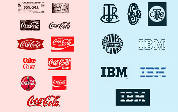
Coca-Cola logo evolution from 1886 to now and IBM logo evolution from 1888 to now
Often, visual continuity and consistency are mistaken for repetition. While continuity and consistency are dynamic and functional aspects of design, repetition is static and undesirable. Think of an anticipated as opposed to a predictable type and image display in your favourite magazine. Imagine if every magazine cover looked the same, or almost the same! That’s what repetition looks like: a lifeless design.
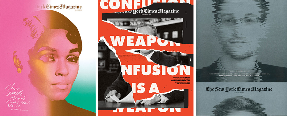
The New York Times Magazine masthead is an excellent example of well-designed visual continuity as opposed to a rigid repetition. The typography is integrated with photography, which makes it exciting and new, even though it is obviously still the cover of the New York Times Magazine.
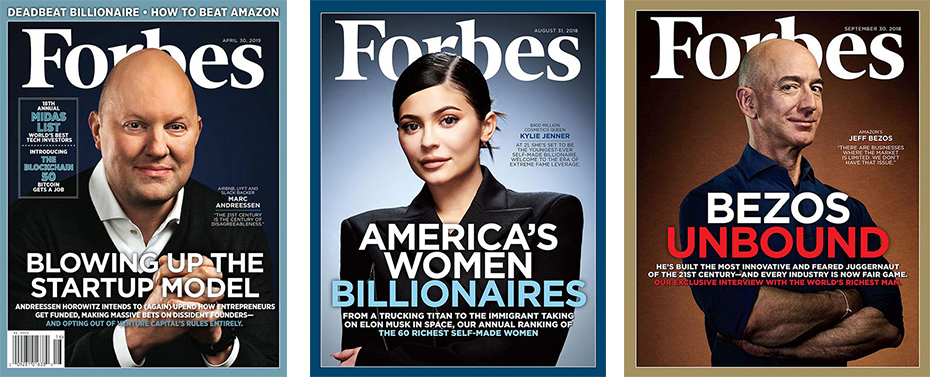
Forbes masthead continues to be repetitive. The typography is static, making the cover appear stale and boring.
The Marilyn Diptych, a monumental work Warhol created in 1962, consists of fifty images, half heavily pigmented and half coloured in black and white. These variations came to contrast her life and death. When she died, Marilyn’s face was as popular as a Coke logo. In the wake of her tragic death, a diptych made of fifty Marilyns turned out to be more relevant than a single majestic portrait—not only as a reference to pop culture’s view on mass consumption, but also to Warhol's capacity to present a multi-faceted, saintly allure that hints at both the death and immortality of stardom.
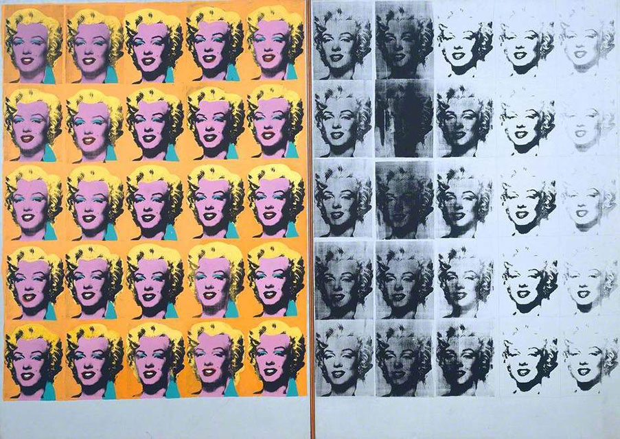
Andy Warhol, Marilyn Diptych, 1962 Tate, © 2020 The Andy Warhol Foundation for the Visual Arts, Inc. / Licensed by DACS, London
In his variations Warhol chose to work with familiar characters such as Mickey Mouse, Mona Lisa, and Chairman Mao. Regardless of how he modified the image, each one remained identifiable. The continuity of Warhol’s unpolished print technique contrasted with the polished celebrity facade and became another unexpected and captivating feature of his work. Warhol transformed the relentless repetition into intriguing visual narratives and easily reproducible works of art.
Even though Coca-Cola’s corporate logo has undergone extensive design transformations, their current brand identity appears the exact same on every can, bottle, fridge, t-shirt and commercial. What if sixty years after Warhol, brands embraced the artist’s concept of variation and introduced a series of corporate identity marks? After all, fifty unpolished Marilyns became more meaningful than one single flawless image. A company's logo could be more than just a clever design bolstered by strict consistency. Instead of focusing on instant easy identification, established brands could start championing more excitement and less predictability. If there’s anything Warhol can teach us, it’s that compelling variations will each get their fifteen minutes of fame–which adds up to a lot of brand recognition for a company and a lot of fun for us.
The Andy Warhol exhibition is on display at the AGO until October 24, 2021.
MARIANA GREZOVA is the founder and creative director at Arts & Labour, a platform for pioneering brands to collaborate with visionary artists, designers and other creative professionals. To advance these collaborations further, Grezova has launched an online publication called A&L MAG. The magazine examines diverse and unorthodox art and design projects around the globe.
Mariana Grezova is a member of the Faculty of Design at OCAD University in Toronto, Canada.