Eyes on Eye on Design, by Will Novosedlik
May 16, 2019
A new publication from America’s most prestigious design organization both hits and misses the mark.
For whatever reasons, publications aimed at the graphic design community are still a lot more interested in what’s fashionable than in what’s critical. Design industry magazines tend to shy away from examining issues that are critical of the industry and how it works. They prefer the much safer and more appealing approach to showcasing great-looking work and successful practitioners.
I have always found this to be a disappointing comment on design culture. So when a magazine comes along that dedicates itself to the issues and writes with a critical voice, I sit up straight and pay attention. AIGA’s Eye On Design quarterly is just such a publication. When I read about it in an email notification and saw the content line up, I jumped at it.
I’ve ordered three issues now, and while I admire the effort, I do have mixed feelings. First the good part: the written content. My thirst for controversy and debate were more than satisfied. The magazine tackles topics like how women are represented in the design business, the differences between working full time and freelancing, the thorny issue of what design should cost, the role of design in surveillance capitalism, co-op vs corporate in an age of growing income inequality, Silicon Valley replacing New York as the epicenter of design, the value of an MFA, the effects of a Universal Basic Income on the design business and the perennial issue of whether design awards are worth anything. And that’s just one issue (#4).
It is an absolute joy to read these articles, so genuinely engaged in issues important to designers who are just trying to figure out how to function in a livelihood that, like every other, is being profoundly disrupted. Many of the longer pieces have been made very easy to read – some are even set in 12 point type as if it were a nod to older readers like me. (As a young designer I never thought I would need anything bigger than 9pt text. I am now sufficiently humbled by my youthful hubris and am very grateful to the designers of Eye on Design for accommodating my ageing retinae.)
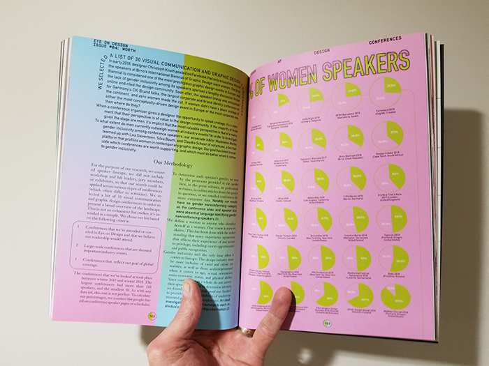
But for all of the great subject matter and occasional courtesy toward older readers, there are many pages on which it appears that the designer purposely did not want us to be able to read, let alone interpret, what is being presented. In the most recent issue, there are two pages of charts with data depicting the percentage of women speakers at the world’s leading design conferences, a subject of some concern. On each page is an array of pie charts – the simplest tool of data visualization known to man – made completely indecipherable through the choice of type size and colour.
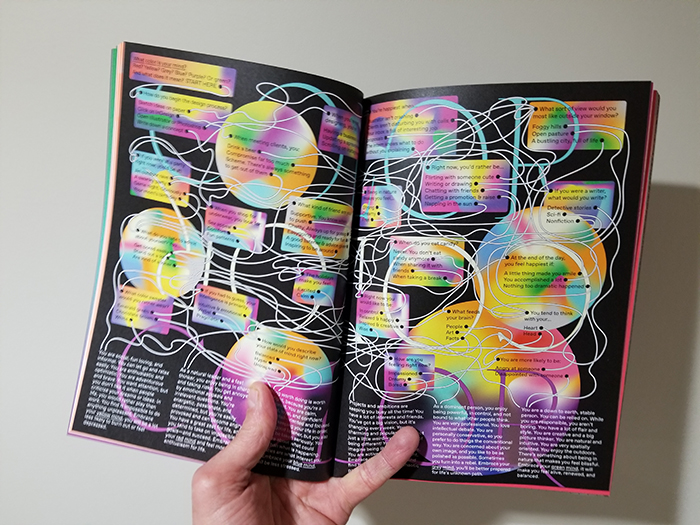
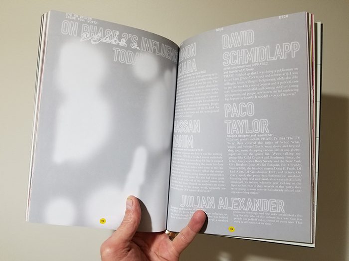
An article about design in the United Arab Emirates is made infuriatingly hard to read by setting it in a fine 9pt black serif on a red background. A long read on the role of flyer design in the early days of hip hop in the Bronx is set in small white text against a light grey background. Another on how designers measure their self-worth in the context of their careers sets black text on a stomach-churning shade of what can only be called fecal green. I’ll let you work out the semiotics of that.
One remembers the heady days of the late 80s, early 90s, when the David Carson‘s of the world trumpeted the end of print and, like kids in a Dadaist toy store, set about devising ways to accelerate its demise. Many ill-advised design decisions were made in the name of post-modernism and while it was in some ways exhilarating to witness the collapse of the modernist orthodoxy, the purposeful obfuscation of visual and verbal communication carried out in those days did little to disrupt the practice of graphic design as we knew it. A few years later something called the internet came along and did a much more effective job of that.
In the end, Eye on Design loves me and hates me. I applaud its choice of subject matter, its editorial gravity and the vigour of its discourse. But I’d be happier if I could actually read all of it.


