Guiding Light
Central Station Rebrands Humber River Hospital
March 4, 2021
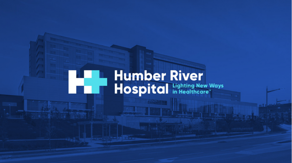
Central Station takes Humber River Hospital’s tagline as a beacon for their rebrand.
After the past year, hospitals can be seen as intimidating and uninviting places. Humber River Hospital is just the opposite: a modern hospital with a focus on forward-thinking staff and technology. Toronto-based agency Central Station wanted to convey that Humber River Hospital is a global leader in healthcare innovation while conveying the hopeful, lighthouse-like nature of their tagline: “Lighting New Ways in Healthcare.”
Utilizing elements from Humber River Hospital’s original logo proved a challenge, as they were not original or ownable. Central Station’s solution was to integrate the hospital’s use of traditional healthcare symbols, an “H” and a plus sign into a unified icon.
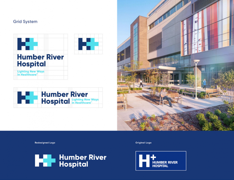
The result is a singular symbol that provides a unique brand for Humber River Hospital. One that inspires "why didn't I think of that?" responses to the simple-yet-powerful icon designed by Dave Rodgers and inspired by the work of celebrated Canadian graphic designer, Allan Fleming. The dark blue of the “H” is contrasted with the lighter blue of the plus or first aid symbol that implies a subtle glow, or the light of the hospital’s tagline. An added plus? There’s a hidden plus symbol in the negative space between the two H’s in Humber and hospital.
Central Station’s Design Director, Rodgers, was one of our Student Awards judges in 2018. The agency’s rebrand of Humber River Hospital is a study in attentive design, and demonstrates just how impressive our judging pool for the Student Awards is. These are the agencies and individuals you want to get your award-worthy work in front of. The deadline for Student Awards is May 21, 2021.


