Student Awards Judge David Walker's Toast to Craft
Cheers to well-crafted creative problem-solving
April 24, 2020

School of Visual Concepts alumni David Walker is Partner & Creative Director at Saint Bernadine Mission Communications in Vancouver
David is also gearing up to judge our 2020 Student Awards (deadline May 22 – just 4 weeks away). He's one of 16 jurors invited to see what the next generation of creatives has been up to.
And students could well learn a thing or two about forging a successful career by seeing what's David's been up to. With a small firm that's both heavily weighted by creative (not admin layers) and multi-skilled (in branding, advertising and digital), as well as focussed on client problem-solving (vs vanity), David's team is set no matter which way the industry winds blow.
The proof: David applies strong creative and strategic skills to solving communications problems for clients across a wide range of industries. His focus on thought leadership in a multi-disciplinary environment leads to work that both wins awards and builds clients' businesses.
David's signature tool-kit includes sharing insights, so take a peek below at a project he's shared where he discusses why sometimes the best new school solution is a deep dive into good ol' handcrafting.
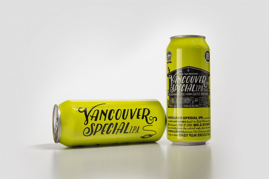
Project: R&B Brewing
"R&B Brewing is one of Vancouver’s original East Van micro breweries, predating the current trend by almost two decades. The design language is inspired by R&B’s resolutely hand crafted product – as such, every element on the packaging is rendered by hand.".
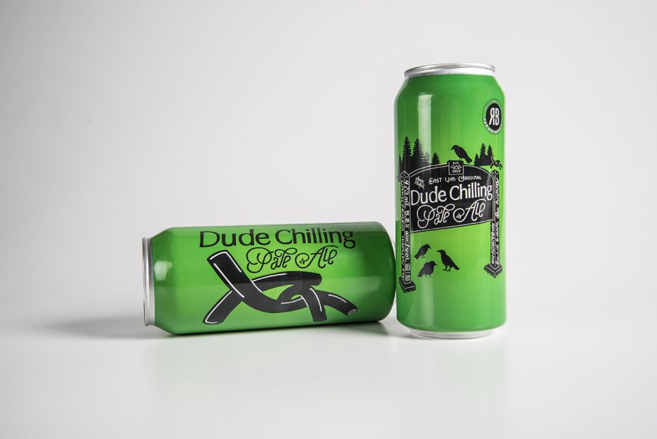
"Bold silhouette key illustrations take their cues from the beers' quirky naming conventions, and strong colours aid standout and shelf blocking. Key brand story elements, hand rendered in expressive type, and additional varietal information, like IBU scale, boil information, aging temperature, hop and barley type and mix all support R&B’s independent, craft positioning."
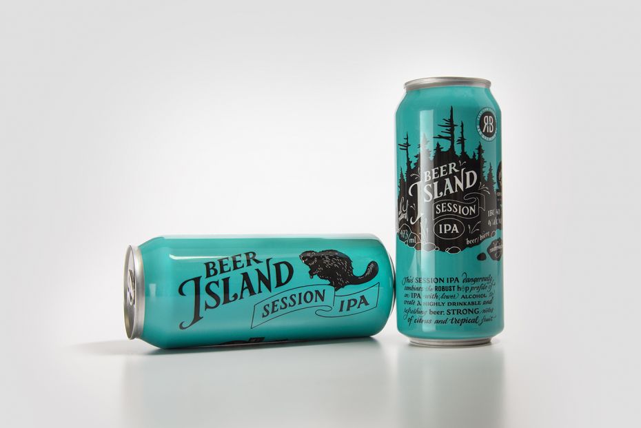
"Hand lettering brings an energy and personality to the content. It reflects the handcrafted nature of R&B’s product as well as their enthusiasm. The hand lettering marries the typography and the illustration creating a cohesive unit. Further, hand lettering brings warmth and a personality to a product and its content – it removes a layer of formality. Hand lettering engages the consumer and makes the brand feel approachable and familiar. This design system is constantly being added to, engaging beer drinkers and sharing the beauty of R&B’s handcrafted beers."